

The Latest


“BBB” - LIMITED EDITION PRINTS WITH A MISSION
Big, Bold, and Beautiful, or BBB, as we call them — is a limited-edition series of large-format prints. Each edition comprises roughly 15 copies, spread across a range of sizes. But the concept behind BBB isn't about luxury, exclusivity, or rarity. It's about…

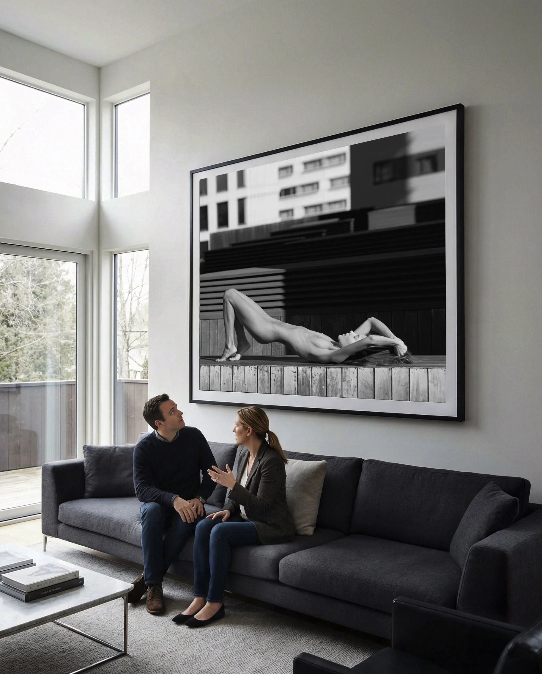
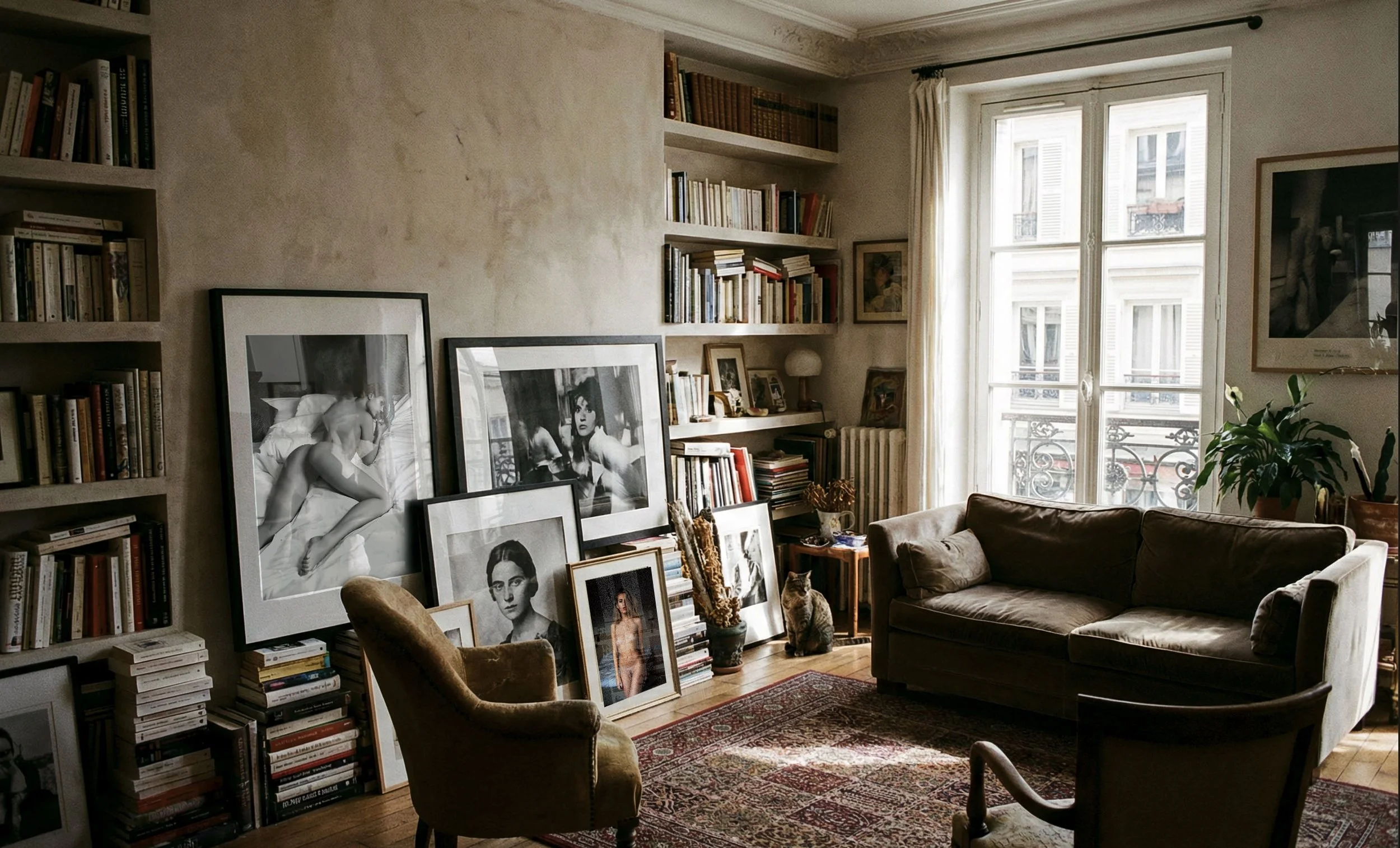
The Titan (140×200cm)
Big, Bold, and Beautiful, or BBB, as we call them — is a limited-edition series of large-format prints. Each edition comprises roughly 15 copies, spread across a range of sizes. But the concept behind BBB isn't about luxury, exclusivity, or rarity. It's about communication. These prints exist to bring human sexuality back to the surface — in-your-face messages designed to start conversations, break taboos, and unite people around our shared humanity.
The name says it all: Big for their size and their power to demand attention. Bold for their uncompromising openness and authenticity. Beautiful for their deep connection to art, aesthetics, and the human form.
THE MISSION STATEMENT.
At Nudicci, we've long felt that nude photography has never been taken as seriously as other photographic disciplines. Whether in prints, magazines, or gallery shows, it always feels slightly self-censored — modest, hushed, kept at arm's length. Even people who buy the work, attend the exhibitions, or subscribe to the publications rarely discuss it the way they would any other art form. The result is a striking absence of common language: most of us simply don't know how to talk about nude and erotic art.
Lot of people experience nude art intuitively — they feel it in their bodies, no intellectual interpretation required. However, our society enforces the self-censorship and our culture fails to teach us how to put words to those feelings, to articulate what we sense and why. No wonder, that discouraged from even having the conversation, we never get the practice needed to develop the mindset.
That's what we are trying to change with those large format edition. We can point the way, but we can't hand you a script. Each of you will need to find your own voice — first for yourself, then for the people around you. The BBB prints are a tool in that mission: large enough to be impossible to ignore, and honest enough to make avoidance feel like the stranger choice.
Our assumption is that BBB will work like a wise old teacher. First, you'll have to convince yourself why this print is worth your hard-earned money. Then you'll have to face objections and comments from friends and guests. Having to justify a purchase — especially as unconventional as a large nude print— does force genuine self-reflection. And navigating social objections is a real and well-documented way people clarify and articulate their own values. And in doing both, you may find yourself face to face with all the ways a culture quietly numbs us from our own sense of beauty and sexuality. This will be a huge win. Mission accomplished.
All of which brings us to the print itself. Because as much as BBB is an idea, it is also an object — a physical thing that will live on your wall, spark conversations, and quietly do its work every day. The decisions you make about size, paper, framing, and glass will affect the way you feel about the artwork. They are part of the same intention – what print will do the best job for you? A print that is too small to command attention, or dulled behind cheap glass, or left curled in a tube, cannot do what it was made to do. What follows is everything you need to know to be fully satisfied in your choice. Let’s walk through a few important details about choosing the BBB prints.
ORIENTATION.
Before settling on a specific image, it's worth thinking about orientation first. It sounds like a minor detail — but it isn't. A great print that has no natural home on your walls is just a source of frustration. A print that fits badly is worse. A little planning upfront saves a lot of regret later
Horizontal is what most people picture when they think of a large print, largely because the landscape printsthey grew up seeing were horizontal. It's also the format of the television screen — which may explain why wide compositions feel so instinctively comfortable and familiar on a wall. Horizontal frames sit naturally above a sofa or bed, and work well for landscapes, wide compositions, and reclining nudes.For nude photographs, the horizontal format is less common and often becomes an afterthought when it comes to printing - vertical often feels more natural when the body is the primary subject.
Vertical frames are more versatile in terms of placement, and carry a different visual weight — less screen, more window or classical painting. They suit portraits and full-body shots naturally, since the vertical frame mirrors the standing human form. A series of vertical prints grouped together can build a cohesive theme across a wall. They also have a subtle architectural effect: a tall frame makes a room feel slightly higher, lifting the perceived ceiling. It's worth noting that vertical is now the default format of the smartphone and social media — yet long before that, it was the dominant format of the nude, for the simple reason that it is the most natural way to photograph a standing body.
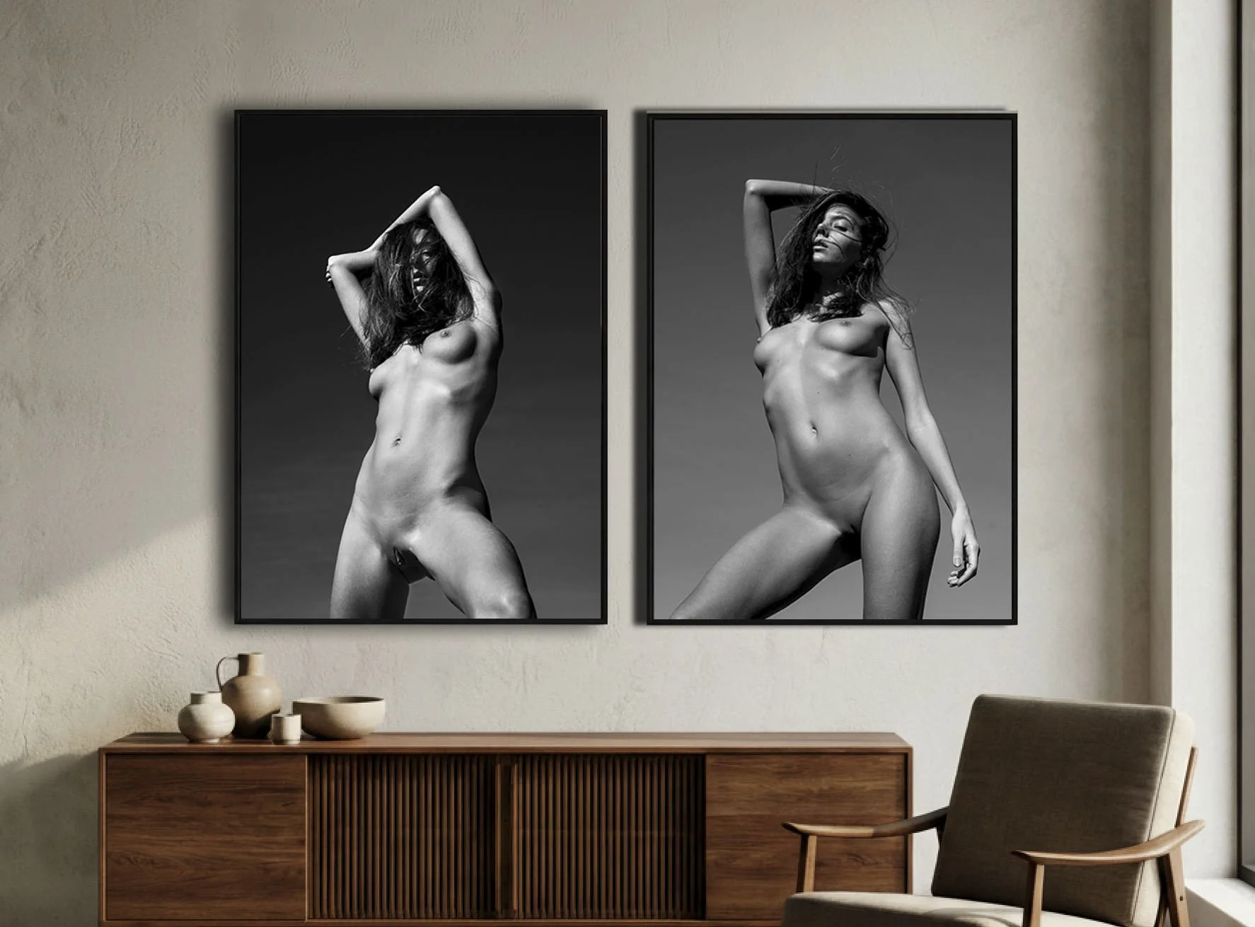
If you place multiple images in a vertical arrangement, you can influence how the viewer reads them. The sequence can feel more connected and intentional, creating a dialogue between the images.
Square formats occupy their own distinct territory. Visually balanced, equal on all sides — nothing to add, nothing to remove. There is something almost ideal about a perfect square, which is perhaps why Instagram launched with it, and why the medium format 6×6 cameras that defined fashion and advertising photography for decades used it. But the square is also the most demanding format to fill well. Not every image was composed with that geometry in mind, and forcing a square crop onto the wrong image can make it feel like something is missing. When it works, it’s quietly perfect. When it doesn’t, you’ll always notice the imbalance. Yet, the best thing about square prints is the endless ways you can arrange them. They’re the most versatile format when it comes to layout and grouping.
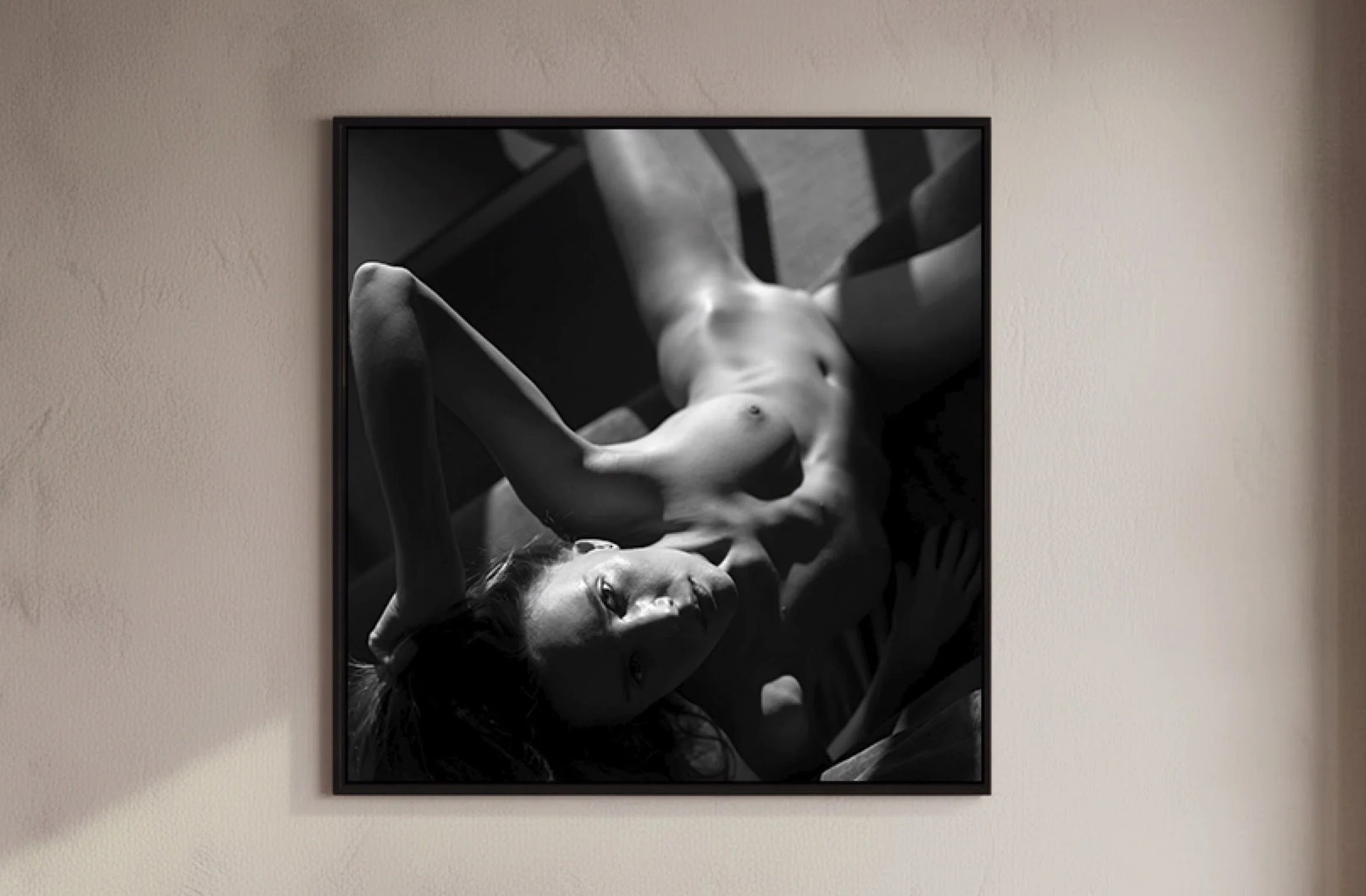
A good example of a square image: it’s not only harmonious, it also doesn’t have a clear up or down, so it can be displayed in more than one way.
SIZE.
An “Epic” 100×140cm limited edition BBB print.
Once you've settled on orientation, the next question is scale — and the same principle applies: what size will make your wall look its best?
We offer three standard sizes: 50 × 70 cm (Grand), 70 × 100 cm (Ultra), and 100 × 140 cm (Epic). Each was designed to match the most common frame sizes available in stores, so DIY framing is straightforward. They also follow a clean progression — each size is double the area of the previous one, which means the Epic is effectively four Grand prints combined.
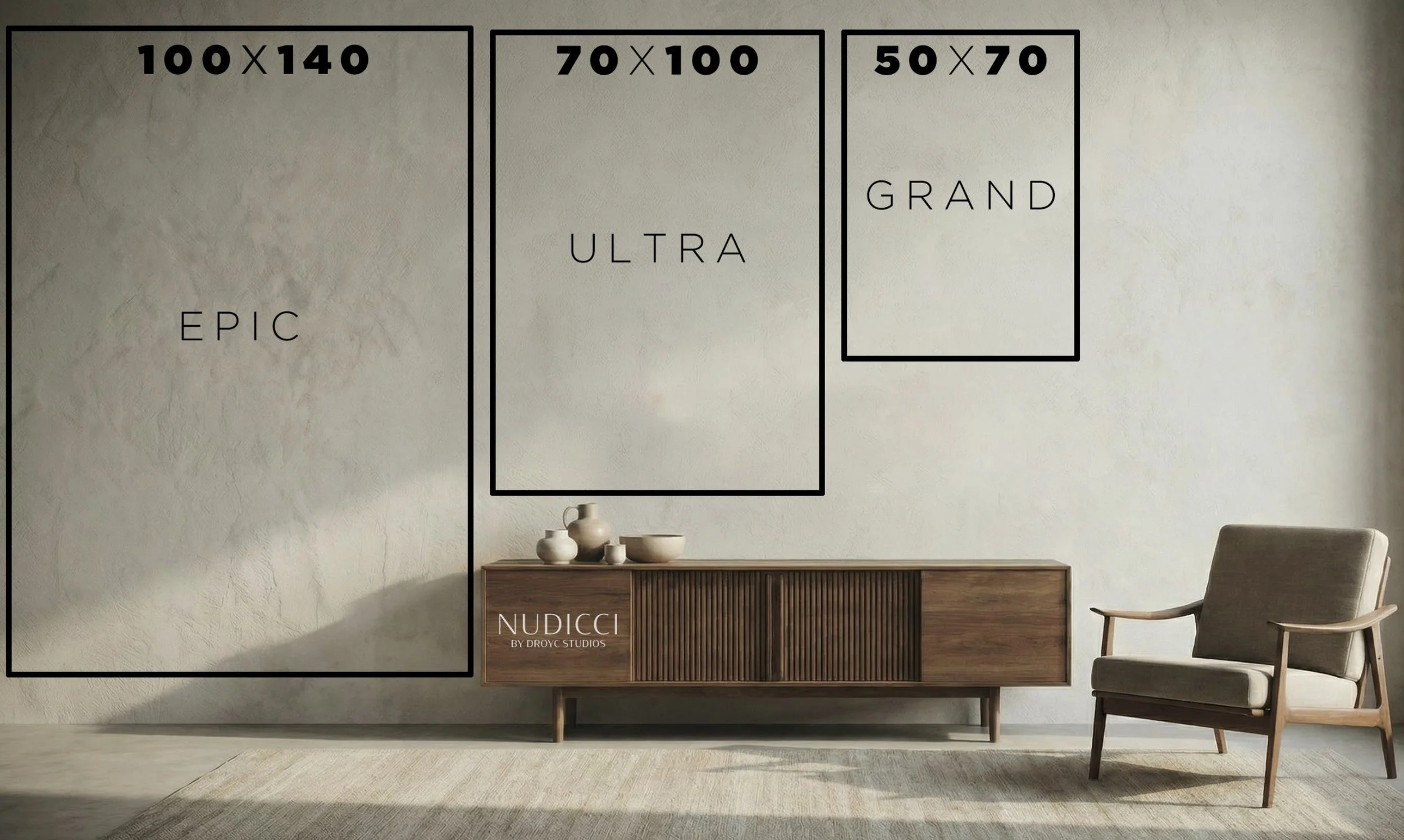
The 3 formats available for BBB Editions. The size logic is simple - with each size step up, the print area doubles.
Occasionally, for some prints, we offer a fourth option: the 140 × 200 cm Titan. It is exactly what it sounds like — massive, commanding, and impossible to ignore. But it comes with practical considerations: it requires custom framing, won't fit in most elevators, and demands a home with the space to match. The Titan doesn't decorate a room — it becomes the room, a portal to another world.
But beyond whether it fits your elevator, there are deeper questions worth considering. Primary: what effect do you want the image to have?
The 50 × 70 cm Grand is the classic home poster size. Big enough to be noticed, beautiful enough to belong in almost any room — but it won't stop anyone in their tracks. You could hang two or three of these without your home feeling like a gallery. This format leaves a lot of room for experimentation without a significant financial commitment. It is a smart starting point if you've never owned a large-format print before.
The 70 × 100 cm Ultra is the size of a street movie poster. At home, it's a different proposition entirely — rich in detail, impossible to walk past without registering. Most people have never owned a piece of art this large, yet it's not so overwhelming that it can only go in one place. You'll likely find several walls that can carry it, and owning more than one is not much of a stretch. It's a format that commands attention without dominating the room.
The 100 × 140 cm Epic is the giant in the room — literally. Think of a 68-inch TV, or a standard office desk that is often 80×140cm and you have the scale. It will dominate most spaces, and there will probably be only one or two walls in your home where it can comfortably live. At this size, the image doesn't just hang on the wall — it presides over the room, it dominated the room. The Epic is not for everyone. Few people will want — or dare — to live with a nude print this large. But those who commit to it will understand immediately why it earned its name. This is a print designed to stop people in their tracks and start conversations that don't end quickly.
And then there is the 140 × 200 cm Titan. This is not a large print. It is essentially an entire wall, double of Epic in area or as big as a Queen-size bed or 96-inch TV-screen. It is colossal by any domestic standard — painfully impractical to move, and utterly unlike anything most people have ever encountered in a private home. It is not a statement piece, designed to announce its price tag or its rarity. It is its own reality. You don't hang the Titan and step back to admire it. You enter the room and find yourself in its presence. It becomes your reality, and there is no escaping it. You are captivated — by the art, by the scale, by something that feels older and larger than the moment you're standing in. Forget Instagram. Forget the news. You are in the presence of something timeless.
In addition to these formats, we also offer square ratios in the same size tiers. Grand in square format is 50×50 cm, Ultra is 70×70 cm, and Epic is 100×100 cm. This depends heavily on the image, though. Very few photographs can be cropped to a square without losing visual impact.
PAPER.
Every serious printer will tell you that paper is half the image. The wrong paper can undermine everything the photograph is trying to say.
This is also where most people get lost. So let's start with the one thing that doesn't need to concern you: price. All BBB prints cost the same regardless of paper. That decision has already been made for you
What hasn't been made for you is the choice of effect. Rather than presenting every paper we've ever tested, we only offer papers we know will make that specific image work. Within that selection, the differences are real and meaningful — absolute blacks that disappear into the wall, saturated colors that feel lit from within, tactile surfaces that invite touch, classic matte finishes that read like traditional photography, glossy surfaces that demand clean hands and clean air. Each creates a fundamentally different experience of the same image. Let’s have a look:
RC Glossy (250–310g) This is the most vibrant and high-contrast option — deep blacks, a high-shine finish, and colors that genuinely pop. Best for bold color work and high-contrast black-and-white. Tradeoffs: reflections can be brutal in dark areas, and the surface shows fingerprints easily, that are impossible to remove.
RC Semi-Gloss (250–310g) A family of finishes — pearl, satin, lustre — that sit between glossy and matte. Beautifully rich colors and good contrast, without the hard reflections of full gloss. This most versatile and forgiving surface, and a safe choice for almost any type of print. Probably 80% of all professional prints are printed on this semi-gloss surface. If you can’t decide - this is the safe choice.
RC Metallic (250–310g) A unique finish — almost chrome-like — that gives images a luminous, near three-dimensional quality, with highlights that appear to glow. Particularly striking on skin tones and images with strong light and shadow interplay. Tradeoffs: white areas take on a silver tone, which reduces overall contrast and shifts whites toward grey. Not the right choice for every image or taste, but unforgettable when it works.
Fine-Art Matte (250–400g) A family of heavyweight papers — cotton, bamboo, or alpha-cellulose — with a smooth, non-reflective surface that reads closest to traditional watercolour paper. Colors are subtler and more nuanced, making it ideal for black-and-white work and images where texture and tone matter more than saturation. This is the mother of all papers — the classical art surface that artists have used for centuries, adapted for modern inkjet. It wants to be touched, and it is made to be touched. No fingerprints, just a clear and immediate tactile experience - the print and the paper become one. Tradeoffs: blacks are rarely true black, resulting in lower overall contrast — a tradeoff that suits images with few full black areas.
Fine-Art Baryta (300–400g) A premium fine-art paper that closely resembles the classic silver gelatin prints of traditional darkroom photography. Available in matte or semi-gloss, and typically made from cotton, bamboo, or alpha-cellulose, it combines the depth and richness of glossy with the archival quality of fine-art paper. Worth knowing: the difference between Baryta and a good RC glossy can be subtle to the untrained eye — but for those who know, it's the most photographically authentic surface available, specially for BW prints.
Fine-Art Canvas (350–450g) The same cotton canvas used for oil painting, adapted for inkjet printing. The texture adds depth and warmth — but it comes with a tradeoff: fine details can be lost on the rougher surface, making the result feel less photographically sharp and more painterly. It is typical surface for nude photography — but in the right image, one that might look like a painting, it can be stunning. Available in matte or gloss, canvas prints are typically finished with a UV-protective coating after printing, which means they can be displayed without glass. The prints are shipped unmounted and will require professional help to stretch. Canvas typically displayed without a frame — making it a particularly compelling choice for very large formats where glass would be impractical.
The right choice of paper depends on questions only you can answer. Where will the print hang — a bright room, a dim one? What surrounds it? Do you value depth, subtlety, drama? What type of frame do you have in mind? There is no wrong answer, only the answer that fits your space and your eye. What we can promise is that every paper in our selection is premium and award-winning — 100% cotton-based, alpha-cellulose, or premium RC. The exact specifications will be documented in the Certificate of Authenticity accompanying your print.
Please note that the paper and border options will appear when you click the “Add to Cart” button. For canvas prints, “gallery wrap” borders will be added automatically.
BORDERS AND FRAMING.
The last decision — and one that's easy to overlook until it's too late are boarders. Borders serve two practical purposes. First, handling: when unwrapping or mounting a print, you want to touch the border, not the surface. Glossy papers in particular are unforgiving with fingerprints, and a border gives you a safe margin to work with. Second, mounting: if you mount a borderless print into a passepartout, the mat will inevitably overlap and hide the edges of the image. A border solves this — the passepartout covers the border, and the full printed image remains visible.
Knowing this in advance matters, because your border choice depends entirely on what you plan to do with the print.
Borderless prints fill 100% of the paper. A borderless 50 × 70 cm print fits directly into a 50 × 70 cm frame — glass, print, backboard. Clean and simple, but you'll lose roughly 1 cm of image under the frame lip, and matting isn't really an option, because you will lose a lot of the printed area.
Borders added to the image area keep the printed image the same size but increase the paper dimensions. A 50 × 70 cm image with a 5 cm border becomes a 60 × 80 cm sheet of paper. This gives you full flexibility — you can mount it in a larger frame later, or choose your passepartout size independently of the print size. Even a minimal 2 cm border on each side (making the paper 54 × 74 cm) buys you that freedom without committing to a specific frame size.
Borders subtracted from the image area keep the paper size the same but shrink the printed image. A 50 × 70 cm paper with a 5 cm border leaves a 40 × 60 cm image — useful if you want to stay within a standard frame size while still having a mat, but the image itself becomes smaller.
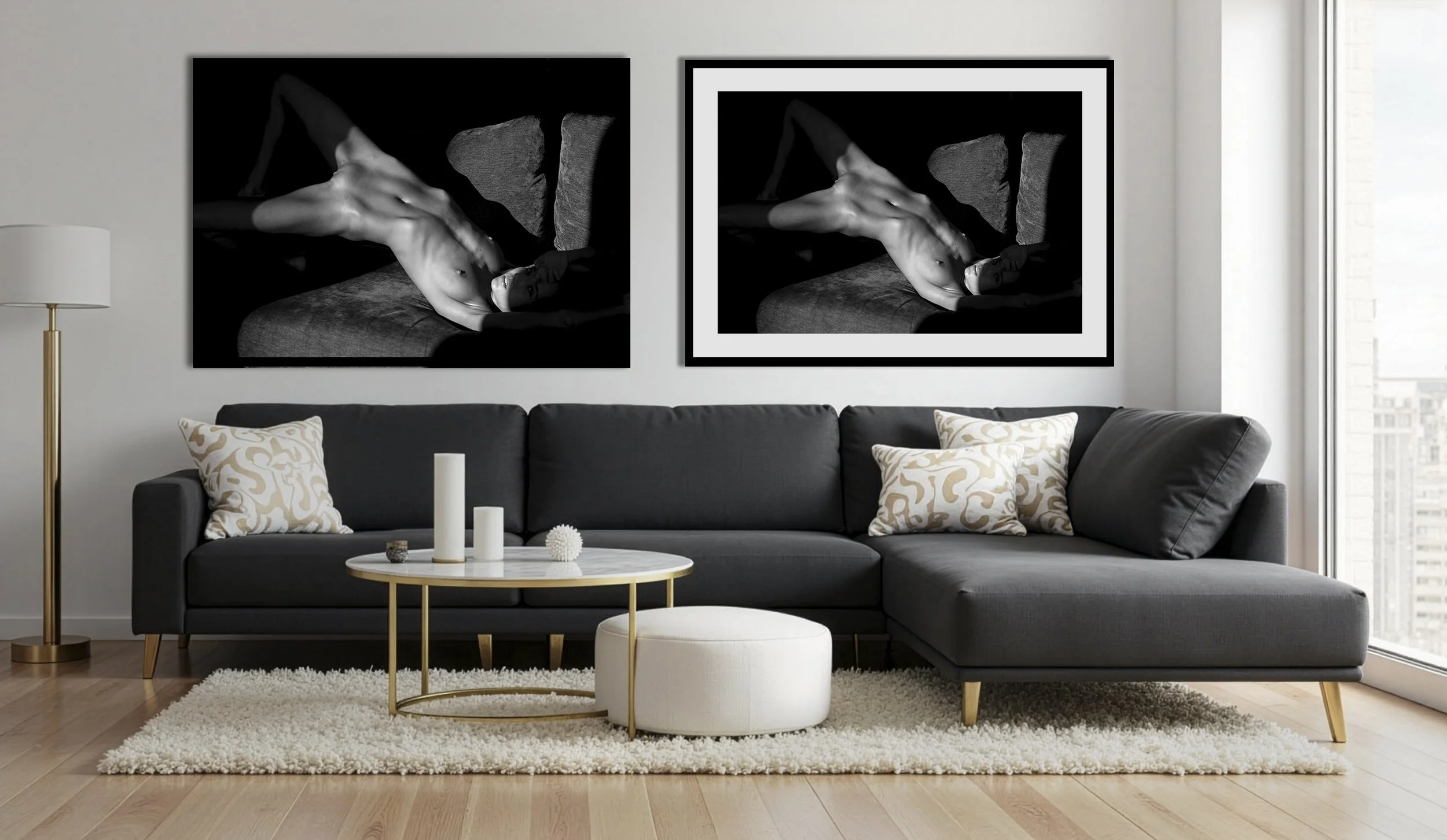
Left: borderless print - image fills the sheet and the frame. Right: bordered by cropping (subtracting) - the same sheet size but the print area decreases by the width of the border. An added border would keep the same print area size but increase the sheet size, so it wouldn’t fit the same frame.
As a general rule: if you're unsure how you'll frame it, opt for added borders. They cost you nothing in image quality and keep your options open. If you end up not needing them, you can just simply trim them.
A print with added borders, ready to be mounted in a larger passepartout.
Passepartout or not? We have full article covering framing and passepartout but let me recap it here again and specifically for BBB editions. The case for a passepartout is both practical and aesthetic — and the two reinforce each other more than you might expect.
Practically, a passepartout adds stability and protection on multiple fronts. It holds the print securely in place, prevents it from touching the glass or plexiglass, and acts as a first line of defence against environmental damage — insects, gases, moisture. It also opens up an option many people don't consider: mounting without glass entirely. In some situations glass isn't necessary, but a borderless print without a passepartout has nothing to hold it in place. The mat solves that. A passepartout also makes it easy to swap frames or rotate images. Many collectors have more prints than frames and cycle through them over time. A mounted print can be safely stored and wait its turn. A loose print, by contrast, has to be rolled back into a tube, slipped into a large plastic sleeve, or stored flat in a folder — none of which are ideal for something you plan to return to the wall.
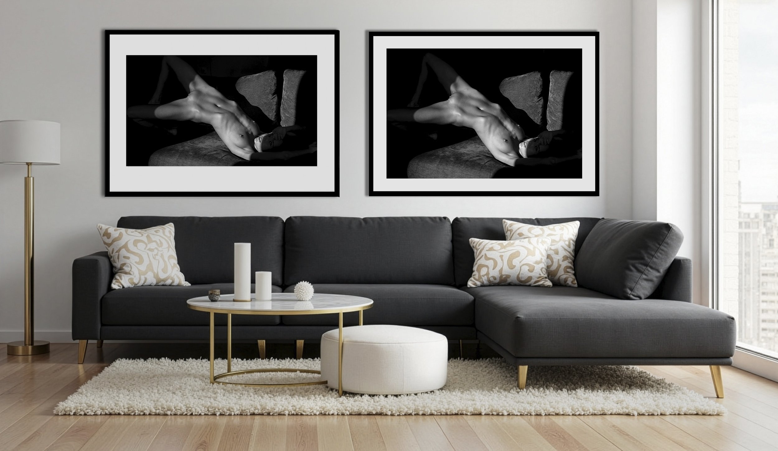
Same frame size: 70×100 cm. The passepartout on the right has a 59×89 cm cutout, with even 5.5 cm borders all around. The passepartout on the left has a 49×84 cm cutout and uneven borders: 7 cm on the sides and 10.5 cm at the top and bottom, which gives it a slightly more dynamic look.
Aesthetically, a passepartout creates a frame within a frame — and that layered separation is deeply associated with how we are used to see art. It signals that what's inside is important, considered, set apart from everything around it. But beyond that classical association, a passepartout offers real creative flexibility. It can alter the perceived proportions of an image, introduce color, and add a sense of depth and dimension. A beautifully crafted passepartout can elevate even an average print into something that reads unmistakably as art.
The case against is essentially one of scale and simplicity. A passepartout adds bulk, cost, and complexity — and at Epicor Titan scale, it can feel unnecessary. At that size, the image commands the room on its own terms, and a mat border risks breaking the immersive illusion rather than enhancing it.
Framing. Framing is a vast subject with no shortage of opinions, but the core principle is straightforward: a frame should protect the print, allow it to be stored and displayed safely, and either disappear into the background or become an art form in its own right.
Most frames fall somewhere on a spectrum between two extremes. At one end, the slim industrial aluminium frame — minimal, utilitarian, with no personality of its own. At the other, the ornate gilded wooden baroque frame, which competes with the image for attention rather than serving it. Between them lies a wide range of options — natural wood, plastic, silver, copper — each suited to a different interior and aesthetic sensibility.
One practical detail worth knowing before you choose: not all frames are built the same depth. Some can only accommodate a print, while others have the internal space to hold a print and a passepartout together. If you plan to mat your print, check this before buying a frame. A beautiful frame that can't accommodate a thick passepartout will leave you choosing between removing the glass or abandoning the mat entirely.
Glass. A final detail that can make or break everything that came before it is the glass. Standard glass will undermine even the most premium print. Reflections take over and you end up looking at the room rather than the photograph - you’ve got yourself another mirror. The solution is either matte acrylic or museum-grade anti-reflective glass, both designed to protect the print without getting in its way. Neither option is cheap, but both will let the print show its true quality
Another option is no glass at all. Our prints are made on premium, award-winning papers using the latest pigment inks, producing a lifespan of at least 70 years unprotected — and many papers rated up to 200 years. UV-protective glass can extend that further to around 400 years — though at that point, there will be no one left to verify the claim
What actually threatens an unprotected print is more immediate: humidity, airborne gases, and physical accidents that can damage the surface. If you can reasonably control those conditions, going glassless is a legitimate choice — and it preserves the full tactile and visual quality of the paper in a way that even the best glass cannot.
Going glasless will also reduce the cost of custom framing. But don't use it as a cost-saving hack. Only choose it if you genuinely believe that glass is getting between the viewer and the work, and you are better off without it.
SHIPPING AND HANDLING.
One last practical matter before you order. All BBB prints are shipped rolled in a tube. It's the most efficient way to transport large-format prints, but it's not the most convenient way to receive them. You'll find a heavily curled print that has no interest in lying flat. Given that most large-format printers work from large rolls to begin with, the curl is already there before it even enters the tube, and several weeks in transit just adds to its curl.
For smaller sizes it's a much less of an issue. For larger prints this can be a genuine challenge — a tightly curled Epic or Titan can be difficult to fit into a frame without a fight. The simplest solution is to take the tube directly to a frame shop and let them handle it. Most framers will mount a print for a small fee if you're buying a ready-made frame from their store. If you're going the passepartout route, expect a higher cost and a turnaround of a few days rather than same-day service.
If you'd rather handle it yourself, roll the print in the reverse direction around the tube and leave it for a few hours under some weight — otherwise it will simply spring back. Place a layer of soft tissue paper, flower wrap, or clean gift wrap between the print and anything it touches while you work. Just make sure whatever you use is clean, flat, and crease-free. Large prints can be stubborn, and any fold or bend risks leaving a permanent mark on the surface.
One way to display large prints is to let them stand on the floor, which emphasizes their scale and physical presence.
One final tip: think about where the print will hang before committing to a spot. A new large-format print often triggers a rearrangement of everything around it, and that's not a bad thing — it's part of the process. But consider letting the print stand on the floor for a while, leaning against the wall, before you decide on its permanent home. Let it settle into the room.
But there’s also a case for letting a work live permanently as a floor-standing piece. Many art galleries and design-led hotels use this approach deliberately: it projects a kind of casual confidence that a perfectly hung print can sometimes lose. Aesthetically, the free lean can feel relaxed, contemporary, and assured. By contrast, once something is fixed to the wall it can feel too final, too settled, and therefore too easy to stop seeing.
This can suit large prints especially well, since their scale already pushes them toward being an installation, not just a neat print. It also changes how your body meets the work. A large print hung high can create a polite, sterile, museum-like experience. A large print leaning against a wall invites a different kind of attention and interaction: you can step closer, view it from different angles, touch it and even lift it. It starts to feel closer to visiting an artist’s studio, where finished and unfinished works share the same space - nothing is settled, everything is open for an interpretation. This kind of experience of viewing an art can engage far more than a static wall-hung frame. But it’s not automatically the best choice for every space, it is just one option to consider.
The tradeoffs are obvious: that same open interactivity makes the work easier to damage, so solid framing and glazing become especially important to protect it from dust, bumps, and everyday life.
That is all for now. Be bold!

For questions, feedback, for larger orders, custom sizes and custom framing, or prints on materials other than paper (metal, plexiglass, etc.), use contact us form.
Understanding Value Creation in Printmaking
It used to be that all photographs were prints. Today, however, most photographers no longer print their work, and printing is too often dismissed as unworthy of a ‘serious’ artist. Yet understanding the full chain of value creation in printing could change how prints are seen and valued—by collectors and photographers alike.
Sometimes talking about printing with other people reveals how little most people understand about the process of making a good print. Somewhere along the line, photography and print became blurred into a single idea. It used to be that all photographs were prints—there was no other way, and the words photography and print were interchangeable. Photography meant print. Period. Today billions of digital images are created each day, yet only a tiny fraction ever make it as prints, and those few that do, often end up as prints stuck to a fridge.
And this attitude isn’t limited to casual viewers—many photographers themselves no longer print their work or even see the point in trying. Too often, printing is dismissed as trivial, unworthy of a “serious” artist. Part of the blame lies with printer manufacturers and their decades-long marketing campaigns. We’ve been led to believe that printers are smart, almost magical machines: buy one, press a button, and a flawless print appears. Yet, anyone who has actually used a printer knows it’s nothing like that. You might get is a print, but it will not be what you’ve expected to see at all.
The truth is that a print is never simply ‘pressed out’ of a printer. A printer is a dumb machine: it knows nothing about the image it is producing, the paper it is using, the conditions in which it will be viewed, or whether the artist wants it more vivid, softer, or higher in contrast. It has no understanding of whether it is printing a volcanic landscape in Iceland or a cat. All of this must be decided and set by the printmaker. That’s why the same printer can produce a brilliant print in one person’s hands and a muddy, lifeless one in another’s. The artistry lies not in the machine but in the judgment and knowledge of the person guiding it.
The other reason for lack of understanding is the rise of fulfillment services with their enticing promise: “Just send us your file and we’ll ship the print to anyone, anywhere.” It’s a good pitch that many photographers fall for, but the product often falls short. The artist has no control, no visibility over what the customer receives, and the customer - believing the print came directly from Photographer X - rarely questions the quality. And without strict quality control - a print is no better than a poster. It is treated as a commodity and inevitably becomes one.
Printing is part of a larger act of translation. It starts from reality translated to a two-dimensional digital image, and back again into a physical object on paper as a print. Every stage of that translation requires both technical skill and artistic judgment. Every print carries the hand of the maker in every decision, and there is real art in that. And of course, none of it would matter without a strong image to begin with.
And here lies the paradox: the better the image and the better the print, the less visible the expertise behind it becomes. Canon and Epson understand this well, which is why they employ armies of brand ambassadors—photographers with strong source material whose work can be translated seamlessly into brilliant prints. That invisibility of labor and effortless success is one reason why prints are so often undervalued compared to drawings or paintings. People know far more about painters, paints, and their struggles than they do about photographers and printing challenges.
Yet understanding the full process might change how prints are seen. If more people grasped what goes into each print, more would value them, recognize them as art, and perhaps even fall in love with them. It is for this reason that I’ve written this guide. What follows is not a universal formula but a map—a sequence of five stages that begins with importing files from a shoot and ends with the framed artwork. Not every photographer follows all of them. Some stop at step1 or 3, others outsource certain steps in between. What matters is that each stage involves conscious choices, and those choices shape both the final result and the value of their art.

A high-level overview of the complete printing process.
Step 1: Selection
The first step is about narrowing down the images into a strong set of candidates for print. Most photographers are used to culling—sorting through and selecting their best shots—but evaluating with print in mind adds another layer. It’s no longer just about asking which images look great on a screen, but which ones will hold their strength on paper. Which images will look good on a wall? Which will stand the test of time?
This is also the stage where the selected files are batch-processed and given a first round of editing in software such as Lightroom: correcting white balance, adjusting the histogram, straightening, cropping, and removing obvious distractions. More detailed local edits, like skin retouching, are usually left for later steps.
To make this more concrete, let me give you an example. After a day of shooting I might come back with 2,000–3,000 images. Through several rounds of sorting, I cut about 90%, which leaves me with roughly 200 images. I process these in Lightroom, export them, and refine the selection again, this time with print in mind. At that stage, I might select only 30–50% as candidates for printing. Before moving on, I also try to form an idea of what kind of print each image might become - whether it’s something small, large, or better suited for an alternative process.
Step 2: Printing
Once images have been selected for printing, the next decision concerns how to produce them. This stage is often what people imagine when they think of “printing”: choosing the paper, the size, printer settings, and managing color. Most literature and workshops focus almost entirely on this step. Yet inkjet printing at home is not the only option. Options range from printing at home, sending files to a professional lab, or preparing digital negatives for alternative processes. Professional labs typically offer a far wider range of materials and the ability to produce larger sizes. They are also specialists in their offerings—papers, aluminum plates, acrylic glass, wood, canvas.
Paper choice introduces another layer of complexity to navigate. In an ideal world, one might print each image on every type of paper and at multiple sizes, then evaluate which combination works best. Reality, however, makes that impossible. Few can afford to test every option, which is why experience and competence are essential: they save both money and time while selecting the best medium for each image.
Knowing the intended use of the print—personal display, a gift, an exhibition piece, or a print for sale - influences which paper is most appropriate. Each scenario has different requirements and expectations. Conservation aspect is critical for prints intended for sale. Cotton-based papers are archival and long-lasting, but more expensive; wood-pulp papers are cheaper but less durable, yet perfectly fine for home prints where cotton based papers will be on overkill.
Example: From 100 candidates selected in the previous step, I will print 15–20 small 10×15 prints on different paper types. This first round eliminates weaker images and highlights the most suitable papers. The strongest 50 might then be printed at 10×15, from which around half are chosen to test at A4. At this size, flaws become more visible: focus issues, subtle distractions, or tonal imbalances that were not obvious at smaller scales. Some images return to Photoshop for correction and local edits before being reprinted. From the A4 prints, perhaps half progress to A3 prints. By the time printing reaches A2, only a handful images will remain. Many images have natural size limits: they work at 10×15, remain strong at A4, but begin to collapse at A3 or beyond. For an artist, it’s essential to know the point at which an image starts to degrade—and never offer prints beyond that threshold. Today’s AI upscaling tools can extend resolution, but resolution is not the real issue. What matters is how busy, engaging, and interesting the image remains at scale. The human eye adapts quickly: what looked striking when first seen at scale can become visually monotonous once the initial “wow” factor fades. That’s why painters and printmakers have long thought about “viewing distance” and “scale integrity”—the ability of a work to keep rewarding attention at different distances and over time.
In this workflow, my home printer capable of A2 is sufficient for most prints. Anything larger is sent to a professional lab. I have already printed an image in A3/A2 size and know that the image can hold its strength at larger size. Without this initial testing, ordering directly from a lab can feel like a gamble - you can never know what you’ll get back.
Step 3: Post-Print Modification
This stage is often overlooked, yet it opens an entire world of possibilities. A print doesn’t have to be “finished” once it leaves the printer. It can be toned, hand colored, overprinted, aged, or cropped. Gloss layer can be added to matte prints, or matte applied to glossy. Creativity is the only limit here. Post-print interventions have a long tradition in art photography and printmaking. Photographers and printmakers have often modified their work after printing to add uniqueness or character.
The reason many photographers skip this step today is simple: post-print processing is not part of the traditional photographic workflow or education. To do it well requires multidisciplinary knowledge, something few photographers possess. Broadly, these interventions fall into two categories: freehand modification and full-image manipulation.
Freehand modification includes drawing or painting directly onto the print. This demands a clear understanding of how different media interact with paper and ink: acrylic, oil, watercolor, inks, as well as the tools—brushes, markers, cotton swabs. It requires knowledge of color theory, blending, and application. Full-image manipulations, by contrast, are less demanding of artistic draftsmanship. Techniques like toning or second exposures rely more on chemistry and process than on hand and brushwork.
With post processing 10 identical inkjet prints can become 10 very different art objects. That’s what gives this step its creative potential: it breaks the idea of the print as a fixed, endlessly repeatable object. If two photographers print the same file, they will produce nearly identical images. But once post-print processing enters the equation, those same prints may diverge completely—each bearing the unique mark of its maker.
Example: I have toned prints in coffee, hand-colored with acrylics, watercolors, and inks, aged with heat or water. Of course, digital tools can replicate some of these effects, but the point here is not consistency—it is uniqueness. Each intervention adds individuality. It isn’t scalable, and from a business perspective it may not be efficient, but as a creative step it transforms a print into something truly unique.
Step 4: Matting
Matting is often dismissed as something outside the printing process. It is seen as uncreative, something to skip entirely or outsource to a framer. But this could not be further from the truth—matting is the step that transforms a sheet of paper into a work of art. Done well, matting elevates a print from paper into something special. It becomes a permanent part of the artwork, not just a decorative border.
Matting is both perception and preservation. Think of packaging: the way a product is wrapped and presented shapes how we value it. Matting functions the same way for a print—it frames the image, sets the stage, and creates the context in which it will be seen. At the same time, mats create a physical barrier, protecting prints from touching the glass, from fingerprints, and from environmental wear.
The obvious question is then - if standard mats are available everywhere, why bother making your own? The answer is that doing it yourself teaches you about your images. Cutting and fitting mats builds an eye for proportion, balance, and how presentation changes meaning. Custom mats give you full control over framing, and the difference is immediately visible. This knowledge also makes you a better judge when you order matt services form someone else. With large editions, economies of scale inevitably demand outsourcing and uniformity, which dilutes the sense of uniqueness collectors value. Historically, this is exactly why smaller editions with visible signs of craft command higher prices.
Example: For me, matting is the ultimate commitment to the print: dressing it to impress, making it truly unique. I often cut and paint my own mats, experimenting with non-standard window ratios. This gives me complete control over how the print is presented.
Of course, practicality has limits. If I had to produce 50 or 100 identical mats, I would outsource them to a framer with cutting machines—after first designing the mat myself. There is no need to manually create 50 identical mats, but designing the first one by hand is invaluable process. Outsourcing only makes sense once I already know what I want. It is like a designer who spends months creating a chair or a dress but once the winning design is found, it can be reproduced in a factory on a mass scale and at a fraction of a cost.
This is also why I resist producing large editions in principle. With 10–15 prints, every copy can be made by hand. With 50 or 100, the pressure to automate and outsource grows, and the collector ends up with something less personal. A small edition means I spend far more time on each print than someone who is using a print fulfilling service. That additional time is my investment in the “best print” for the most demanding collector and it is why my prints are priced higher.
Step 5: Framing
Up to this stage the process has taken a digital file and turned it into a physical print on paper. Mixed artistic skills may then be applied to modify the print, and matting gives it both presentation and protection. Framing is the final step in this interdisciplinary process.Framing determines how an artwork will live in the world. It is what separates a poster from art. The same image, unframed, can feel casual or temporary; once framed, it gains weight, permanence, and status. That’s why even inexpensive prints or posters look “upgraded” when placed behind glass in a proper frame.
Framing is both protection—against dust, moisture, pollutants, and UV light—and the permanent home for a print. Creatively, it is also one of the most open-ended steps, capable of either elevating or undermining a piece. As the saying goes, bad framing kills great art. The framing options are nearly endless: materials, colors, sizes, depths, glazing.
The choice of frame depends on the type of print and where it will hang. Where will it be displayed? What color are the walls? What else will share the space? What kind of glass does it need—or should there be no glass at all? An artwork never lives in isolation; it is in constant dialogue with its surroundings, and the frame is what facilitates that dialogue. Museums and collectors invest in framing not only for its appearance but also to safeguard a work’s lifespan. For rare or valuable pieces, conservation framing is worth the investment, with museum-grade materials that protect a print for generations.
Today most people settle for thin, industrial metal frames. They are stylish, functional, and draw little attention to themselves. But historically, frames were treated as an art form in their own right—often inseparable from the artwork. That doesn’t mean a print today needs an ornate Rococo frame, but it does mean there is creative potential here. With modern 3D printing, and with skill in wood or metal work, highly sophisticated frames can be made today.
Ready-made frames are often sufficient, but custom framing is a completely different undertaking. A skilled framer blends craftsmanship with design and conservation knowledge, often advising on interior presentation as well as technical protection. Even a quick visit to a local frame shop reveals hundreds of possible custom frames—an easy way to see how different choices might reshape the way a print is perceived.
Example: I rarely ship framed prints. Framing is highly personal and best left to the collector’s own preferences. For personal prints that I hang at home, I often use Nielsen or Halbe premium frames. They are high quality and allow for easy image swapping. The original glass can be replaced with UV-protective acrylic, which also makes the frame lighter. Sometimes I omit glass altogether, letting the print be touched and experienced directly. I’ve also experimented with painting white frames in other colors, using both sprays and markers.
Conclusion
The point of this guide and overview is to give a bit more understanding of the steps involved in printmaking, but also to highlight the difference between photographers who handle every stage themselves and those who do only a few and outsource the rest. In art, the story behind the work is often as important, and sometimes more important than the object itself. If the image alone were what mattered, high-quality reproductions would sell for far more than they do. What we truly value is the connection to the artist. That’s why signed prints, hand-modified works, or editions with COAs (Certificates of Authenticity) command higher value.
There is a big difference between buying a print that has been made and sent by the artist and buying one shipped directly from a fulfilment lab. Knowing that an artist has mastered matting or post-print modification techniques helps explain why such prints cost more than something fresh from the printer. Skills like matting, alternative printing, or hand-finishing require practice, which costs time and money. Each adds an extra layer of uniqueness to a print. But if the market only rewards cheap standard output, there’s little incentive for artists to develop or maintain these skills. The result is a race to the bottom, where the cheapest print wins. This is a real dynamic - the abundance of cheap prints and automated fulfillment has pushed down prices, making it harder for handcrafted or deeply considered prints and artists to compete. This trend helps no one: photographers cannot sustain themselves or refine their skills, and collectors end up with mediocre prints that carry little artistic weight. In such a scenario, the art print competes with a poster as disposable home décor.
This framework can also be applied to other roles to understand value-creating activities in the production chain. A lab, for instance, doesn’t need to engage in image selection—their expertise lies in how best to print what is sent to them. A framer doesn’t need to know the printing process, as their specialization is in matting, framing, and glazing. Each stage has its own craft, and recognizing this helps reveal the full value chain.

An example of a photographer whose engagement with an image ends after the printing stage, outsourcing the rest.

An example of a lab’s full-service offering - only what to print is selected by a customer.

An example of a framing store offering.

The Limited Edition Mindset
For many artists releasing work as a limited edition is both a creative and strategic decision. It’s a way to control how the work enters the world and how it’s perceived and valued in an oversaturated art market. A strong limited edition strategy ties together the number of prints, the price point, and the presentation into a single story. It highlights quality and exclusivity, establishing the artwork’s value both artistically and financially.
Most photographers know the basics of limited editions - how to print, price, and sign them. Collectors, too, often know what makes limited editions special. Yet, there is a question that rarely gets explored deeply: why limit an edition at all? What does limiting editions really accomplish for the art, for the artist, for the collector? Few articles dive into the strategy behind making that choice in the first place. To fully understand the limited editions strategy, we need to explore what limited editions mean from both the artist’s and the collector’s perspectives, because one doesn’t work without the other.
When I say “strategy,” I don’t mean the practical steps of producing or selling a limited edition. I’m talking about the mindset, the philosophy behind the choice to limit an edition in the first place. Understanding this mindset matters to both artists and collectors. For artists, it helps them make deliberate, purposeful decisions rather than just following trends. For collectors, understanding the artist’s intent provides insight into why an artwork is special artistically, emotionally, and financially. It transforms the act of collecting into something more meaningful: a genuine connection with the artist’s vision. As a result, understanding this mindset enriches the whole process of creating, sharing, and owning art.
For many artists, releasing work as a limited edition is both a creative and strategic decision. It’s a way to control how the work enters the world and how it’s perceived and valued in an oversaturated art market. A strong limited edition strategy ties together the number of prints, the price point, and the presentation into a single story. It highlights quality and exclusivity, establishing the artwork’s value both artistically and financially.
Even more importantly, limited editions help artists form meaningful, long-term relationships with serious collectors. These relationships build trust, enhance the artist’s reputation, and lead to ongoing support and steady income over time.
But at the core of any limited edition strategy is the image itself. The decision about which image to edition, and how large that edition should be, influences both the meaning of the edition and its impact on the market.
1.Purpose behind the numbers
When an artist caps an edition at 10 or 20 prints, they’re not just limiting quantity, they’re setting the terms. It sends a clear message to collectors: this work is rare and won’t be available forever. That alone raises perceived value and focuses attention. Scarcity, of course, plays a key role - when the supply is very limited, the work commands more interest and a higher price per piece. It creates urgency. People act faster when they know something might disappear, especially if previous editions have sold out quickly.
But scarcity isn’t necessarily about marketing gimmick. Often, there’s real data behind those edition numbers. Most artists aren’t global celebrities and even if they could produce 100 prints, they might realistically only sell 15. In that case, setting a smaller edition isn’t a sales trick but a reflection of the artist’s actual market.
This is where strategy meets artistic judgment and experience. Choosing an edition size is often a mix of ambition and honest self-awareness about the artist’s audience. The challenge is finding the right balance. On one hand, artists don’t want to overprint—setting the edition too high can lower the perceived value and leave them with unsold inventory for years. On the other hand, printing too few can mean selling out too quickly and missing the chance to meet real demand or generate additional revenue. It’s a classic supply-and-demand forecasting problem, but with creative stakes.
Some artists would rather sell one print for €4,000 than ten for €400 or forty for €100 each. That choice reflects both personal philosophy and practical limitations. For some, producing forty high-quality prints simply isn’t realistic—whether due to time, resources, or energy. Focusing on just a few carefully made prints each month might not only be more manageable, but also more fulfilling. It’s a strategy that aligns with how the artist wants to work and what they value in the process. It’s about purpose. It might also come down to size. Some artists simply don’t want to sell small prints - they see their work as something that needs to be experienced large, with all the visual and emotional weight that comes with a big, commanding presence. But selling wall-sized prints naturally limits the audience. Not everyone has the space, interest, or budget for such a artwork, so expecting to sell just one or two works becomes a more realistic goal.
Some artists approach this by offering their work in a range of sizes - think XS to XL, anticipating that only a few collectors will go for the large-format versions, while more might opt for smaller, more affordable prints. It’s similar to estimating how many people will buy a T-shirt in S, M, or XL sizes. You’ll almost always sell more if you offer options, rather than forcing everyone into one format or size. This kind of segmentation gives flexibility without inflating the total edition size.
Other artists take a more direct approach by speaking with loyal collectors before releasing new work. Getting early commitments from serious buyers helps plan the edition size more confidently. But honoring those early supporters also means keeping the edition tight. If 15 collectors commit to one print each, they’re not going to be thrilled to find out they own 1 of 100. In those cases, an additional 5–10 prints might be acceptable—making the total edition 20–25, not 100. Respecting the loyalty of early buyers is part of the long game.
Experienced artists usually know their range. They don’t inflate edition sizes to boost their ego or bet on sales 5 years down the line. A well-planned limited edition should move quickly and not linger on an artist’s website half a decade after its release. In short, a well-planned limited edition isn’t just about making money but also about understanding your audience while keeping the edition size meaningful and truly exclusive.
2. Building connections through quality
Then there’s the issue of attention and quality. Small editions are more personal. When an artist is printing 10 or 20 copies, every single one matters. Each print still feels like a conscious, hands-on effort—not a batch job. But once an edition scales to 50 or more, the process starts to shift. It risks becoming a production line. The connection fades, and with it, the story behind the work. It’s hard to sell something as exclusive when it no longer feels personal—not to the collector, and not to the artist.
A true commitment to quality naturally puts a cap on how big an edition can be. Yes, it’s technically possible to hand-print 100 or even 300 copies but doing that takes serious time and energy, and the price per print usually has to drop to make it viable. It quickly becomes a counterproductive effort: the more prints in the edition, the lower the price per piece. But it takes longer to produce. So while the total revenue might go up with a larger edition, the actual profit per print often goes down. The question then becomes whether that time could have been better spent on another image. Maybe producing two or three smaller, tighter editions instead of committing to one large one would lead to more engagement, more flexibility, and a stronger collection.
Choosing a realistic edition size isn’t just a business decision, it’s a creative one. It shapes the pace of the work, the rhythm of production, and the kind of relationship the artist wants to have with the work and their audience.
3. Limited Edition as Curation of a Life’s Work
And finally, limited editions give structure and legacy to an artist’s career. They draw a clear line in the catalogue: what was made, when it was released, and how many copies exist. Once an edition sells out, it’s closed, and that finality gives the work weight. It becomes a fixed chapter in the artist’s story, not just another print floating around the market. For collectors, that sense of authorship and closure is part of what makes the work meaningful.
Think of it this way: a photographer might have 50,000 images in their archive, but only 250 ever became prints—and of those, maybe just 10 were released as limited edition series. That tells a powerful story of time, skill, and dedication. It shows what truly mattered to the artist, what they believed was worth their time, what they chose to preserve at the highest level of quality, what they were willing to stand behind and be remembered for.
Choosing which works become limited editions is an act of curation. It’s how an artist defines their own legacy. It’s a way of saying “This one matters. This is the version I want to live on.” Out of hundreds or thousands of works, only a handful are chosen to be part of this smaller, more intentional record. Over time, these editions form a kind of autobiography - not of the artist’s life, but of their most deliberate creative moments.
Seen this way, limited editions aren’t about restriction. They’re about clarity. They’re a way of distilling a lifetime of work into something focused, collectible, and enduring.
And of course, the collectors who buy into that edition become part of the story. They’re not just buyers, they’re evangelists. Apostles of the artist’s vision. People who help write the story and shape the legacy. And that, at its core, is what Limited Edition is really about - purpose, connection, legacy.
4. The collector’s perspective.
Now let’s look at the collector’s side. What makes a limited edition print worth paying for? What motivates someone to pay more for a limited edition when almost identical prints can be bought for much less? The value comes from multiple drivers - emotional, material, cultural, and personal. How much weight each of these carries depends on the collector, but here’s how it generally breaks down. The percentages given aren’t scientifically or statistically validated - they’re just meant to give a general sense of the ranking.
1. Exclusivity and Privilege (~50%)
This is the main psychological driver for most collectors. They’re not just buying art, they’re buying access to something that most people can’t get. The right to say “I own one of 15 copies” and the feeling that they’re part of something rare, specific, and ahead of the curve. Scarcity adds both emotional and social weight, especially in high-priced or ultra-limited editions.
There’s also a sense of discovery—a feeling that they’ve spotted something early. Maybe the artist will become more recognized, maybe not. Serious collectors know that most limited edition prints won’t skyrocket in value. The motivation usually isn’t speculation—it’s connection. They buy because the work speaks to them, because they like it, because it makes them feel something. It’s an emotional purchase, not a financial investment. The exclusivity is just a bonus.
2. Quality and Connection (~30%)
This is about the physical experience of the object. The paper, the texture, the tonal depth, the sharpness, the ink. Even if the collector isn’t trained to see the details, they can usually feel them. A well-made print holds space. It has weight and presence. It looks and feels different from a mass-produced reproduction.
Presentation matters too. A signed, numbered print communicates care. It proves that someone made this with intention, and that it came directly from the artist—not from a generic photolab. That kind of authenticity adds emotional resonance. A signed print on the wall isn’t just a picture - it’s a story, a personal statement, a conversation waiting to happen. This speaks to a universal human need to be good at something, and here it is a question of a good taste.
3. Support for the Artist (~20%)
This part isn’t always talked about, but it’s real. Some buyers simply want to support the artist. They believe in the work and the person behind it. Buying a limited edition is their way of showing up, of saying “I see what you’re doing, and I want to be part of it.” If the artist becomes more visible down the road, the collector gets to say, “I was there from the start.” Moreover this type of early support, often leading to early access, special releases, and direct conversations with an artist.
These three motivations ties in well with the artist’s perspective—purpose and scarcity create a sense of exclusivity that appeals to collectors. A strong focus on quality builds deeper connections, something both artists and collectors genuinely care about. And when the artist is thoughtful about what they release and how, it often leads to even greater support. Mindful curation doesn’t just increase desire for the work—it strengthens trust in the artist and makes people want to be part of that journey. Any serious collector understands that limited editions help support the creative life of an artist. Paying more for limited edition is not just about owning a rare art; it’s a way of showing that the artist’s work and artistic vision matter and are worth supporting.

Types of Limited Editions
Generally, there are three main types of prints: one-offs, limited editions, and open editions. You can think of them as one, some, and unlimited copies. Each category has its own subtypes and nuances. Let’s take a closer look at what each one includes.
Understanding editions is an essential knowledge for anyone collecting prints seriously. It tells you how rare, intentional, and valuable a print really is. It directly affects how you evaluate the artwork. Beyond just the number of copies, it’s about understanding the bigger value - the artist’s intention, the production method, and how the print fits into their broader body of work. Understanding these details helps you make smarter decisions, recognize quality, and connect more deeply with the work beyond the image itself.
Generally, there are three main types of prints: one-offs, limited editions, and open editions. You can think of them as one, some, and unlimited copies. Each category has its own subtypes and nuances. Let’s take a closer look at what each one includes.
Type 1: One-Offs
Type 1 includes all works created as a single, unique piece of art. They are not reproducible. Most traditional art—like paintings, sculptures, and drawings—falls into this category. Historically, this was the dominant form of artmaking before mechanical and digital reproduction became widespread. Here are some variations:
One Print/One-Off/Unique
This means exactly what it sounds like: there’s only one print made of that image. It’s a unique object, not part of any edition. Thunk of a classic oil painting - there is only one painting like that. Often this term overlaps with "Monoprint" depending on how it was made.Monoprint
A monoprint is made using a repeatable matrix (like an etched plate, block, or screen), but only printed once with intentional variation - say by adding hand-inked textures, different inking techniques, or mixing processes. The plate/image stays the same but each print is unique.Monotype
A monotype is made without any repeatable matrix. The image is created directly on a smooth surface like glass or metal and transferred to paper using a press. Because most of the ink comes off on the first pull, you usually only get one strong print (and maybe a faint "ghost print"). It’s essentially painting or drawing transferred by printing fully unique.Test or Trial Print (TP)
A test print is usually made during the technical setup process used to check things like color, contrast, registration, or plate alignment before the actual editioning begins. In digital printing this could be tests of various papers or printer settings. These prints aren’t originally intended for sale, but some artists choose to release them later as unique pieces, often marked “Test Print” or “TP.” They often carry visible artifacts, color shifts, or cropping, which can make them interesting in their own right. Trial Print is very similar to a test print, but often a bit more intentional, closer to the final print. Think of it as part of the creative process before committing to a final edition.Note that some test and trial prints that are significantly off - like having a strong color cast, incorrect aspect ratio, or other noticeable flaws might be labeled as Reject or B-Grade. This isn’t a formal edition type but more of a grading used when a print doesn’t meet archival standards for its intended tier. That could mean a minor printing defect, color cast, paper flaw, scratches or fingerprints. These are usually marked clearly and priced lower. Still, some collectors are drawn to B-quality prints because of their random imperfections as one-of-a-kind item.
Type 2: Limited Edition
Limited Edition is a print run that’s capped at a specific number—like 25, 50, or 100 copies. Each is numbered and often signed by the artist or the printer. Once all copies are sold, no more can be produced in that edition. This built-in scarcity makes the prints more collectible and valuable. Buyers are paying for something rare and of high or even unique quality. Compared to one-off prints, limited editions involve more planning around production and packaging and can often be of higher production quality. They’re typically treated like a small product release, with everything set up from the start to produce only 5, 10, or 50 high-quality copies. This often includes a deliberate choice of rare or expensive materials to maximize the visual impact of the work.
Variations within limited editions.
A limited edition usually includes more prints than the number stated in the main edition, it’s important for collectors to be aware that these extra copies exist. For example, if an edition is listed as 15, there might be a few additional prints made outside of that run. Two might be kept by the photographer, one could go to the printer, publisher, sponsor, or even the model, and another might be held in the photographer’s archive. The point is that only the 15 numbered prints are for sale. The extra copies exist, but they are typically not on the market and if they are sold later, it’s usually a rare opportunity . All copies including artist’s proofs, printer’s proofs, archive copies, or any others—should be clearly listed in the Certificate of Authenticity (COA). Here are the main types you should be aware about:
Artist’s Proof (AP)
These are extra prints outside the numbered edition, traditionally kept by the artist. Marked "AP" and usually limited (capped at around 10% of the main edition). Sometimes these are priced higher when they hit the market due to their perceived rarity.Printer’s Proof (PP)
Given to the printer or studio that helped produce the work. Usually limited to just 1 copy, marked as PP.Publisher’s Proof
Reserved for the publisher who financed or supported the edition. Similar to AP or PP in concept, but can still add one more addtional copy.Bon à Tirer (BAT)
Literally "good to print" in French. This is the final approved proof that all other prints in the edition are meant to match. It’s a unique proof and often kept by the printer or artist.Hors Commerce (HC)
Means "not for sale" in French. These are proofs made for exhibitions, archives, or promotional use, marked HC. They may still be sold later, depending on the artist’s or publisher’s policies.Archive Copy
A print held back for documentation, studio records, or institutional archiving. Usually not for sale, but for the future reference.
Limited Edition: Edition Variable (EV)
There is an important version of limited edition that collectors should know about. An Edition Variable (EV) is a set of prints that belong to the same edition but are intentionally varied. EV usually refers to handmade prints rather than digital prints, hence the artist starts with a repeatable base—like a plate, screen, or block—but changes something in each print. This variable could be the paper, color, inking method, added hand work, or layering. A common example is printing the same image on different types of paper: one on bright white, another on off-white, and a third on cream. The result is a group of prints that are clearly related, but no two are exactly alike due to the differences in paper. Artists often use EV when they want to explore a theme through variation or add a layer of uniqueness to each print without going full monoprint.
Each EV print is still numbered, just like a normal limited edition, but usually marked something like EV 3/10 to show it’s the third unique variation out of ten. It tells collectors: this is part of a series, but also one-of-a-kind. Think of Andy Warhol’s Marilyn Monroe screenprints—the image stays the same, but each print is slightly different. Changes in color, registration, and ink application make every piece unique, even though they all come from the same base image.
Type 3: Open Edition
An open edition means there’s no fixed limit on how many prints can be produced. The artist can keep printing the work indefinitely. They’re ideal for affordable, wide distribution, essentially always available, on-demand prints. These prints often blur the line between fine art and merchandise and most prints in the world fall into this category. Many artists use open edition to reach a broader audience before producing a full edition.
Since open editions can be printed over long periods, slight differences may appear between early and later prints—such as changes in paper type, printing process, or color accuracy. For this reason, many open editions use widely available media that are likely to remain accessible for 10–15 years, such as professional glossy, semi-glossy, and matte papers.
In addition, most open editions are unsigned and don’t include full documentation or a certificate of authenticity. These prints are usually priced lower because they’re not scarce, untraceable, and typically use lower quality materials to cut costs and achieve consistency.
Conclusion
To summarize, edition types are like an accounting system for the artwork. They keep track of how many prints exist, what kind they are (AP, PP, etc.), and where each one fits. The numbers in an edition carry meaning: they tell a story about process, rarity, authorship, and intention. Collectors, curators, and artists rely on this “accounting” to understand value, trace authenticity, and place the work within the artist’s larger body of work. Knowing how to read those details will help you understand the full picture - not just the image, but the history and thinking behind it’s creation.

What is a Limited Edition?
Limited edition prints usually cost more than open editions. But why is that? What really sets them apart from just “high-quality” art? Is it all just a marketing trick, or is there something real? If there is real value, then what are the assumptions, expectations, and ideas behind the whole concept of a limited edition that make people willing to pay a premium? Great questions! Let’s dig in.
Limited edition prints usually cost more than open editions. But why is that? What really sets them apart from just “high-quality” art? Is it all just a marketing trick, or is there something real? If there is real value, then what are the assumptions, expectations, and ideas behind the whole concept of a limited edition that make people willing to pay a premium? Great questions! Let’s dig in.
1.What Does "Limited Edition" Really Mean?
It’s easy to assume that putting the word “limited” on a print automatically makes it more special or valuable. But that’s not how it works, at least not if the artist takes their work and reputation seriously. The word limited often gets used interchangeably with exclusive or premium, but those ideas aren’t necessarily linked.
In fact, most things in life are limited without being labeled that way, or being exclusive at all. For example, a 2025 car model, an iPhone 16, or a pair of Nike Air Max sneakers will all disappear from shelves eventually. No one calls them limited editions, yet in a practical sense - they are. Still, they’re not premium or rare. Their “limited” nature has nothing to do with quality.
So in the world of art, what does limited edition print actually mean? Let’s break it down.
Sometimes it’s easier to explain something with a simple example. Think of Sunday pancakes. I don’t know what your childhood was like, but chances are Saturday or Sunday was a pancake day. These were handmade. The batter was mixed by eye, maybe a splash too much milk, or a missing egg. It didn’t matter! There was enough for 13 to 15 pancakes. One always got ruined—burned, torn, or sacrificed to test the pan—so 12 made it to the table. That was the batch. That was the limited edition of 12 pancakes.
Each pancake was slightly different—shaped by the heat of the stove, the slant of the wrist, the mood in the kitchen. But they clearly belonged together. One batch, one moment. And when they were gone, they were gone. Next weekend would be different. New batter, new pace, new energy. That’s how limited editions work.
Now compare that to pancakes from a hotel breakfast buffet. These made by machines, identical every time. Same shape. Same texture. Same taste. Whether you’re in Stockholm or Singapore you get the same product. Efficient, consistent, soulless. Designed to resemble pancakes, but far from the best pancakes. That’s your open edition.
And that’s the difference. It’s not just about what was made—it’s about how, and why. Limited editions carry the mark of the moment, the hand that made them, and the intention behind them. They’re not just products. They’re small rituals, made visible. And when you hold one, you’re holding something that can’t happen again.
Back to art: an edition is a set of prints made under the same conditions—same image, same paper, same size, same crop, same finishing. It’s a group of artworks that are intentionally consistent, produced as one body of work, born from a single creative moment.
Here’s how that might look in practice. An artist starts by experimenting—trying different papers, tweaking the image, adjusting the crop. Eventually, they arrive at a version that feels right. At that point, they might print 15 identical copies on the paper they’ve chosen. That’s the edition.
But a week later, with a different mindset, new materials, or simply a change in taste, that same artist might decide to print the image again. And chances are, it will come out differently—different paper, different decisions, different feel. If the result is distinct enough, it becomes a new edition.
Open editions, on the other hand, are produced on demand. One print might be made in January, the next in May. The materials can change - inks might shift, paper quality might vary. Open editions can often be outsourced to print labs, and while the image stays the same, the consistency and personal involvement may not. Open editions aren’t about true art - they’re about availability and distribution.
To be clear, a one-off artwworks isn’t an edition—it’s a single work, made once. An edition is about controlled repetition. The defining feature is that multiple identical, or near-identical, copies are made on purpose, as part of a limited, deliberate series.
2. What Makes an Edition “Limited”?
An open edition has no cap on how many prints can be made. The image can be printed and reprinted for as long as there’s demand. As long as people want it, it stays in production. This keeps the price lower and makes the artwork more accessible to a wider audience.
Think of an iPhone as an example. Each new model has a production limit, but you’re never told exactly how many units will be made. That number can shift based on sales, it’s flexible, market-driven. But that’s not how true limited editions work. With a limited edition, there’s a hard ceiling. The number is fixed and clearly stated from the beginning: 15, 50, 100 copies. That’s it. No reprints, no surprises. When it’s sold out, it’s gone.
But here’s the important part: limited doesn’t always mean it’s physically impossible to do again. Most of the time, it just means the artist has made a decision not to repeat it. It’s a choice, and it’s a promise. Sometimes that decision is driven by business, sometimes by access to materials, and sometimes by the medium itself, where repeating the process just isn’t practical or even possible.
The key is understanding why the edition is limited. Is it limited by choice? By circumstance? By nature of the process?
Let’s break down the types of limitations that actually matter.
A.Limited by Choice — The Artist’s Promise
The most common form of limitation is the artist simply saying, “I won’t do this print again.” That’s what gives a limited edition its meaning. It’s limited by choice. But what exactly does this mean?Usually, an edition is defined by a combination of factors:
The image
The crop or aspect ratio
Image size/print size
The paper type
Th paper tone or color
Finishing choices (like matting or framing)
So yes, the same image might appear again. But if it's printed on different paper, cropped in a new way, or presented at a new size, it becomes a new edition.
But how different is different enough? That’s where the artist’s intent—and honesty—come in. It’s a bit like comparing an iPhone to an iPhone Pro. At a glance, they look almost the same. But under the hood, they’re made for different users, with different expectations.
It’s the same with print editions. Sometimes, a print that looks identical at first glance might be made on a different paper—and that change alone can justify a new edition. Because for some collectors, the type of paper isn’t just a technical detail—it’s central to the value of the work.
Take, for example, a print made on standard wood-pulp paper that may yellow within a decade. That’s not the same as a print on museum-grade cotton paper designed to last a century. They might look similar today, but they serve different purposes and speak to different kinds of collectors.
Even subtler differences like natural white versus high white paper can matter. For a collector whose entire collection is on natural white, a high white print might feel out of place.
B. Limited by Availability — Material Scarcity
Sometimes an edition is limited by the materials themselves. An artist might have a few packs of a discontinued fine-art paper that is hard to find again. Once it's gone, it’s truly gone - they can’t reprint the edition even if they wanted to.
This kind of limitation is physical, not just conceptual. It adds value to the edition because it creates a built-in impossibility of exact repetition. The same goes for other materials: maybe a unique blend of pigments or inks that the artist mixed in the moment and can’t replicate. When the materials are limited, the results are too.
C. Limited by Medium — Technical Limits of the Process
Some printing methods naturally come with built-in limitations. The physical tools involved can only go so far before quality degrades or the setup has to be replaced. This creates editions that are “limited by nature” of the process.
Photogravure: The metal plate used to press the image wears down after 15 to 30 impressions. Once it’s no longer sharp enough, a new plate must be made by hand. And because each plate is slightly different, each new run becomes its own edition—even if the image and everything else stays the same.
Film negatives: In the analog darkroom, some photographers used to limit editions by destroying the negative after printing. But this isn’t a foolproof method. There might be near-identical frames from the same roll, or someone could create a new negative from a finished print. So even this form of "destruction" has its limits.
Darkroom prints and many alternative processes are often limited editions by default. The chemistry involved is a bit like pancake batter: mixed by hand, sensitive to the environment, and nearly impossible to replicate exactly. Temperature, timing, paper batch, even the mood or rhythm of the process - all of it affects the outcome. So while an artist might try to make a second print of the same negative six months later, it’s unlikely to be identical. That’s why many darkroom and alternative prints are treated as unique or editioned in very small numbers. Not because the artist wants to create scarcity - but because the process itself is inherently unrepeatable.
Screenprinting: Similar to photogravure, screenprinting relies on physical tools - in this case, a mesh screen that can only be used so many times before losing precision. After a certain number of prints, the screen degrades or clogs, and re-creating it won’t produce an exact match.
D. Limited by Agreement — Licensing Restrictions
In some cases, the limitation isn’t creative or material—it’s contractual. The artist might only be licensed to produce a specific number of prints, say 15, of a particular image. Once those are sold, that edition is closed unless a new agreement is negotiated. If the work is re-released, it would have to differ in some way: new size, new paper, new format. The license may limit not just quantity, but also how the work can be reproduced. This is especially common when the artist doesn’t fully own the image—for example, in commissioned projects, collaborations, or when working with historical archives.
3.Numbering and Signatures
For an edition to be truly limited, it needs to clearly state the maximum number of copies that will ever be produced. A proper limited edition is usually both numbered and signed. For example:
12/50 means this is the 12th print in a total edition of 50.
You might also come across these markings:
A.P. = Artist’s Proof – usually kept by the artist or sold at a premium
P.P. = Printer’s Proof – made for the printer involved in the process
B.A.T. = Bon à tirer – the final approved proof before the edition is printed
These proofs typically aren’t part of the main edition offered for sale, but it’s still important to be aware of them. If an edition is marketed as “50 prints,” it matters whether that means 50 total or 50 plus another 10 artist/printer proofs. Transparency about these extras shows respect for collectors and reinforces the intent behind calling something a limited edition in the first place.
There are many ways to sign an artwork, but the most common setup is: edition number, title, and signature. This is usually placed just below the image on the white margin of the paper, or sometimes on top of a passepartout, below the image. The layout typically goes like this:
Left: Edition number (3/25) Center: Title (often in quotes). Right: Artist’s signature (sometimes date)
There are plenty of variations. Some artists use full names, others prefer initials. Some sign on the back to avoid distracting from the image. The choice of pencil or ink often depends on the paper and medium and is partly tradition, partly personal choice.
4. Certificate of Authenticity
A serious edition will often include a Certificate Of Authenticity (COA). This document records which edition the print belongs to, what materials were used, when it was printed, and other relevant production details. It is a document that marks the edition’s authenticity, its origin, and its exclusivity.
Think of COA is both a recipe and a passport. In the pancake example, COA is the nutritional label—it lists the key ingredients and confirms what was made and how. But it also acts like a passport: it’s part of the print’s identity, and it should follow it wherever it goes. Without it, a print becomes just an image. With it, it becomes a traceable, authored work.
The number of available copies is critical to the value and integrity of a limited edition. Without clear documentation, an edition labeled “50” could mean very different things.
50 identical prints (traditional limited edition)
50 identical prints + 20 unlisted artist’s proofs
50 unique variations (Edition Variable, or EV)
10 variations in 5 colorways (e.g. 5 red, 5 blue, etc.)
Or a mix—like 40 standard prints and 10 in a special finish
This is why transparency is essential. A well-documented COA should explain:
What defines the edition and how many prints exist
Whether prints are identical or variable
If variable, how—by color, crop, size, or technique
Whether the variation is random or structured (e.g. 10 per colorway)
Whether any additional prints exist outside the numbered edition (A.P., P.P., B.A.T., etc.)
Collectors should expect this information in the COA or accompanying documentation.
Edition Variations
Sometimes an artist decides to release multiple formats of the same image within a single edition. For example, an edition of 20 might include:
10 prints in size A, 5 in size B, 3 in size C, and 2 in size D.
That’s still one edition—just spread across different formats. The unifying element is the image itself, while the materials, size, or presentation vary. Think of it like the pancake example: you can make small ones, big ones, even square ones, but they all come from the same batch of mix.
Offering variations like this can make the work accessible to different types of collectors. Some may want a large centerpiece; others might prefer a smaller, more affordable format. But even with these variations, the total edition size should be fixed, transparent, and well documented. Collectors know exactly what exists and how many versions are out there.
Another kind of variation is called an Edition Variable (EV). In an EV edition, each print is intentionally different in some visible way, even though all prints come from the same base image or plate. The variations might include changes in color, paper type, inking, cropping, or even hand-finishing. The artist may alter each print during production, making every piece one-of-a-kind—yet still part of a defined, cohesive edition.
An EV edition embraces difference as part of one conceptual theme. In our pancake example, an EV—Edition Variation—is like changing the filling: cherry jam, strawberry, meat, cheese, mushrooms. The pancakes are clearly related, made from the same batter, but each one is intentionally different. The point isn’t to make them the same—it’s to explore variation within a shared base.
In art, one print might have a bold background, another might be more muted. Some may feature subtle ink shifts or hand-applied details that give each piece its own personality. It’s a limited edition, but with intentional uniqueness built into every copy. If a label says EV 1/10, that means it’s the first of ten individually varied prints.
A famous real life example is Andy Warhol’s Marilyn Monroe silkscreen prints. Each work in the series starts from the same photographic image of Monroe, but Warhol deliberately varied the colors, backgrounds, ink application, and registration. The result: a group of prints that are visually connected, yet distinctly different. Some are bright and clean, others off-register or more chaotic. Warhol used the mechanical process of silkscreen printing not to create perfect copies, but to highlight imperfection, chance, and variation.
5.Why Limited Editions Matter
Limited edition isn’t just about printing fewer copies, stamping the word “Limited” on them, and charging triple. For the artist, a limited edition is the highest form of commitment. When done right, it’s a statement. A moment that won’t be repeated. A level of attention and care that may never come together in quite the same way again.
A true edition is something the artist has developed and stood behind fully and personally. It’s a declaration of what they believe is worth preserving in the highest possible quality. It carries their hand, their mind, their decisions. It’s authored. It’s signed. It’s limited.
A limited edition is also a process that an artist goes through. Testing papers, adjusting tones, refining every detail—until everything feels exactly right. So much thought goes in that only a few people might truly understand the effort. And that’s the point. Because owning a limited edition is more than owning an image. It’s about forming a connection—with the artist, with their process, with a moment of intention made visible. The real value isn’t just in how few copies exist. It’s in how much care went into every single one.
That’s what sets a limited edition apart. It’s a record of artistic judgment. The scarcity is the message. When something is limited, people tend to slow down. They take it seriously. They pause. And that’s what serious art is about—less about consumption, more about contemplation and absorption.
If photography is a record of time, then a limited edition is a record of the photographer. A snapshot of their thinking, their taste, their process. What they believed was worth sharing with the world. Worth signing their name to. It captures a decision—a moment of authorship anchored in a specific point in time.
And as a collector, you might be one of only 10, or maybe 15, who will ever own that exact work in that exact form. Remember - a limited edition isn’t made for everyone. That’s what gives it value—when you feel it, and you just know you absolutely have to have it.