

The Latest


What is a good print?
This guide is here to help you uncover what truly goes into creating an art print, how to choose the perfect piece for your space, and what makes a print worth your investment. By the end, you’ll…
This guide takes you through what goes into creating an art print, how to choose one that fits your space and taste, and what is really worth paying for. When you’re done reading, you’ll have the confidence and know-how to start your own print collection.
Buying an art print should be a simple and enjoyable experience, something you look forward to with excitement and anticipation. After all, art is about emotions and conceptual ideas that resonate with you. What makes owning art so appealing is its power to alter our mental states.
Yet, too often, buying art ends up being confusing or intimidating experience, especially if it’s your first print. People often see buying art as a gamble, where the only way to avoid losing is not to play at all. So, they steer clear of purchasing art altogether, fearing they’ll be taken advantage of or end up feeling duped. That is just sad, but it’s understandable given the nature of the art market.
Buying prints is really not hard. Find an image you love, pick the right size to fit your space, ensure it’s printed on quality materials, frame it, and you’re all set. That is all there is to buying a print. Unless of course you wonder if the price you’ve paid for it was fair. And it is a valid question. How can you tell if you’re getting a premium print at a fair price or an overpriced, low-quality one? How do you figure out what’s truly worth it? The truth is, you probably don’t, at least not when you’re just starting out. But that’s where this guide steps in, here to help you get up to speed quickly.
Remember, the goal of any purchase is to get the right thing at the right price. In the world of art, that means understanding the printing process and how value is created along the way. Once you learn what makes a print good, bad, or truly exceptional, you’ll never unlearn it—and you’ll be able to recognize exactly what’s worth paying for. Let’s get started!
WHY BUY PRINTS?
Size doesn’t matter. At least not for prints. Actually, scratch that. The bigger, the better… if bigger is better. What? You see, not every image is meant to be printed large. Some are designed to be small, intimate, and personal. Others demand to be showcased in grand sizes and lose their appeal when scaled down. And then there are those that work beautifully in any size. Welcome to the art of choosing the perfect print, and yes, the perfect size too.
Welcome, and let’s address the big question: why buy prints at all? Why do some people choose to spend money on prints when they could use it to buy other things or experiences? Are they wealthy? Art scholars? Social media influencers? What makes them see value where others don’t? These are excellent questions to kick off this conversation.
If we exclude art posters, nearly 99% of people have never bought a print in their entire lives—in fact, not just prints, but no art at all. Ever. This makes print collectors a truly rare breed. But luckily, we have some data to help us understand them better. According to Art Basel’s 2018 Report (which focuses mainly on paintings, not prints), the top five reasons people buy art are aesthetics, passion, supporting an artist, expected return on investment, and portfolio diversification. When it comes to prints, financial motivations can almost entirely be ruled out—very few prints will ever appreciate enough in value to be considered a true investment asset. That leaves aesthetics, passion, supporting an artist, and social reasons. Let’s look at them closely.
Aesthetics often come down to a simple desire: filling a space with art. This might mean choosing a black-and-white print, a bold red or blue piece to match an interior, or even opting for an image of a female figure that complements the room’s vibe. In these cases, the art buyer is rarely an expert in what they’re acquiring, the goal is on filling a spot on the wall rather than acquiring any particular art itself. For instance, a home decorator might recommend or purchase art for a client to create a specific mood or atmosphere within their home. You might be surprised by how often art is purchased simply based on a specific color or combination of colors.
Passion, on the other hand, is purpose-driven and fueled by curiosity. It might arise from a fascination with a certain topic or place, specific print techniques, unique materials, particular models, or the work of a favorite photographer. This type of purchase is often calculated based on the personal joy or meaning the piece will bring over a lifetime. A print can become a powerful reminder of something significant, transport the collector to a particular time or place, or serve as a gateway to something greater—an exploration of craft, art, creativity, the human drive for expression, self-discovery, and authenticity.
For these collectors, a print becomes more than just an object; it’s a story, a piece of their life, and a reflection of their values. They can spend hours talking about their favorite prints, passionately recounting the emotions and connections tied to each piece. These individuals draw energy from art—it’s their escape, their solace, and their way of coping with the ordinary grind of life. For them, art is not just decoration; it’s a bridge to something bigger than the everyday. Many collectors who buy landscape art prints often have a personal connection to the place depicted, which inspires them to have it framed and displayed in their home. Fans of nude models do the same—each new purchase becomes part of their collection, deepening their unique story and personal connection to the place or person captured in the art.
Supporting an artist is a straightforward motivation. This happens when a purchase is made not for the print’s aesthetic appeal or a personal passion, but out of a belief in the artist and their work. It’s a value-driven decision, rooted in thoughts like, “I’m not a fan of their style, but I believe in their vision and want them to continue.” In such cases, buyers may not fully understand the artistic or monetary value of what they’ve purchased. Instead, the act is one of patronage, sometimes resembling charity, driven by a desire to support creativity. Many friends and relatives of artists fall into this category—they buy art, but rarely grasp what it is they’ve acquired and what to do with it.
Finally, there’s the social aspect, where people buy art because they feel it’s expected of them. Whether it’s a status symbol or a situational decision, social motivations are often influenced by external pressures or trends. For instance, certain institutions or families might purchase prints on a trendy topic, not because the art brings them joy, but because they don’t want to appear out of touch or be left behind.
Clearly, out of the 4 main reasons to buy art, it’s the passionate collector who experiences the most joy from purchasing, owning, and curating a collection. This is someone who consciously chooses to spend money on specific pieces, guided by their own criteria and personal satisfaction. Which brings us to the next big topic - money.
There’s a common misconception that collecting art has to be an expensive hobby. Or that is some upper class, bohemian, or academic activity. It is not, and specially not art prints. By eliminating the idea of art as an investment, what’s left is art for pure pleasure. And most prints don’t have to break the bank to have an impact on you. While there are very expensive prints, like large-format prints on metal or premium plexiglass for $3,000 or more, most prints cost under $1,000, with the vast majority priced below $500. This isn’t an insignificant cost, but it’s attainable for many people with the right prioritization. What I mean is that it’s absolutely possible to acquire a very good print for $500, and in this article, I’ll show you exactly how to do it. Remember, the true value of a print isn’t just in its appearance or price—it’s in who you become by owning it. Few things can enrich your life in the same way art does.
Collecting art as an emotional journey
Ultimately, collecting art is not a destination but a journey. As we grow and evolve in our social, economic, and personal lives, so too do our motivations and needs for art. Art is more than something that simply hangs on a wall—it transforms the spaces we live in, provokes thoughts we might have been afraid to explore, and becomes an integral part of our existence. It speaks to who we are, challenges us, and dares us to dream. Collecting art is about moving forward, discovering, and becoming.
Collecting art is a dynamic and deeply personal process. It’s not just about accumulating pieces; it’s about allowing art to influence and enrich your life, while discovering what resonates with you in the moment. Some artworks enter our lives at just the right time, creating an immediate impact and adding meaning we didn’t know we needed. Others grow on us gradually, becoming more significant as time goes on.
Over time, some pieces may fulfill their purpose, paving the way for something new. This evolving relationship with art requires an openness to new experiences, perspectives, and potential acquisitions. Collecting art means planning to expose yourself to new works, exploring possibilities, and remaining open to the unexpected power art can have on your life.
The 4 elements of a good art print
Now, let’s talk about the four key elements that define a professional art print. If any of these components are poorly executed or missing, the value of the print is significantly diminished. Understanding these elements will give you a clearer picture of what makes an art print distinct from an IKEA poster and help you know what to look for when selecting one. These four elements are: the image (or negative), the printer, the paper (or medium) used for printing, and the presentation (including matting, framing, and glass). Before we go any deeper into each of these elements, let me introduce you to a few concepts that will guide us along the way.
Print as a product
At its core, an art print is a product. And like any product, it involves three key components: an idea, execution, and presentation. A shot was taken, the print was created, and it was framed with a specific goal in mind: to become something desirable and meaningful. Ultimately, each print has, or at least should have a purpose to exists. It might aim to decorate, inspire, delight, or provoke deeper emotions. It has to do something, otherwise it is useless as a product.
Think about it: why does an IKEA poster cost a fraction of a professional print? After all, it might even be the same image. The difference lies in the job it’s meant to do and the care that goes into its creation. A print sold at IKEA is "hired" to do a very different job than a professional photographer’s print. These cater to distinct demographics with entirely different motivations. IKEA knows this, and so does the photographer.
The concept of "hiring to do a job" is a marketing idea that emphasizes how customers don't just buy products or services; they "hire" them to fulfill a specific need or solve a problem. For example, when someone buys a drill, they’re not interested in the drill itself but in creating a hole in the wall—a means to a deeper purpose, like making their space feel cozier or more organized. This concept underscores that every purchase satisfies not only functional needs but also emotional and social ones, such as projecting a certain image, fostering comfort, or achieving personal satisfaction.
At IKEA, customers buy prints as convenient, affordable wall decorations. A professional print, however, is an entirely different product. It delivers the full experience—the craftsmanship, the quality, the story behind its creation, and the emotions it evokes when displayed. It is not a casual purchase to fill a kitchen wall. A professional print embodies the skill of the photographer and printer, the meticulous selection of materials, the precision in its presentation, and the authenticity in every detail. It is designed to communicate emotion, with no compromises made to achieve this. What you pay for is purity—comparable to lossless audio or 4K video. A professional art print exists in its purest form, delivering unmatched quality and detail.
By contrast, an IKEA print is "optimized" to be affordable and widely appealing. Its image, size, and colors are "compressed" to meet mass production criteria, ensuring it fits into any setting without challenging its buyers. This approach makes it accessible but strips away the individuality, craftsmanship, and depth that define a true art print. Despite originating from the same source material, these are two entirely different products. They might appear similar at a glance, but they couldn’t be further apart—differing vastly in price, quality, and the emotions they evoke. One is a disposable decorative item, the other is a carefully crafted piece of art.
1.NEGATIVE - THE ORIGINAL SOURCE
The main reason anyone falls in love with a print and wants to own it is, of course, the image itself—the negative. If the original image isn’t strong, no amount of technical perfection in the printing process can save it. By “high quality,” I don’t necessarily mean technical flawlessness. It’s about the energy, vision, and connection the image conveys—something that resonates, inspires, or moves you. A great image retains its power, whether it’s printed on cheap poster paper or as a small 10x15cm print. This is the same principle behind many successful ads and branding campaigns: hire the best photographer you can afford, and everything else falls into place. A great shot can communicate an entire story or emotion, whether it’s featured as a page in a magazine or displayed as a billboard the size of a building. Ultimately, it’s the image and what it represents that draws people in, far more than the print itself.
So, the first step in collecting print art is finding an image that truly speaks to you. It should evoke positive emotions, connect with your memories, or reflect something deeply personal. With nudes, for example, the image might remind you of someone you know, stir memories of youth, or evoke admiration for the human form. Art can also shift your perspective, awaken dormant dreams, or draw you into the artist’s raw intent and emotions, making you a part of their vision. When the energy of an image aligns with you as a viewer, that’s when art becomes powerful and personal.
Consider this: compared to all other types of photography, nudes are an incredibly challenging area to master. There are no YouTube channels dedicated to discussing what makes a good nude, and online courses are almost nonexistent. While there are excellent photo books on the subject, there’s a noticeable lack of theoretical texts and foundational principles, unlike other genres of photography. That said, there are a few insights that can be distilled into key principles.
Rule 1: most nudes that look appealing on a screen won’t translate into good prints. The power of a print lies in its ability to resonate with your shifting states of mind, day after day, as it hangs on your wall. In contrast, images on a screen are designed to be swiped past or viewed for just a few seconds. They tend to be simpler, more direct, and often more explicit. For example, an open-leg nude might grab your attention on a screen, but as a wall print, it will likely bore you within a week.
Rule 2: most images in photo books won’t make great wall prints either. Images in books are curated to follow a sequence and tell a story. Some might work as standalone prints, but many are included to provide context or support the narrative. You may love an image because of how it fits within the book’s flow, but take it out of that context, and it can fall flat, losing all its energy. Even in a highly curated photo book, where only the best images made the cut, perhaps one in ten—or even one in twenty—might have the strength to stand alone as a wall print. This highlights just how difficult it is to find a truly good print.
Rule 3: good nude print is almost always a black-and-white print. This isn’t due to some outdated notion of what qualifies as art or nostalgia for classic prints, or some other BS. It’s because bare skin inevitably triggers specific thoughts in our brains, and we want to steer clear of those predictable patterns. A great print should evoke something new each time you see it, not lead you back to the same thought day after day. Black and white strips away distractions, inviting a deeper, more layered engagement with the image. It makes the familiar less familiar and removes the visual hierarchy created by colors that we learned to respond to.
Rule 4: Not all black-and-white prints are art. Beware of pseudo-artists who rely on the black-and-white aesthetic to disguise mediocre work. Converting a bad image to black and white doesn’t magically transform it into art. The essence of a great photograph lies in its composition, lighting, the model’s expression, pose, and attitude—not in the presence or absence of color. Black and white can only enhance what’s already there; it cannot create substance where there is none.
Rule 5: Don’t mistake a model with great genetics for a great print. Many beginners fall into the trap of confusing an image of a genetically blessed model with a strong photography. But that’s not how it works. While exceptional genetics is a gift, hand a camera to 50 people, and you’ll end up with almost identical “great shots.” of that model. She will likely look good in all of them, but that doesn’t demonstrate skill—it merely showcases access. If the measure of a photographer’s talent is reduced to having access to the best models, it misses the true essence of the craft entirely.
The reality is quite the opposite: a great photographer doesn’t rely solely on exceptional genetics; they discover unique and unconventional ways to convey beauty and express their vision in any setting. The art often lies in the contrast between what’s expected and how it’s executed. Ask yourself: if a different model were in this shot, would it still be a strong photograph for you, or is it just the genetics that draws you in? And take it a step further: if it’s the genetics, could another photographer have captured this person’s beauty even better?Don’t reward mediocrity with your wallet. Pay for work that reflects real creativity, skill, and vision.
Take your time. Explore a variety of prints. Let yourself be drawn to something that stirs something deep within you—something you feel will enrich your life simply by being a part of it. That’s the true essence of art: not just decoration, but a portal to another world, a reflection of another self, offering a glimpse into something deeper and transformative. When you discover that image—one you can analyze, defend, and truly desire to own—it becomes personal. It becomes yours.
When you’ve chosen an image you love, the next step is to consider the aspect ratio—essentially, the image’s proportions—and the size of the print you want. These two factors work together to shape how the artwork will look and feel in your space, influencing both the composition of the image and its overall presence in the room.

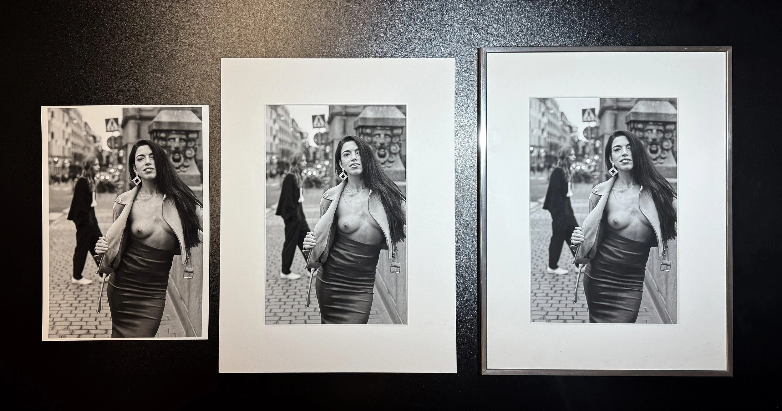
Different croppings of the same image create slightly different stories. The traditional ratio on the right includes more ground and sky, but does this extra context add value, or can we do without it, as seen in the square crop on the left? Which one is more appealing to you? Why?
A camera’s original rectangular photo can be cropped into different ratios, each highlighting specific parts of the image and altering how you experience it. You see this all the time in fashion ads: the same photo might appear vertically in a magazine but horizontally on a billboard. This process, called cropping or trimming, can dramatically influence the focus and balance of an image.
For example, a square crop feels balanced and harmonious, drawing attention to the central elements, while a wide panoramic crop might isolate the subject from its surroundings, creating a sense of space and expansiveness. Cropping is all about controlling where the viewer’s attention goes and reshaping the story the image tells.
The original aspect ratio isn’t always the best choice. In some cases, thoughtful cropping can elevate an image’s impact by focusing attention or removing distractions. As discussed before, nudes that grab your attention on a screen might not translate well into prints for your space. Cropping can emphasize or downplay certain areas of an image, significantly influencing how it’s perceived.
As the medium shifts from screen to paper, aspect ratios often need to adapt. Exploring different variations of the same image can reveal the format that best aligns with your vision and suits the environment where it will be displayed. For instance, one room might call for a square format, while another could be better suited to a panoramic layout.
Once you’ve settled on your preferred aspect ratio, you’ll often have a clear sense of the image size you want to own. Few apartments can comfortably accommodate very large prints, and even when budget isn’t a concern, mid-sized prints—like 30x40cm or 40x50cm—remain the most popular. These sizes are versatile, easy to hang, and fit well into a variety of spaces—40x50cm, for instance, is often considered a gallery-sized print, striking a balance between presence and manageability. Smaller prints, such as 10x15cm or 13x18cm, are perfect for tables or shelves, offering a more intimate, up-close experience. They also serve as an excellent introduction to different paper types or printing styles, making them a smart choice before committing to a larger piece.

Print Sizes Chart. Each size follows the principle that the next size is roughly twice the size of the one before it. Starting with XS, a standard 10×15cm (A6 or 4×6in) print, the progression leads up to A1, which is equivalent to 32 A6 sheets.
After choosing your image, ratio, and size, the next step is determining whether the asking price is fair. To do this, you need to understand how the print was made—what materials were used, the printing process, and the craftsmanship behind it. These details are crucial in assessing its true value. After all, simply cropping an image and printing it on a home printer isn’t art—it’s just reproduction. True art prints are the result of deliberate choices, skilled techniques, and a dedication to quality that elevates them beyond simple prints.
2.PRINTER – THE MACHINE’S QUALITY AND CAPABILITY.
The next element is to understand the printer and inks used to bring an image to life. Since most prints are purchased online, assessing quality firsthand isn’t usually an option—you’re left relying on the information provided in the product description, which isn’t always as detailed as it should be. This lack of transparency can make it difficult to evaluate the true craftsmanship behind a print before committing to buy. Many high-quality art prints come with a Certificate of Authenticity, which typically details the method of production. This certificate not only provides assurance about the print’s origins but also adds credibility to the craftsmanship, making it an important factor to look for when browsing prints online.
What really matters in this step is whether the print you are considering to buy will stand the test of time. A beautiful image printed with low-quality inks might look stunning initially, but it will fade quickly, losing its vibrancy and contrast. Even when printed on high-quality paper, non-genuine or experimental inks can compromise both the quality and longevity of the print. This is exactly the kind of information you need to know before making a purchase. After all, spending $30 on an image you like, even if it might fade in a year, can feel like a reasonable gamble—after all, you might not even like it anymore by then. But paying $300 for the same print, believing it’s a true art print meant to last, only to discover it will fade quickly, is a painful experience.
Printers are essential tools in the art creation process, playing a role as significant as oil paints or chisels did for the masters of the past. While art prints can also be made using methods like chemical development or silk screening, this guide focuses exclusively on inkjet printers—the most popular method for creating modern, high-quality art prints.
Note, the next section might feel a bit technical, but I assure you it’s all very straightforward and easy to follow. It is for your own best.
Printers. Today’s printers are vastly more advanced than those from just a couple of decades ago. Comparing a professional digital print from 2005 to one produced today reveals a striking difference in quality that anyone can notice. What once seemed like magical results can now be surpassed by even inexpensive home printers in 2025. The progress is undeniable.
However, even with today’s advancements, not all printers are created equal. High-end printers utilize cutting-edge technology to achieve exceptional results, while consumer-grade models still fall short in key areas. The same applies to inks—some are not designed for producing archival-quality prints and may fade after just a few months. Ensuring your print retains its vibrancy and detail over time means understanding the printer and inks used in its creation.
There are two main types of inks used in modern printing, each with many variations ranging from budget options to professional-grade formulations. Knowing the differences can help you make an informed decision and ensure you’re investing in a print that will truly stand the test of time.

The 9-ink pigment palette of the Epson P800. Note that only 8 inks are active at a time, as Matte Black and Photo Black (for glossy prints) cannot be used simultaneously.
Pigment inks are renowned for their durability and deep penetration into the paper. Made from solid particles suspended in liquid, these inks bond with the paper by embedding themselves into its surface. This process provides exceptional resistance to light and environmental factors, ensuring the print’s stability over time. Pigment inks are ideal for art prints, as they can last for decades without fading, making them the preferred choice for high-quality, long-lasting work. Most photographers, particularly those working with black-and-white images, rely on pigment inks for their superior archival properties.
Dye inks, by contrast, are water-based and known for their vibrant colors immediately after printing. Unlike pigment inks, they sit on the surface of the paper rather than embedding into it. They excel on glossy paper, producing vivid, eye-catching colors with smoother rendering than pigment inks. However, they fall short in longevity compared to pigment inks due to their vulnerability to fading when exposed to light.
While dye inks are an excellent choice for temporary or high-impact prints, they are less suitable for artwork meant to last for decades. That said, advancements in dye ink technology have introduced additives that can significantly improve their longevity, making them a more viable option for certain applications where durability is still a consideration.
The primary threat to your prints over time is UV light exposure. UV rays can degrade inks, causing colors to fade and lose their vibrancy, especially if the print is made with non-UV-resistant inks or displayed without UV-protective glass. Even prints of the highest quality can deteriorate when exposed to prolonged sunlight, diminishing their beauty and detail.
This is why prints stored in photo albums or other light-protected environments tend to retain their vibrancy far longer than those displayed on walls with direct sunlight. For prints intended for display, using UV-resistant inks and framing materials, such as UV-protective glass or acrylic, is crucial to ensuring their longevity and preserving their original brilliance.
The printhead. The type of ink—pigment or dye—is just one input in print production. Other critical factors include the number of inks a printer uses and the printhead itself. Over the past two decades, the printing industry has evolved significantly, moving from 3-color inks systems to models that now utilize more than 12 inks in 2025.
Having more inks allows printers to achieve a wider color gamut, enabling more accurate and nuanced reproductions of shades, gradients, and details. This results in smoother color transitions, more vibrant and lifelike images, and greater depth and realism in the final print. Consider this: the latest professional printers with expanded ink sets are now rapidly approaching the color range of high-end RGB monitors—about 50-60% of human vision. This marks a significant improvement from just a few years ago, when printers could only achieve around 30-40% of the colors visible to the human eye.
For black-and-white art prints, printers with more ink options often include multiple shades of black and gray, along with subtle tints like light gray or warm and cool tones. These additional shades create smoother gradients and add depth, resulting in a richer tonal range. Instead of relying solely on black ink, the extra gray inks enhance details in shadows, mid-tones, and highlights, avoiding harsh transitions and producing a more refined image.
For example, a black-and-white image printed on a 10-ink printer will generally outperform one printed on a 6-ink printer. The increased tonal precision and smoother transitions make the final result more balanced, sophisticated, and true to the original artistic intent.
The printhead plays a crucial role in the printing process, determining how ink is applied to the paper and directly influencing the quality of the final print. Think about it: a high-end printer can produce up to 16 million colors using just 12 inks. How does it know which colors to mix and in what order to apply them? The answer lies in the printhead - which is a sophisticated combination of advanced hardware and highly refined software. Together, they work to ensure sharper details, smoother color gradients, and more accurate color reproduction.
The same ink can produce vastly different results depending on the printer it’s used in. For instance, a newer printer model often delivers superior prints compared to an older one, even when both use the same type of inks. This is because manufacturers continuously refine printhead technology and ink formulations, pushing the boundaries of print quality with each new generation of printers.
To summarize, the better the printhead, the more precisely it distributes and mixes ink, resulting in higher resolution prints with crisper, clearer details. This incredible precision and coordination enable modern printers to transform a limited number of inks into a breathtakingly wide spectrum of colors, producing prints that are both vibrant and true to life.
Understanding the type of printer used offers valuable insight into the print’s overall quality, detail, and durability when evaluating an art print. However, this alone isn’t enough; the choice of paper is just as crucial. The combination of the printer and the paper determines the final look, feel, and longevity of the artwork, making both elements inseparable in assessing its true value.
3.PAPER/MEDIUM – THE MATERIAL ON WHICH THE IMAGE IS PRINTED
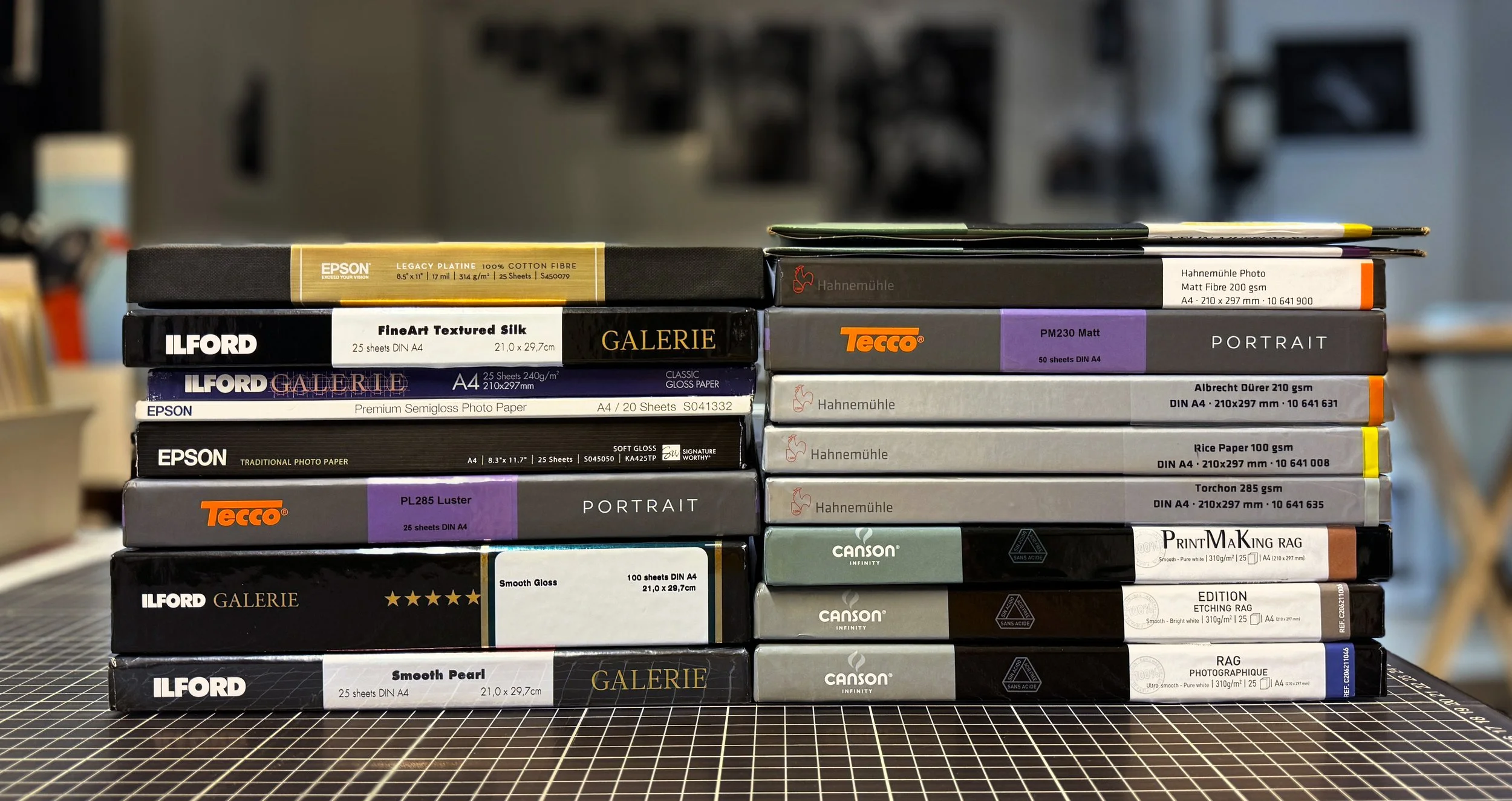
Just a small sample of the many high-quality photo papers available. With hundreds of variations in texture, tone, composition, and size, knowing how to match the right paper to the right photograph is where true print artists shine.
The type of paper used is the third key element in determining the final quality of an art print. While a great printer and the latest inks are essential, the right paper can make all the difference in bringing the artwork to life.
Technically, not all inks (and printer models) are compatible with all paper types, and not every printer can handle every kind of paper. The choice of paper can profoundly affect how an image is perceived. A poor paper selection can lead to dull colors, reduced contrast, or unwanted tonal shifts, detracting from the overall impact of the artwork. The right paper enhances the artwork, creating a truly compelling art print.
There’s a significant difference in the type and cost of paper, sometimes varying by as much as 20x in price depending on its quality and properties. Higher-cost papers generally offer superior performance, with better color reproduction, longevity, and texture. However, exclusivity can also influence the price—some papers are rare or produced in limited quantities out of limited materials, which allows them to command a premium.
In general, photo papers fall into four categories:
Budget Photo Papers – Found at stores like Walmart or Lidl, these are typically glossy papers for home printing and temporary prints. A 50-pack can cost as much as one sheet of premium paper.
Professional Papers – These papers strike a balance between quality and cost, offering excellent image clarity and solid durability. However, they may have some compromises in their composition, such as not being acid-free or containing optical brightening agents (OBAs). OBAs enhance brightness and whiteness but can potentially impact long-term stability. Despite these limitations, professional papers are widely used in photo labs due to their reliability and versatility across a range of print jobs. The types of papers in this category typically include various levels of glossy and matte finishes, catering to different artistic styles and preferences. Both Canon and Epson produce high-quality papers in this range, along with offerings from numerous other reputable paper manufacturers, ensuring a wide selection for different printing needs.
Luxury or Premium Art Papers – These are top-tier papers, produced at a higher cost and often reserved for special, high-end projects. They are designed to deliver exceptional quality for art pieces where nothing less than the best will do, making them ideal for museums, galleries, weddings, and true fine art prints. Due to their exclusivity, these papers are not always easy to find in stores, and their prices are significantly higher than professional-level papers. Common types in this category include baryta, cotton, bamboo, and hemp-based papers, each offering unique textures, tones, and archival qualities that elevate the artwork to the highest standards.
Experimental Surfaces – This category includes papers and other print materials with unique textures or innovative formulations. Examples include ultra-thin, translucent Asian papers, special fiber compositions, or materials like canvas, aluminum, wood, or plexiglass. These surfaces stand out for their visual impact and creative appeal rather than their long-term archival quality. They are perfect for bold, contemporary pieces where making a statement takes precedence over durability, offering an exciting way to experiment with presentation and style.
When it comes to papers, great papers aren’t cheap, and cheap papers aren’t great. This means you should expect an expensive print to be crafted on an equally expensive paper, ensuring maximum quality and longevity. Look for papers that are free of optical brightening agents (OBAs) and acid-free, preferably made from cotton or other non-wood materials for superior durability and appearance.
Furthermore, take some time to explore the different types of paper surfaces and coatings available. Most people only know glossy and matte, but there’s a wide range—from ultra-glossy and metallic, to textured, rough mattes, and everything in between. Each surface has its own strengths and ideal use cases, so it’s worth learning about them and figuring out what you’ll truly appreciate in your prints. Some surfaces are designed to be tactile, once framed and hung on a wall, that texture can often become less noticeable or even disappear entirely. Other surfaces are not meant to be touched at all. If you want your print to be accessible for everyone to handle, these delicate surfaces won’t hold up for long.
The thickness of the paper can also be a significant characteristic. Premium papers are generally thicker and more durable. Look for papers that are around 300gsm or more for a high-quality feel and lasting impression.
In addition to surface and grams, look for premium papers from trusted brands such as Canson, Hahnemühle, Innova, MOAB, FotoSpeed, MediaJet, or certain high-end lines from Epson and Canon. Whenever possible, ask for a sample or small print, to experience the paper’s texture and finish firsthand before committing to a larger print. Understanding paper types is essential to fully valuing and appreciating a print.

“White paper” is an umbrella term for many different types of paper—each with its own effect on the final image. The same ink behaves very differently depending on the paper’s surface, coating, thickness, and tone.
Up to this point, we’ve covered three key elements of a great print: the source image, the printer and its inks, and the paper. Many photographers stop here, assuming that whatever comes out of their printer is already art. But that’s only half true. What emerges from the printer are high-quality raw ingredients. The true transformation into art, the actual cooking, happens in the next step—matting and framing.
For a deeper dive, check out our full article on choosing the right art paper.
4.PRESENTATION – FRAMING
In the art world, framing is a separate profession—a highly skilled craft where framers have the expertise to transform almost anything into framed art, whether it’s a t-shirt, a print, or a painting. Becoming a professional framer often involves 2–3 years of education, as the role requires mastering various disciplines - color and material theory, presentation techniques, preservation and archival practices, as well as technical skills to create, repair, and modify frames, prints, and passepartout.
Framers are trained to meet archival and conservation standards, often requiring certification to ensure their methods protect and preserve the artwork for the long term. Their expertise often goes unnoticed by the general public but is essential for elevating and safeguarding art for galleries, museums, and private collectors. While their services can come at a significant cost for a private individual, the result is a custom-made solution tailored specifically to your needs, ensuring both the presentation and preservation of the artwork are of the highest standard.
Clearly, most photographers are not trained framers, and their framing skills are often limited. Critical elements such as archival practices, material selection, and precision craftsmanship typically fall outside their expertise. However, framing is not rocket science, and any motivated photographer can master a few essential techniques tailored to their art presentation without needing to acquire the full range of skills that a professional framer might have.
As an art collector, it’s essential to distinguish between the good, the bad, and the ugly of framing.
Framing turns a simple print into an artwork. It’s what separates a hobbyist from an artist. Each step—from loose print to mounting and framing - strengthens the artwork, protects it, adds artistic value, and turns it into something worth collecting.
Without framing, a print is just a sheet of paper with ink from an inkjet printer—it’s not an art yet.
Like a dish in a fine restaurant, where a pot of soup in the kitchen is yet to become the chef’s signature creation served to customers in the dining room, it requires thoughtful presentation to elevate it from just a soup to an experience—something that justifies its price, sets it apart from the restaurant next door, and creates a lasting memory. People don’t pay for food in these places; they pay for an experience.
In the same way, people who buy fine art prints don’t just buy prints—they buy an experience. The right matting, framing, and glassing transform a print into a polished and complete work of art, elevating it from ink on paper to something that defines its value, presence, and impact.
Let’s break it down into steps.
Passepartout (Matting)
Passepartout is a thick cardboard frame that surrounds a print. It serves multiple purposes, both practical and creative, to elevate the presentation of the artwork:
• Protection. According to preservation guidelines, a print should always be kept away from coming into direct contact with the glass in a frame. Glass, being an excellent conductor of temperature, can cause issues like sticking, moisture absorption, or heat damage when in direct contact with a print, potentially damaging it. The passepartout creates a protective gap of 1–3mm between the print and the glass, protecting it from these risks.
• Modifier: Passepartout can adjust the aspect ratio of the artwork. For instance, a rectangular print can be transformed into a square by modifying the passepartout’s opening. This ability allows the passepartout to influence the narrative and visual impact of a print, subtly altering how the artwork is perceived.
• Directing Attention: Passepartout creates a visual separation between the artwork and the frame, acting as a preframe that draws focus to the image itself. Without it, a plain image on a wall is heavily influenced by its surroundings. Essentially, passepartout isolates the artwork and saying “Hey! This is important—look here.” This is why most museums and galleries rely on passepartout to separate the artwork from its surrounding environment.
• Creative Finish: Passepartout opens up endless possibilities for personalization. While white or black are a standard in galleries and museums, it can feel cold or overly formal at home. Colored passepartout can match interior backgrounds, offer variety, or add contrast. Custom designs, including uniquely shaped openings or bevels in contrasting colors, elevate the print and turn the matting into an art form itself.
• Exclusivity: Custom-made passepartout often becomes an integral and inseparable part of the artwork. Creating a high-quality passepartout requires specialized tools and training, which is why many photographers either overlook this step or outsource it to professional framers. However, when done skillfully, the handcrafted nature of a custom passepartout adds a layer of exclusivity and significantly enhances the perceived value of the art. This careful attention to detail and thoughtful craftsmanship is what elevates a print into a true art print.
Beware that not all matting materials are created equal. Since a passepartout is often seen as enhancing the value of a print, many manufacturers try to offer cheap alternatives designed for elevating low-quality prints. They are cheap because they’re made using low-cost materials and processes such as non-acid-free materials that cause long-term harm to your print. Furthermore, poor-quality mats or backings can release harmful gases inside a closed frame, leading to the gradual deterioration of the artwork. That’s why it’s essential to ensure that the presentation not only enhances the aesthetics but also protects the print, rather than acting as a decorative touch that might ultimately compromise its longevity.
Types of passepartout.

Three different types of passepartout are shown. The 1.4mm is the most common and also the cheapest, its surface is noticeably less smooth compared to the other two. The 3mm version might not fit standard ready-to-hang store frames and will require a custom framing, hence 1.8mm version is often the best practical choice.
Budget passepartout are usually 1–1.4mm thick and made from low-cost materials. Their thinness reduces both their protective qualities and visual appeal, but they do provide the basic function of keeping the print separated from the glass. On closer inspection, you’ll often notice that the bevel is not the same clean white as the passepartout but reveals the cheap brown cardboard beneath.
A standard passepartout is typically 1.5–1.9mm thick and made from acid-free materials. These are commonly sold at frame stores in standard frame sizes with pre-cut openings. They generally provide adequate protection for the artwork while also offering a visual enhancement, making them a reliable choice for most framing needs. Custom-made passepartout are typically in the same thickness range, around 1.5–2mm, as most cutting tools are designed to handle materials up to 2mm thick.
Premium passepartout typically start at 2mm thickness and beyond. Museum-grade passepartout are often 3mm thick and made from cotton, offering exceptional quality and durability. These passepartout are significantly more expensive than standard options, require specialized equipment to cut and handle, and are usually reserved for truly special and highly valuable artworks. They might also be too thick to fit into standard frames, often requiring a custom frame instead.
Most of DROYC prints come with an acid-free passepartout but shipped without a frame. This is intentional. We want you to take that final step and choose a frame that fits your space and personal taste. Taking the time to select the perfect frame creates a deeper connection to the art, making it uniquely yours. It’s not just about hanging a ready-made piece on your wall, it’s about curating the art to reflect your style. Sometimes, that simple act of choosing the frame is what makes you fall in love with the piece.
Frames
Generally, we don’t sell art pre-framed. First, framing is highly personal. The ideal frame depends on your space, your existing art, and your individual taste. Some collectors prefer uniform frames for a cohesive look, while others seek unique, custom framing for each piece. It’s nearly impossible to offer a one-size-fits-all option, and framing can be costly, so why charge you for something you may want to change anyway?
Second, choosing your own frame makes the art more meaningful and personal. This taps into the "IKEA effect" phenomenon - the idea that we value things more when we’ve invested time and effort in creating or customizing them. In other words, by spending time researching and selecting a frame you make your art much more personal to you.
Finally, framing significantly increases shipping costs and risks. Frames are heavy, glass can shatter, and artwork can be damaged in transit. By skipping framing, we can offer more affordable prices and safer, simpler shipping—leaving you the savings to invest in the perfect frame yourself.
To help you navigate the world of framing, we’ve created a practical guide on how to choose the right frame for your art. You can also watch a few videos about framing on YouTube to get you started.
CONCLUSION
If you’ve made it this far, you’ve hopefully realized that creating a great print requires multiple elements coming together seamlessly and you are now able to recognize at least some of these elements. Let’s recap.
Art prints are called “art” not solely because of the image itself, but because they embody the thoughtful transformation of a great negative into a physical object—one you can hold, admire, and live with in your own space. It’s this combination of visual beauty and tactile experience that elevates a print into a true work of art. The value and price of an art print often reflect the harmony of these elements working together.
By buying a print, you’re voting with your money. Purchasing a low-quality print supports and sustains subpar production standards, encouraging mediocrity in the art world. On the other hand, investing in a high-quality print not only enriches your own life but also helps maintain and promote excellence in the craft. You contribute to a process that brings joy and inspiration to other collectors and enable the photographer to continue creating meaningful work at the highest level.
Producing high-quality prints is no easy task. If it were, anyone with a decent Epson or Canon printer could do it at home. But the steep learning curve deters most people. Many photographers selling prints lack an understanding of what makes a print truly great. They often haven’t bought art prints themselves and fail to grasp the emotional or aesthetic appeal of their own work. The result? Prints that look no better than what you’d get from a home printer on auto mode—yet priced as art. That is not right, and should not be rewarded.
The same holds true for many galleries and photo labs. For example, I once purchased a print from YellowKorner, a French gallery/store that sells limited-edition photography prints. The print’s quality was low, so I got a replacement, which was slightly better but still poorly optimized for the image. The moral - just because it comes from a well-known brand doesn’t guarantee perfection. Their processes are often optimized for scalability and affordability rather than the highest possible quality. To their credit, some high-end pieces, particularly large-format prints, may be of a very high quality since these are handmade and produced in smaller quantities. Still, it’s vital to ask questions and do your research before investing in your first art piece.
There’s a lot of mediocre work out there, but finding a truly great print—one worthy of display in your home—is rare and rewarding. Take the first step and you will never regret it!

Paper, Part II: Printers And Inkjet Paper Coatings.
In Part I, we followed the 2,000-year journey of papermaking, from its origins in ancient China to today’s advanced inkjet papers. Now, in Part II, we explore how modern technology is reviving old innovations and giving them new life: inkjet coatings.
In Part I, we explored the 2,000-year journey of papermaking, from its origins in ancient China to the advanced inkjet papers of today. The history of paper is remarkable because it is the history of human invention, often shaped by the arts. It’s centuries of humans searching for a way to express themselves, for a way to send a message through time. It’s important to remember this, especially when we often hear that art is just entertainment, or worse - meaningless and unnecessary.
This series is called “When Print Becomes Art” and paper coatings play a major role in that equation. I want to set the expectations for this article upfront. I’m not here to rewrite Wikipedia, but this won’t be a short read and I’m sorry for this, there is no other way. My aim is to show you what’s driving printing and photo art today and why it matters. If you’re new to printing, whether you’re a collector or a photographer, I want to expand your horizon - to get you seeing and thinking in new ways. Because once that happens, the world around you gets richer. The way you look at a print, at an image, at the very idea of art, will change. Permanently. You’ll learn what sets a good print apart from a great one, but that kind of shift doesn’t happen in a single paragraph. It takes a more systematic approach to set the scene.
The story of print paper starts with the story of paper itself — and that’s where we begin. Inkjet printers might be cutting-edge today, but in the bigger picture, they’re just tools — tools for human creativity, for expression, for storytelling. The technology may be new, but the purpose is as old as art itself. Every innovation in printing — from the darkroom pioneers of the 1900s to today’s nano-precision printheads — is built on centuries of craftsmanship, trial, and reinvention. The inkjet papers we use today carry the vision of fine art masters from the 1500s, and the craftsmanship of papermakers stretching back two thousand years. The past isn’t just an influence — it’s the foundation of art.
Since the beginning, artists have used paper for calligraphy, drawing, and painting, experimenting with its composition to suit their needs - altering ink absorption, texture, and longevity. Then, with the rise of industrialization, these papers evolved into its own category—art papers. They were designed with specific arts in mind - for watercolor, oil painting, drawing, calligraphy, and printmaking, each driving its own development forward.
Then came a new art form — photography. Early photographers needed a surface that could stay stable under the chemical coatings used to expose and develop an image. After starting with glass as the first chemically resistant medium, they turned to art papers as an alternative. By coating high quality art papers with special emulsions and adjusting the development processes, they produced the first photographic prints. Photo emulsion coating became a critical layer - controlling how the paper behaved during the chemical development. This gave rise to an entirely new industry: photographic paper coating. It’s a science where chemical layers on paper determine how an image comes to life. For over 100 years, photographers and artists have depended on variety of darkroom coatings to turn light and shadow into lasting images we can still see today.
And now, with the arrival of inkjet printers, the demand for new coatings set off new wave of innovations. The new technology required innovative nano coatings that could properly receive and absorb inkjet inks on paper. Coatings control how ink is absorbed, how colors pop, how blacks stay deep, and how details remain crisp and vibrant for decades.
Paper coatings are engineered to work seamlessly with the other advanced technologies of the digital era — printers and inks. Without synergy between these three — printers, inks, and papers, modern printing wouldn’t exist, and artists wouldn’t have embraced the digital workflow. That’s why, we are taking a closer look at paper coatings—their critical role in the print industry, how they work, why they matter, and how they define the final print.
1.THE ROAD TO MODEN INKJET PAPER, OR WHAT’S SO SPECIAL ABOUT COATING?
Because, coating is what separates a good print from a great one, and the perceived quality of a print—its colors, sharpness, contrast, and longevity, depends on it. Without coating, even the best printer, paper and ink in the world would produce dull, lifeless results. But to get there, paper manufacturers, print and ink makers, and coating technologists must work together, aligning their innovations to create the perfect fit.
Let’s first define what we mean. When we talk about “photo paper” for inkjet printing, we’re really talking about paper that has been specially coated to receive dye or pigment inks. There’s no such thing as photo paper without a coating. Raw, uncoated office paper or artist paper straight from a block won’t work with inkjets — try it, and the result will be dull and lifeless. A specialized coating layer is applied to the base paper to control how ink droplets spread and absorb. This precision boosts color vibrancy and sharpness, improves archival longevity, and elevates overall print quality. The challenge is developing coatings and application techniques that don’t alter the character of the paper. If a paper is matte and textured, it has to remain that way even after coating. Before we get into coatings, a quick recap on paper.
For many centuries, rag-and linen based paper was ”the paper”, and was characterized by its strength, archival quality, and texture. The invention of the printing press in 15th-century Europe sparked a surge in demand for paper, leading to the rise of the first paper mills and laid the foundation for the modern paper industry in Europe. But by the mid-1800s, the growing demand for paper made cotton rag supplies unsustainable, forcing the exploration of alternative sources. The development of a process to manufacture paper from wood pulp transformed papermaking into an industrial process, making paper cheaper and more accessible. However, this cheaper wood-based paper came at the expense of longevity and quality compared to traditional cotton-based papers. This shift divided paper industry into two categories: wood-based paper for everyday use, such as newspapers, packaging, and books, and cotton-based paper for fine art, premium publications, certificates and money.
When we link the history of paper to photography, two distinct paths emerge: traditional darkroom printing and inkjet printing. Within the darkroom paper category, there’s a further distinction between fiber-based papers and resin-coated (RC) papers. Fiber-based papers, rooted in the legacy of cotton art papers, absorb more chemistry and water. They require longer processing and washing times but deliver superior print quality. Many coatings were developed to enhance print quality, including Baryta, known for its deep blacks and bright whites. With its rich tonal range and distinctive surface, Baryta became the gold standard in printing, favored by printers, collectors, galleries and museums.
Resin-coated (RC) darkroom papers emerged more than a century after the first cotton-based photo papers, revolutionizing traditional darkroom printing by making it faster and more affordable. A polyethylene layer on both sides of a wood pulp base prevented liquids from soaking into the fibers, allowing the paper to dry quickly and resist curling or damage. Since the paper itself was encased between plastic layers, manufacturers could use lower-cost wood based paper, further driving down production costs.
Baryta and RC coatings clearly influenced the development of inkjet paper by showing how surface treatments can fundamentally change the properties of paper. The interplay between paper types, surface coatings, and inks defines the very character of printed art. Each paper offers its own texture, brightness, contrast, and longevity, all of which interact uniquely with specific inks and printers, shaping the final print. To understand this fully, we need to start by looking at the three key variables that coating companies must consider: the type of inkjet printhead, the ink type and formulation, and the paper itself, which serves as the foundation for these coatings.
Let’s start with printers—because without them, there would be no industry. The way a printer delivers ink onto paper determines everything else. It influences the type of inks that can be used, the coatings needed to control absorption, and ultimately, the quality and longevity of the final print. Understanding printers is the first step to understanding how paper, coatings, and inks come together to create a perfect print.
THE TALE OF TWO KINGS: EPSON AND CANON
The world of professional photo printing is a duopoly—Epson or Canon. Their dominance wasn’t handed to them - it was built through fair and relentless innovation. Both companies have spent decades perfecting their printheads, ink formulations, and paper compatibility. Customers voted with their wallets, forcing competitors with inferior products out of the market, proving that when given the choice, consumers will favor superior technology.
Inkjet printing technology was invented as early as the 1950s, but it wasn’t until the mid-1980s that HP and Canon successfully turned it into a commercial product. However, before the mid-1990s, there was little demand for high-quality inkjet printing. Photography was still dominated by film. There simply wasn’t much to print. Offices relied on laser and dot matrix printers, and inkjet photo printing was more of a novelty than a necessity, giving manufacturers little reason to push innovation. Inkjet printheads were developed in labs, but they were rarely seen by consumers due to low high cost and how demand. But as digital cameras advanced, so did the desire to print photos at home, setting the stage for an entirely new industry - professional home photo printing.
As digital cameras advanced, traditional photo labs handled the printing. Instead of sending in a roll of film, you could now print directly from files. For printer manufactures, the key to success in photo printing was always clear: make high-quality home printing affordable and remove the need for photo labs. Achieve that, and it would drive printer sales while creating a steady demand for replacement inks, fueling long-term revenue. That revenue, in turn, could be reinvested into more R&D, pushing the technology even further. But to match lab-quality prints and make printers a truly appealing product, manufacturers had to develop new ink formulations and advanced printheads capable of delivering precise colors and razor-sharp details. And all of this had to fit into an affordable, desktop-sized printer—a challenge that required completely rethinking traditional printing technology used in labs. So the game was on. But who would be the first to succeed in building a professional small-business photo printing industry?
Epson was the first to enter the professional photo printing market in the mid-1990s. Instead of starting with consumer-grade printers, Epson made a strategic decision to begin at the top, targeting the most lucrative premium segment—photographers, artists, and professionals who demanded the highest print quality, regardless of cost.
Epson took a significant risk by developing its MicroPiezo printhead technology and committing to more expensive pigment inks at a time when dye-based inks dominated the industry. While pigment inks offered clear advantages—better longevity, superior fade resistance, and a wider color gamut—they were also more costly and, at the time, no commercial printheads were optimized to handle them.
Despite these challenges, Epson’s bet paid off. By delivering a product that combined exceptional print quality with long-term durability, Epson set a new standard in professional photo printing, securing its position as the industry leader.
Meanwhile, Canon and HP, both of whom dominated the office printer market, were slower to enter the professional photo printing space. By the time Canon began focusing on high-end photo printing in the early 2000s, Epson was already the industry leader for several years. Additionally, Epson’s extensive patents on piezoelectric printhead technology created significant barriers, making it challenging for Canon and HP to catch up quickly in the professional photo market. The truth was, the initial photo printing market was too small for Canon to bother with. Until it wasn’t. By the time Canon realized its potential, the industry had grown too big to ignore, and they had almost missed the train.
Because Canon arrived late, the premium “uncompromised quality” position was already claimed by Epson. That left Canon searching for another angle, leading them to focus on entry-level printers. This choice shaped their early strategy, making photo printing more accessible to a wider audience. Canon leveraged its existing thermal inkjet technology (which it co-developed with HP) to refine its printers for use with cheaper dye-based inks. This helped Canon secure a strong second place in the market, becoming a formidable competitor to Epson.
However, in the long run, this early focus on accessibility rather than high-end product proved limiting. As the industry evolved, the professional market—where print quality and longevity mattered most—became the real battleground. Epson, having already committed to pigment-based inks and high-end printheads, maintained a dominant position. Canon had to play catch-up, eventually developing its own professional-grade printers and pigment ink systems to compete head-on with Epson in the high-end market. Other manufacturers like HP tried to compete, releasing the occasional product, but none could keep up. Eventually, they threw in the towel.
Today, both Epson and Canon remain at the forefront of professional photo printing, continually pushing the boundaries of print quality, color accuracy, and longevity, each with its own technological approach and loyal user base. While Epson is still the leader, its previously undisputed position is now challenged by Canon’s LUCIA PRO pigment inks, which offer excellent color accuracy, deep blacks, and archival quality.
A few other brands worth mentioning are the so-called lab machines—high-output, high-quality systems designed for large-scale production. Fujifilm, Roland, Mimaki and HP offer high-quality photo printers used by top labs around the world. However, they are not aimed at individual photographers or small studios and have little influence in this space, so we won’t consider them here.
TWO TYPES OF INKS
Now let’s turn to the inks, so we can understand the risk Epson took — and why it worked. There are two main types of inkjet inks: pigment and dye inks. Both types of producing colors have existed long before modern printing, finding their roots in the arts and textile industries. Their differences in composition and behavior affect everything from color vibrancy to longevity and even the type of paper on which each excels. So why two types, you might ask? The existence of both pigment and dye inks comes down to balancing quality and cost.
Dye-based inks have been around for centuries. These are traditional dyes, derived from natural sources like plants and minerals, and were used for coloring fabrics, paper, and other materials. When inkjet printing technology emerged, dye inks became the natural choice for manufacturers because they were easy to produce, inexpensive, dissolved well in liquid carriers, and created vibrant, rich colors when absorbed into paper.
Dye inks are made from color molecules fully dissolved in liquid, much like sugar in water. This allows them to soak into the paper’s fibers, similar to dyeing a T-shirt, where the dye becomes part of the fabric itself rather than just sitting on top. In printing, dye inks produce rich, vibrant colors with smooth gradients—meaning you won’t see where one color ends and another begins. The benefits of dye inks lie in their affordability and their ability to create vivid prints, especially on glossy surfaces.
However, because of their chemical composition, dye inks are inherently more sensitive to environmental factors such as UV light damage, ozone, humidity, and pollutants. When exposed to these elements, the chemical bonds in dye inks break down, causing colors to fade over time. Additionally, dye inks don’t perform as well on matte papers, struggle with producing deep blacks in black-and-white prints, and lack the stability required for archival purposes or museum-quality prints. Essentially, dye inks were well-suited for consumer-grade printers but failed to meet the demands of professional photographers who required long-lasting, high-quality prints that would last for decades.
This unmet need for professional prints created a demand for more durable inks—ones that could deliver stunning prints while ensuring long-term stability for professional photographers, for whom quality mattered more than price.
Pigment inks were introduced to address the limitations of dye inks, particularly their tendency to fade quickly. Inspired by the long history of pigments used in fine art, such as those found in oil paints and pastels, pigment inks offered superior durability and longevity, making them ideal for archival purposes. However, they required more sophisticated technology to handle the solid particles and apply them consistently to paper surfaces.
Pigment inks use tiny solid particles of color suspended in liquid. Unlike dye inks that soak into the paper’s fibers, these particles sit on the surface, forming a durable layer of color that is far more resistant to fading. Think of it like painting a wall versus dyeing a fabric: pigment inks create a stable, protective layer on top, while dye inks are absorbed into the material itself. Because pigment particles remain on the paper’s surface, they are more resistant to environmental factors like light, moisture, and pollutants. Their chemical stability makes pigment inks the preferred choice for archival-quality prints where longevity is essential, offering photographers and artists confidence that their work will endure over time.
So both ink types have their strengths: dye inks offer vivid colors and smooth blends, while pigment inks provide durability and longevity. Yet, each has its limitations too. Dye inks are prone to fading over time, while pigment inks have historically struggled to match the vibrancy and seamless color transitions of dye-based prints.
Epson prioritized pigment inks early on, focusing on longevity, color accuracy, and expanding the color gamut through additional channels. They understood that this is what professional photographers would value most.
Canon, by contrast, initially leaned on dye inks, favoring affordability and vibrancy, and focused on the consumer market first. But in recent years, Canon has made significant strides in pigment technology with its LUCIA series, now competing directly with Epson in the professional photo market.
Today, the advances in both dye and pigment technologies have significantly narrowed the gap between the two types. Some premium dye ink formulations are now offering improved longevity and UV resistance. Meanwhile, new pigment ink formulas are achieving similar vibrancy to dye inks. But choosing the type of ink is just one part of the equation. The real challenge is how to deliver that ink onto paper. That’s where printheads come in.
TWO TYPE OF PRINTHEADS
All inkjet printing operates by precisely ejecting ink droplets through electronic control, but the technique used to accomplish this differs. Canon and Epson, took different approaches to solve this problem, each developing their own printhead technology with distinct advantages: thermal inkjet technology by Canon and HP’s and piezoelectric inkjet technology by Epson. But what is a printhead?
Printhead is the heart of any inkjet printer. It responsible for accurately placing tiny droplets of ink onto paper. The printhead does not mix colors or process the image. It is purely a mechanical component that ejects tiny droplets of ink onto the paper in a controlled pattern. Think of the printhead as the brush in a digital painting—it doesn’t decide which colors to use or how they are mixed, but it applies them onto the paper with high accuracy.
How does it work? Printhead contains thousands of nozzles, each assigned to a specific ink color. These nozzles fire droplets as small as 1-4 picoliters which is about 10 times smaller than the diameter of a human hair. Each printhead is designed for a fixed number of inks, meaning if a printer has 10 inks, the printhead will have 10 separate ink channels and nozzles. For example a printer might have 180 nozzles for each of it’s 10 inks, making it 1,800 nozzles in total.
Beyond simply placing ink, the printhead controls droplet size and placement. Piezoelectric printheads, used by Epson, can adjust droplet size (variable droplet technology) on the fly because they use an electrically controlled deformation of piezo crystals to control how much ink is ejected. Think of it like choosing the size of a brush — a small brush for fine details, a broad brush for large, solid areas. Larger droplets efficiently fill broad color areas, while smaller droplets enhance fine details and smooth gradients, leading to smoother gradients and better tonal transitions.
A 10-12 ink system can theoretically produce billions of colors. Yet inkjet printers do not mix inks inside the printhead like traditional paint mixing. So if the printhead itself doesn’t mix colors, how are colors created? It all happens in the printer’s software. The RIP (Raster Image Processor) and printer drivers use halftoning algorithms to determine how inks are layered and combined to produce a vast color range from just a dozen of inks. Color mixing happens on the paper, where microscopic droplets of different ink colors are placed next to or on top of each other. The human eye then blends these dots visually, creating the illusion of smooth gradients and continuous tones.
It’s actually an incredibly impressive feat of calculation—the ability to produce any color simply by placing microscopic dots on paper. What we perceive as solid colors, smooth gradients, and fine details is, in reality, mostly white space, with tiny ink droplets carefully arranged in patterns. The human eye blends these dots visually, creating the illusion of continuous tones and a full spectrum of color. It’s a mind trick of precision and engineering, turning basic ink placement into stunning, lifelike prints.
The accuracy of droplet placement is measured in dots per inch (DPI)—the higher the dpi, the finer the detail and the smoother the gradients in the final print. This is what is called “printer resolution”. However, DPI alone does not determine print quality, much like megapixels in a camera don’t guarantee better image quality. A well-optimized 24-megapixel camera can outperform a poorly engineered 40-megapixel sensor, and the same principle applies to printers. A 2400 DPI professional photo printer with precise droplet control will often produce superior prints compared to a 5600 DPI consumer-grade printer. While higher DPI means more dots per inch, fixed droplet printheads (like Canon’s thermal inkjet) always eject the same-sized droplets, which can lead to harsher tonal transitions and visible dot patterns. In contrast, Epson’s 2400 DPI piezoelectric printheads with variable droplet technology can dynamically adjust droplet sizes, using smaller droplets for fine details and larger ones for solid areas, resulting in smoother gradients, better tonal transitions, and more natural-looking prints—especially in black & white photography.
But while most color mixing happens visually on the paper, some degree of unwanted physical blending occurs when wet ink droplets overlap. This is why paper coating matters—some papers allow more ink spreading, while others keep droplets distinct for sharper detail. Paper coatings act like guides for the ink, making sure each droplet stays exactly where it was placed. Additionally, high-end papers are often supplied with their own ICC profiles—a set of instructions that guide the printer on how to accurately reproduce colors on this paper type. These profiles ensure that the printer adjusts color data correctly, optimizing ink application for the specific characteristics of the paper, such as its brightness, texture, and coating.
It’s worth mentioning that advancements in cameras and monitors have played a major role in pushing printing technology forward. As cameras captured more detail and monitors displayed more accurate colors, printers had to evolve to keep up. A 5-megapixel image from the early 2000s didn’t require the same level of precision in inks and printheads as today’s 64-megapixel files. At the same time, as speed improves everywhere—from internet connections to processors and SSDs—expectations for print times have risen. People no longer tolerate waiting 10 minutes for a single print. To meet that demand, today’s printheads are designed to deliver both speed and quality — working together with faster-drying paper coatings. Modern printheads achieve this by increasing nozzle density, improving droplet precision, and boosting firing efficiency. The result: professional-quality prints, produced fast, without sacrificing detail or depth.
Now that we understand what printheads are and how they work, let’s take a closer look at the two distinct designs used by Epson and Canon.
EPSON’S PIEZOELECTRIC TECHNOLOGY: SUPERIOR TONAL TRANSITIONS & LONGEVITY
Epson was the first to introduce an elegant and technically advanced solution: piezoelectric printhead technology. The printhead reliese tiny crystals that change shape when an electrical charge is applied, mechanically pushing ink droplets out of the nozzles. This method allows for incredibly precise droplet control, resulting in finer details, smoother gradients, and better color accuracy.
The beauty of this approach is that it emerged from a completely different industry—watches. Epson, originally part of Seiko, had engineers who recognized the potential of the piezoelectric effect used in Seiko’s quartz watches and adapted the same principle for inkjet printing. But what is the piezoelectric effect? It is a phenomenon where certain materials, like quartz or ceramics, generate an electric charge when subjected to mechanical pressure. This effect also works in reverse—when an electric charge is applied, the material changes shape or deforms in a highly controlled and repeatable way.
Epson’s Micro Piezo printhead technology is built on this principle. Instead of using heat as Canon’s thermal printheads, Epson’s printheads use tiny piezoelectric elements that flex when an electric charge is applied. This controlled movement creates pressure, pushing precise amounts of ink through the nozzles without the need to boil the ink. This breakthrough led to the creation of Micro Piezo printheads, which became the foundation of Epson’s inkjet superiority, setting it apart from competitors. The advantage of piezoelectric printheads is that they allow for variable droplet sizes, more consistent ink placement, and greater durability, since they don’t experience the wear and tear caused by heating and cooling cycles.
Epson’s Micro Piezo technology became the gold standard for archival-quality photo printing. The superior longevity and precisionof piezoelectric printheads made Epson printers the go-to choice for photographers who demand consistent, high-quality results over time. However, piezoelectric printheads are more expensive to manufacture, contributing to the higher cost of Epson printers. While the initial investment is higher, the printhead lasts the life of the printer. And because no heat is involved, the printheads experience less wear over time, making them long-lasting and highly reliable. Built upon Seiko’s breakthrough in quartz watch technology, Epson transformed inkjet printing with its piezoelectric innovation, redefining professional photo and fine art printing and securing its position as a dominant force in the industry.
CANON’S THERMAL INKJET TECHNOLOGY: CHEAPER, FASTER SPEEDS & VIVID COLORS
Now, because Canon, entered the professional photo market later than Epson it forced to take a different approach. Epson’s piezoelectric printhead technology was patented. Before Canon adapted inkjet for photo printing, thermal inkjet technology was primarily used for office and home document printing as well as label printing for markings or shipping.
Thermal inkjet technology was pioneered in 1977 by Canon engineer Ichiro Endo and later commercialized by both Canon and HP. It works by using a resistive heating element inside a tiny ink chamber. When an electric current is applied, the ink is heated to over 300°C in a fraction of a microsecond, causing it to vaporize and form a bubble. This sudden expansion forces a droplet of ink through the nozzle onto the paper. As the bubble collapses, a vacuum effect draws fresh ink into the chamber, ready for the next cycle.
Canon’s solution was to refine and optimize existing thermal inkjet technology for professional photo printing. Canon focused on increasing nozzle density and enhancing precision, allowing their printers to achieve high resolutions, smooth gradients, and vibrant colors. Their FINE (Full-Photolithography Inkjet Nozzle Engineering) printhead technology improved droplet placement, making Canon’s professional photo printers competitive in both detail and color accuracy.
One of the main advantages of Canon’s approach is cost-efficiency. Thermal printheads are cheaper to manufacture, making Canon’s professional photo printers more accessible for photographers needing high-quality A3 and A2 prints at home. However, despite its strengths, thermal inkjet comes with inherent limitations. The ink must be designed to withstand extreme heat, meaning not all ink formulations work well with this technology. The heating and cooling cycles also cause wear over time, making thermal printheads a consumable part that must be replaced periodically, adding a long-term maintenance cost.
CANON VS EPSON TODAY
The core difference between Canon and Epson inkjet technology lies in how their printheads deliver ink — and this difference is protected by decades of patents. Epson holds key patents for its piezoelectric printheads, while Canon’s thermal inkjet technology is also proprietary. Neither company can use the other’s method without licensing agreements. Still, over time, the performance gap has narrowed. Today, the difference between the two is subtle and often only noticeable to the most demanding professionals.
In the early days of professional photo printing, the divide was clearer — mainly due to the type of inks used. Before 2006, Epson was the only major manufacturer offering pigment-based inks for high-end photo printing. This gave it a strong lead among archival printmakers and fine art photographers, who needed long-lasting, stable prints. Canon, by contrast, focused on dye inks, which offered more vibrant colors on glossy paper but lacked longevity.
The real issue with dye inks isn't just how they’re absorbed by paper — it's their chemical makeup. They fade faster over time. To compete, Canon developed LUCIA pigment inks for its imagePROGRAF series in 2006. These were paired with refined thermal printheads capable of handling pigment particles reliably. From that point forward, the competition shifted: no longer dye vs. pigment, but rather how each brand optimized pigment ink within its printhead system.
A major technical difference remains in how ink is delivered. Canon’s thermal printheads eject ink using heat, producing a fixed droplet size. This design favors speed and sharpness. Epson’s piezoelectric printheads use mechanical movement and can vary droplet size on the fly. This allows for smoother tonal transitions, richer shadow detail, and finer gradients — especially noticeable in BW prints using dedicated gray inks.
Since Canon’s thermal heads can’t change droplet size, they rely on higher nozzle counts and denser droplet firing (higher DPI) to achieve smooth results. It works well, but lacks the nuanced tonal control of Epson’s approach. Canon tends to be faster and sharper; Epson slower but better at subtle transitions and grayscale depth.
To summarize: Canon’s thermal technology is efficient and fast, but puts more strain on the printhead. Epson’s piezo method is slower but offers greater precision and durability. Each has evolved to meet the needs of professional photographers in different ways. Canon moved from dye to pigment to stay competitive in the archival space, while Epson expanded into dye-based consumer printers to reach a broader market.
In the end, the choice between them comes down to priorities — speed and vibrancy vs. tonal depth and fine control.
Finally, we can group the last 30 years in print quality innovation in these 5 areas:
Higher-resolution printheads with more nozzles (increased from 12 to more than 50,000), enabling faster, sharper prints.
Variable droplet technology, allowing precise control of ink volume in each tiny area for smoother gradients and finer details.
Expanded ink sets, moving from basic CMYK to 6, 8, 10, or even 12-color systems, improving color accuracy, tonal depth, and black & white performance.
Improved ink formulations that resist fading, provide richer colors, and enhance print longevity.
Better paper coatings that optimize how ink sits on the surface, preventing bleeding, smudging, and bronzing.
And the last point naturally lead us to the topic of coating. As inkjet technology has evolved, so too have paper coatings, adapting to the demands of higher-resolution printheads, wider ink gamuts, and the need for long-lasting, museum-quality prints. So, let’s dive into the world of paper coatings.
2. WHAT IS COATING?
Now, finally, we arrive at the main topic - coating. That long introduction was necessary to set the stage for our main character. By the mid-2000s, professional inkjet printers could produce color gradients and black-and-white tones that rivaled traditional photo labs—thanks in no small part to advancements in paper coatings. To reach that level of quality, printer manufacturers set to develop new ink formulations and printheads. But they also recognized that their hardware performance relied on paper that could consistently produce perfect prints. This led to the need for specialized paper coatings designed to work seamlessly with their specific inks. As a result, both Epson and Canon began investing in their own branded papers optimized for top performance with their printers. Thus, the photo paper industry essentially became a “coating industry”, and the competition for papers and coating has begun.
Famous artisan paper companies like Canson, Hahnemühle, Arches, and Fabriano had spent centuries making premium cotton-based papers for artists. They now saw a new market in inkjet printing and began investing in advanced inkjet coatings for their renowned papers, blending old-world craftsmanship with new-world chemistry for the photo industry. Meanwhile, some established darkroom paper giants struggled to adapt to the digital era. Brands like Agfa, Kodak, Fujifilm, Polaroid, and Vivitar didn’t survive the digital revolution. However, new tech companies seized the opportunity, focusing entirely on research and development of inkjet paper coatings, becoming true specialists in the world of coating.
All photo papers have coatings. If you have an art paper at home, like watercolor paper, and try to print on it, the image will likely come out blurry. Why? Because the ink is absorbed too deeply into the paper, much like watercolors. Even if it’s high-quality cotton paper, without an inkjet coating, the ink will spread too far from where it was originally placed - colors will mix, lines will blend. The structure of the paper itself, with its various fiber properties, affects how the ink is absorbed. The solution is to prepare the paper to hold the ink in its exact place. This is where coating comes in. It’s a layer—or multiple layers—applied to the surface of the paper, designed to control how printer ink behaves on that specific paper type.
Coating catches the ink droplets and guides them exactly where they need to be. The base paper still matters – type of paper used, its composition and thickness influence durability and feel, but the coating is where color vibrancy, sharpness, ink absorption, and longevity are truly decided. In short, coatings are what make the difference between a traditional art paper for drawing and a high-performance photo paper capable of reproducing vibrant colors, sharp details, and long-lasting prints.
But it’s not as simple as just applying a primer or gesso layer to paper. Coatings are made up of various materials - binders (polymers, starches), fillers (often silica or clay/ceramic), and other additives for gloss control, UV resistance, and drying properties. If the coating is too absorbent, the ink droplets spread, making images look blurry. If it’s not absorbent enough, the droplets can pool or smudge. And if the chemical composition doesn’t match the ink, colors may shift or fade. But coating does more than just control how inks behave. It can solve a variety of issues—providing UV protection, making paper water-resistant, and enhancing color range. As a result, coating is complex and highly innovative.
To address multiple challenges, a multi-layer coating approach can be used, where each layer solves a specific issue: producing high D-max (rich blacks), achieving a wide color gamut, ensuring fast drying, and providing resistance to fading or bronzing. Alternatively, a single advanced coating can be engineered to serve multiple functions at once, such as controlling ink spread, enhancing color, and providing protection, all within one advanced coating. Both approaches are valuable, and many top manufacturers use a mix of both depending on their product line and target market.
So coatings are the most critical factor for inkjet paper because they:
Control ink absorption (preventing bleeding or spreading).
Enhance color vibrancy, sharpness, and tonal range.
Support longevity (e.g., fade resistance, UV protection, archival properties).
With so much emphasis on coating, it’s no surprise that patents and trade secrets abound. In this space, proprietary coatings are the real magic sauce. Each brand has its own secret formula, often protected by patents or trade secrets. And patents can complicate things—if a manufacturer doesn’t have access to a specific patented technology, they must either license it, or find a workaround to achieve similar results. This explains why some brands may excel in certain coating characteristics, such as color vibrancy, while others may focus on archival longevity or gloss uniformity. Some brands handle everything in-house, while others buy third-party coatings to complement their own.
This intense competition over coatings shapes the industry’s structure and drives its unique value propositions. The need for specialized expertise in coatings has led to distinct categories of manufacturers, each contributing in a different way to the creation of high-quality photo paper.
Branded Papers - by Epson and Canon
Heritage Paper Mills - Legacy mills like Canson and Hahnemühle that are also doing their own coating,
New Tech Companies - new technologically advanced dedicated coating companies such has MediaJet, FotoSpeed, or Moab and also older traditional darkroom companies like Ilford.
It is also possible to add a fourth category—Specialized Coating Companies. These manufacturers don’t produce the paper itself but instead develop advanced coatings that they supply to paper mills and printer brands. However, since consumers will never interact with these brands directly, we will not cover them here.
BRANDED PAPERS
Canon and Epson play a vital role in the print ecosystem. They hold a unique advantage in the photo printing industry as the creators of both printer technology and proprietary ink systems. Without their printers, there is no industry, and no need for print papers. Everyone in the industry depends on them. But they depend on others to make papers as they don’t manufacture their own papers or coatings. They typically partner with mills that can supply the base stock and with coating specialists who can formulate surfaces tuned to their specific inks. They determine essential properties like ink absorption, color vibrancy, smudge resistance, and drying speed.
Epson and Canon have deep scientific expertise in how ink interacts with different media, particularly for their own proprietary ink formulations. They hold key patents in ink chemistry and coating technologies, giving them tight control over print quality. When working with paper suppliers they provide specific requirements for chemical formulations, surface texture, and coating durability, ensuring that the paper meets their exacting standards.
Before approving a paper for their lineup, they conduct rigorous testing to guarantee color accuracy, longevity, and performance across different printing conditions. Once the paper meets their expectations, the rest is simply packaging, branding, and distribution, making it appear for consumers under their own name. The final product is sold as “Canon Photo Paper Pro” or “Epson Legacy” even if a separate mill or coater is behind the scenes.
For example, it’s plausible that a paper sold as Epson Signature Worthy was produced in collaboration with Hahnemühle, with subtle tweaks to ensure compatibility with Epson’s pigment inks. Consumers know that these papers are tested with their respective printer models, providing a sense of safety and reassurance, ensuring reliable results. These are great benefits for an entry-level customer, offering reliability, ease of use, and peace of mind when choosing the right paper.
However, while these branded papers are excellent for their printers, they aren’t necessarily the absolute best on the market. Independent companies like Canson or Ilford might offer competing papers with better performance. Why? Because, Canon and Epson prioritize printer and ink development, which are their most profitable products. Photo paper is an important part of their ecosystem, but not their primary business. By outsourcing production to established paper manufacturers, they avoid the associated costs while still offering papers that are good enough for most users. This might sound like a less-than-ideal approach for a brand with a premium reputation, but there is a clear logic behind it.
Both Epson and Canon sell a wide range of printers, from entry-level models to high-end professional machines. And all of these printers need paper. But not all paper needs to be premium—most of what they sell consists of basic, everyday photo papers that are not good enough for artists and professionals. For these customers, they offer in high-quality, reliable papers, but they often lag behind in adopting the latest coating technologies. Instead of leading innovation, they rely on third-party manufacturers to bring cutting-edge coatings to the market. This creates a market opportunity for specialized paper manufacturers who can offer rare papers or innovative coatings that push print quality beyond what Canon and Epson provide.
Epson and Canon base their strategy on a simple real-world assumption: professional photographers are unlikely to stay loyal to a brand’s limited paper selection. And is this really a problem for them? Of course not. No matter which paper photographers and artists choose, they still need ink—and that’s where the real money is. Whether a print is made on their branded paper or a third-party specialty paper, the printer still runs on Canon or Epson inks, keeping their business thriving.
In fact, the more high-quality papers available, the more consumers feel the need to experiment—and that search burns through ink. Every test print, every comparison, every adjustment means more ink consumption, which only benefits Canon and Epson. The more serious a photographer or artist becomes about finding the perfect paper, the more ink they end up buying along the way.
HERITAGE PAPER MILLS
Historically, many of the big names in the art paper industry built their reputations on centuries-old papermaking expertise: Fabriano (funded 1264), Arches (1492), Canson (1557), Hahnemühle (1584), and St Cuthberts Mill (1700s). They continued their tradition of producing high-quality artist papers, using techniques like mould-made manufacturing and 100% cotton rag processing. But with the rise of digital printing, a new opportunity emerged—inkjet printing. Recognizing this shift, they set out to develop innovative inkjet-receptive coatings, adapting their premium papers for the demands of modern printing technology. And they often produce unique textures and mould-made surfaces that modern mass-production factories simply cannot replicate.
Heritage brands have an enormous marketing advantage - their deep-rooted connection to the arts. Their legacy isn’t just about centuries of papermaking expertise; it’s about their place in art history. Their papers have been used by iconic artists, showcased in top museums and galleries, and tested in real-world archival conditions. This lineage is their appeal.
You might be holding a fresh print in 2025, but the paper you’re using carries the same tradition that fueled artistic pursuits in the 1500s. It reflects the same obsession with quality, the same relentless drive for perfect self-expression that has defined artists for centuries. Great artists have always needed tools to express their vision, and heritage mills earned their place by matching the artist’s dedication to craft. Paper is never just paper—it is a masterpiece in the making. You’re not just holding a modern inkjet print—you’re part of an unbroken artistic lineage, applying the latest technology to the same timeless pursuit of beauty, meaning, and self-expression.
For example, a brand like Hahnemühle protects its paper recipes, blending centuries of internal knowledge about cotton rag formation with advanced polymer chemistry for the top layers. This fusion of tradition and innovation is what sets them apart. Their brand story resonates deeply with artists and fine art photographers who appreciate the weight of history behind their materials.
Another example is Japanese paper maker Awagami, that stand out because they combine their centuries-old washi traditions with modern coating technologies. Their base papers are entirely their own, often handmade or produced on traditional equipment, but they apply proprietary coatings to make them suitable for inkjet printing. These papers tend to be more textured and tactile, offering a unique look and feel that appeals to niche markets and command very high prices.
But it’s not just about smart marketing. Marketing can sell inferior products, and legacy alone doesn’t guarantee quality. Just because a brand traces its roots back to 1584 doesn’t mean it makes the best product today. Relevance and performance in the present are what truly matter. And that’s where these papers stand apart. They aren’t just built on tradition—they set the modern standard. Their heritage lies in uncompromising service to artists—not just preserving tradition, but continually pushing the boundaries of quality to meet the demands of those who rely on their materials to create. Their superiority is proven by countless awards and independent industry tests. Time and again, they outperform competitors in archival longevity, color accuracy, and print quality, making them the gold standard for fine art printing.
These papers are standard for museum and gallery exhibitions, guaranteeing archival-quality prints that withstand the test of time. They are also the preferred choice for weddings and limited edition prints, where artists and photographers seek not just exceptional print quality, but also the depth and prestige that comes from working with heritage brands known for their craftsmanship and history. It’s something special when the paper itself has a story.
NEW TECH COMPANIES
It’s reasonable to expect that where heritage brands exist, new, innovative companies will rise to challenge them. Companies like MediaJet, PermaJet, Tecco, Innova, FotoSpeed, and Moab may lack centuries of prestige, but they focus on pushing innovation in coatings and responding quickly to market trends.
Their goal isn’t to preserve the past—it’s to solve the problems of today. They aren’t bound by tradition but driven by innovation, constantly refining materials and coatings to meet the evolving demands of modern digital printing. Unlike traditional mills, these brands typically source base papers from established manufacturers and invest heavily in advanced R&D for coatings. Because they aren’t tied to any heritage, they have the flexibility to experiment with new materials and technologies, bringing products to market faster. Many compete on speed, cutting-edge coatings, and cost-effectiveness, with some offering equal or even better performance than legacy brands.
Make no mistake - these companies are deeply passionate about photography and printing, perhaps even more so than some legacy brands. They represent a new breed in the industry. Unlike heritage brands, they have no connection to traditional art papers and, in many cases, no ties to darkroom papers either. Their entire focus is on digital printing—not as an extension of the past, but as the only thing that matters.
This dynamic creates a diverse market, with each brand claiming unique advantages in texture, gloss, longevity, or ink compatibility. While heritage brands focus almost exclusively on the premium “best” segment, modern coating companies serve a broader range of customers—offering good, better, and best options to meet different needs.
Another key advantage of specialized coating companies is their commitment to innovation. Heritage brands can sustain themselves on reputation and their connection to fine art, but for coating companies, performance is everything. If their products aren’t good enough, they don’t survive.
Another point worth mentioning is that the price of photo paper is often linked to the base stock. High-end inkjet papers made from cotton rag or bamboo tend to cost more because of the raw materials and their superior archival qualities. These fibers are longer, stronger, and less likely to yellow over time. Other fibers like hemp, agave, and sugarcane are also used in specialized papers, each offering unique textures and tonal qualities — often at a premium. But no matter the base material, it’s the coating that ultimately turns them into true inkjet photo papers.
To summarize. Today’s photo paper industry is complex. Coating specialists might produce slightly different formulas for various clients. Canon or Epson might commission a line of “Premium Photo Paper” from a well-known mill, customizing it with certain top layers to match their inks. Meanwhile, the same mill could produce an uncoated or differently coated variant for a smaller brand. Some big mills supply base stock to multiple brands.
3. HOW COATINGS WORK
As we’ve already discusses, paper coating controls how inks interact with the surface, and there are papers specifically designed for each printhead technology. The type of ink used (pigment vs. dye) and the method by which it is applied (thermal vs. piezoelectric) affect how the paper absorbs, holds, and displays the ink.
A typical inkjet coating starts with a base layer that may contain fillers and binders to smooth the paper surface. This is followed by one or more layers of either microporous or swellable polymers — each designed to handle ink differently.
MICROPOROUS COATING
One of the most advanced coating technologies is the microporous coating. It’s called microporous because it contains millions of tiny pores that act like a sponge, instantly absorbing ink while keeping the surface dry to the touch. This fast absorption prevents smudging and allows for deep, rich blacks and vivid colors. Microporous coatings are widely used on professional glossy, satin, and fine-art papers because they produce sharp images with excellent detail. Microporous coatings are more compatible with pigment inks and piezoelectric printheads like Epson’s, which rely on precise ink placement and variable droplet sizes. The paper coating is designed to hold the pigment particles on the surface rather than letting them soak into the fibers.
There are microporous and nanoporous coatings, with nano being the latest innovation.
Microporous
Standard for quality pigment printing, fast drying, good archival quality.
Contains tiny pores in the range of a few microns (1 micron = 1,000 nanometers).
Ink is absorbed quickly into these pores.
Designed mainly for pigment inks, which stay near the surface while the liquid vehicle is drawn into the pores.
Offers fast drying, sharp detail, and good water resistance.
Very common in high-end photo and fine art papers, especially those using pigment inks and piezo printheads.
Nanoporous
An evolution of microporous, with smaller pores for finer control and smoother finishes.
Contains even smaller pores, typically in the tens to hundreds of nanometers range.
Functions similarly to microporous coatings but with a more refined pore structure.
May offer finer control of ink spread, higher density of pigment capture, and slightly better gloss uniformity.
Often used in premium inkjet papers where extremely fine detail, smoother gradients, or more uniform finishes are desired.
Piezoelectric printers, like those from Epson, often benefit from papers with highly advanced microporous coatings that allow for the precise placement of variable droplet sizes. This preserves the fine tonal gradation and detail that piezo heads are known for. Nanoporous coatings, offer even finer pore structures that enable more controlled ink absorption, leading to smoother gloss, improved image uniformity, and even sharper detail. They are especially effective with high-resolution pigment printing, where precise pigment placement is critical.
Canon’s thermal printheads also work well with microporous-coated papers, though their fixed droplet size can make them more sensitive to overly absorbent coatings. Papers that slightly regulate ink absorption help maintain consistency and prevent issues like dot gain or banding. Canon printers using dye inks may also pair well with swellable-coated papers for improved gloss and color vibrancy.
SWELLABLE COATING
Dye inks require papers with a swellable coating. In this approach, the polymer layer absorbs and expands around the ink, locking the color molecules into the top layers of the paper. This encapsulation helps protect dye inks from environmental pollutants like ozone and light, which can cause fading over time. Swellable coatings often produce smoother gloss and more uniform surface appearance but take longer to dry. They can deliver rich, vibrant colors, especially on glossy papers, but are generally less resistant to humidity and UV light compared to microporous coatings used with pigment inks. Swellable-coated papers are typically better suited for thermal printheads, like those used by Canon, which rely on dye-based inks and fixed-size droplets fired at high speeds.
To summarize:
Microporous/Nanoporous = better for pigment inks and piezo heads (e.g., Epson)
Swellable = better for dye inks and thermal heads (e.g., Canon)
COATING BY SURFACE TYPE
Now when we know how the coatings works, we can split all papers into two categories: glossy papers and matte papers. Glossy papers are typically RC-coated (Resin-Coated), while matte papers are what is often called fine-art papers. There are exceptions and hybrid papers that blur the lines, but keep these binary divisions in mind for now.
Coatings determine gloss levels. Glossy RC-papers have a polyethylene layer that seals the surface and prevents ink from soaking into the paper fibers. This results in higher contrast, deeper blacks, and more vibrant colors, making them ideal for high-impact photographic prints. Within glossy papers, we find variations like high-gloss, semi-gloss, pearl, satin, and luster finishes—all sharing the core characteristic of a smooth or lightly textured surface with strong reflectivity. Luster, or semi-gloss, strikes a balance — offering strong contrast while reducing glare.
Matte papers are, by definition, non-reflective. They use a different kind of coating — a textured surface that can range from smooth to heavily textured, much like watercolor paper. Matte papers can be either standard or premium fine-art grade, but what they all have in common is the absence of a plastic RC layer. They can’t be coated in the same way as glossy or luster papers, because doing so would flatten or mask their texture and make them glossy.
There are some exceptions. Baryta-coated fine art papers sit between glossy and matte, offering a semi-gloss surface without an RC layer — combining deep blacks and sharpness with the depth and feel of a textured paper. The baryta layer, widely used in darkroom printing, refers to a coating of barium sulfate (barite) in a gelatin binder applied to fiber-based photographic paper. It behaves more like a mineral-based, clay-like layer than plastic. Modern inkjet "baryta papers" often mimic the look and feel of traditional baryta, though they may use different minerals and coating formulas to achieve similar optical and tactile qualities. There are also RC-coated matte papers, which retain the durability of resin coatings while offering a non-reflective finish.
STANDARD VS. PREMIUM COATINGS
Let’s talk pricing — why are some papers cheap while others can cost ten times more? It mostly comes down to two things: the base material and the quality of the coating, especially how well that coating works with the ink. Premium papers use better bases like 100% cotton or alpha cellulose, which are more stable, durable, and archival. They’re paired with advanced coatings that hold ink at the surface, producing vibrant, crisp prints that resist fading over time. Cheaper papers, on the other hand, cut corners. They often use wood pulp bases and lower-grade coatings that may absorb ink inconsistently. Sometimes they work fine — but they can also fade, shift colors, or degrade within months. Gloss differential — where dark areas appear duller than lighter ones under certain lighting — is a more common issue with budget papers. This happens because lower-quality coatings can’t hold ink evenly across tonal ranges, leading to inconsistent surface reflectivity, especially in high-gloss or semi-gloss prints. Premium papers minimize this with more uniform, multi-layer coatings that maintain consistent gloss across the entire image. That might be acceptable for casual vacation prints, but it’s not reliable for professional use — especially not for commercial work.
Standard inkjet papers typically use swellable coatings or basic microporous coatings. Swellable coatings are common in lower-cost papers because they are cheaper and simpler to produce than microporous or nanoporous coatings. They use water-soluble polymers, which are less expensive than the materials required for more advanced coatings, and the result is well-suited for dye-based inks, which are widely used in many consumer and office printers.
Premium papers, by contrast, almost always use microporous or nanoporous coatings. High-end brands like Canson, Hahnemühle, and Moab often apply multi-layer microporous coatings that improve ink holdout, reduce gloss differential, and deliver deeper blacks (better Dmax) — especially with pigment inks. These advanced coatings are typically paired with superior base materials, such as 100% cotton or alpha cellulose, which enhance print stability and archival lifespan. Tuned for fine art and exhibition-quality output, premium coatings allow for highly precise pigment placement, faster drying times, and minimal risk of bleeding or dot gain. Basic microporous coatings, on the other hand, use larger or less-uniform pores and may show slight inconsistencies in ink absorption, leading to minor issues like gloss differential, uneven saturation, or less smooth tonal transitions. Cheaper papers also often include optical brightening agents (OBAs) for brighter whites, which can cause prints to discolor over time, which is why some ultra-premium fine art papers avoid them altogether.
Brands like Canson and Hahnemühle can offer paper that works exceptionally well with both Canon and Epson printers because their papers are designed with versatile, high-quality coatings that accommodate the differences in both printing technologies. The key lies in the advanced science behind their paper coatings and the adaptability of modern pigment inks used in both thermal and piezoelectric printheads. This type of coating is not tied to how the ink is delivered—whether through Canon’s thermal heat-based method or Epson’s piezoelectric mechanical method—but rather to the ink itself, particularly pigment inks. This versatility means photographers don’t have to worry about whether a certain paper will produce better results on a Canon or Epson printer; top-tier papers are built to deliver exceptional quality across the board. Advancements in coating technologies have also led to the development of papers with unique textures, providing artists and photographers with creative options such as unique surface finishes, from ultra-matte to metallic and even handmade textures.
Now let’s talk details — longevity. Two major factors that affect the lifespan of a print are acidity and the use of optical brightening agents (OBAs). Papers made from 100% cotton or alpha-cellulose are naturally acid-free and built for long-term stability. In contrast, papers made from wood pulp typically contain acid unless they’ve been specially treated — making them less suitable for archival use. Glossy papers are typically less archival than matte papers.
Glossy RC-based papers often rely on optical brightening agents (OBAs) and chemically active coatings to achieve a bright white base and reflective finish. These components can degrade over time, particularly under exposure to light, heat, or humidity, leading to yellowing, fading, or surface cracking. Even when labeled acid-free and OBA-free, the polyethylene resin layers itself remain vulnerable to oxidation and brittleness as they age. Under ideal storage conditions, modern RC papers can last several decades, but they still don’t match the long-term stability of high-quality cotton or alpha-cellulose papers.
Matte papers, especially those made from 100% cotton or alpha-cellulose, are typically free from OBAs and plastic resins, making them more chemically stable. Their porous, natural surfaces bond well with pigment inks, supporting fade-resistant, archival-quality prints that can last for generations.
That said, some premium RC papers are engineered with enhanced coatings that improve ink absorption, color stability, and surface durability. A few even include baryta-like layers that boost contrast and image depth. While these papers still don’t meet the full archival standards of fine art cotton papers, they can offer a respectable lifespan of 40 to 60 years when stored under proper conditions.
Furthermore, there are also functional coatings - to protect the print and improve handling, longevity, and display potential. Coatings are chemical solutions to problems that can’t be addressed by the base paper alone. These properties may be built into a single coating layer (think smoothie) or applied as additional layers on top of each other (multi-coated). Many premium papers include UV-blocking agents in the coating to reduce fading from sunlight or indoor lighting. This is especially critical for dye inks, which are more sensitive to UV degradation. Water resistance is built into microporous and nanoporous coatings, especially when paired with pigment inks, which are already water-insoluble. Some papers include a hard topcoat or a gloss optimizer-compatible surface that improves resistance to scratches and minor abrasions. Some coatings can reduce fingerprint smudges. Finally, there are anti-scanning coatings with embedded pattern that are applied to a paper surface that disrupts attempts to scan, photocopy, or photograph the printed content. Coatings turn an ordinary sheet into something with entirely different properties.
4. CLOSING THOUGHTS
This has been a long article, and I’m glad you’ve made it to the end. What I want to leave you with are a few final thoughts — not conclusions, not answers, just things to sit with. Questions without right or wrong. Just food for thought for your own reflection.
We’ve lost the meaning of print. Historically, a print meant an imprint — something pressed into or onto a surface. Stone, metal, or wood onto paper, textile, or another material. It was a physical trace of contact, a transfer of presence. Relief, intaglio, lithography, screenprinting — all involved physical interaction between matrix and substrate. That embodied process gave the print both material presence and authorship.
Today, when we say “print,” we usually mean something rendered line by line by a machine onto a surface — paper, vinyl, metal — with no trace of where it came from. What’s often lost is the simple, essential question: what is being printed, and on what? The type of ink and the type of paper rarely enter the conversation. Most people don’t think about what ink is being used, what paper it’s printed on, or how these choices shape the final image. That awareness mostly exists among photographers, printmakers, and collectors — not the general public.
The word “poster” has been hollowed out too. Historically, poster referred to silkscreen or offset printed works made for public display: promotion, propaganda, concerts, etc. Over time, the term has come to mean any cheap wall art. When you hear the word, you’re not meant to ask how it was made or with what materials — you just assume it’s cheap and disposable.
And by flooding the world with cheap, lifeless reproductions, we’ve devalued real printed art. A carefully made print now seems “too expensive” or “too much” next to a ten-dollar poster. Why pay more for something that looks similar at a glance? Mass-produced posters have lowered expectations of what art “should” cost. If a 50×70 cm poster is $10 at IKEA, then a hand-printed, pigment-based, archival photo print for $300 suddenly seems “expensive” — even though it's a different object entirely. This distorts public understanding of value in art and craft.
Posters have become the fast food of the art world — convenient, mass-produced, stripped of origin and meaning. Posters deliver instant visual gratification, mass-distributed, with no nutritional (or artistic) depth. They don’t nourish anyone except the businesses selling them.
The point is this: turning a print into art is a complex project. It involves a number of variables — the printer, the inks, the paper, the coatings, the framing — each with its own role in shaping the final piece. At one time, a photograph was by definition a print. But today, digital images have overtaken that meaning. The art print has become something of an exotic object — rare, unfamiliar, even misunderstood. We used to discuss art, to debate its meaning, its beauty, its place in the world. Today, we buy posters designed to blend effortlessly into our interiors. They match the furniture, fill the space, and they are silent, mute. They are cheap and safe. They’re there, but no one remembers them. Hollow. Shallow. Disposable. Empty calories that doesn’t do the job art is meant to do.
Prints aren’t old-fashioned, and they’re not a nostalgic cry for the past. In many ways, they’re more relevant than ever. They are a critical reflection on how language, production, and perception have shifted in the digital age. Prints are physical, and so are we. We live in a physical world. A print has weight, texture, presence — things a screen can’t offer. While screens flicker and vanish, a print stays and lives with you. It asks you to pause. It anchors the image in reality, in time. It’s not only a technical shift — it’s a shift in how we feel, connect, remember, and understand ourselves.
Guide to Quality and Size Options at NUDICCI
Whether you’re just starting out or building a serious collection, we have something to suit your needs. From affordable professional prints to high-end premium pieces. Every artwork is designed to cater to different spaces, tastes, and budgets. Read on to learn more…
Whether you’re just starting out or building a serious collection we probably have something for you. Our artworks are designed to cater to different tastes, spaces, and budgets - from affordable professional prints to high-end premium pieces.
Traditional online print stores offer many options to let you have your perfect print: sizes, papers, passepartouts, frames, and glass types. This level of customization may be reasonable and well-intended, but all too often, too many choices create an overwhelming and frustrating buying experience. The decision-making is detracting from the joy of acquiring art. We take a different approach: one print, one product. Each piece is designed to be its best version, freeing you from unnecessary decisions.
Our Philosophy
Our approach is simple: we limit artwork options to only the best, helping you focus on the art. Through hands-on experience, we know which sizes, materials, and formats suit each image best. We’ve tested them. We’ve evaluated their visual impact. If an image shines in 3 configurations, we present 3 distinct products. In developing this system, we made several assumptions. We assumed collectors have a clear budget and intent - whether they want a large or small print, a premium or standard quality print. That’s why we offer only a few quality and size levels for each print. Now, let’s dive into the details.
1.Quality Levels
We offer three levels of print quality: Silver, Gold and Platinum. The quality level is set by the final product - so it’s not just about the paper, inks, or sizes but how they come together that defines the rating. This system provides clarity to customers while allowing for subtle distinctions in quality and pricing.
• Silver (think “professional”): prints done on high-quality professional print papers.
• Gold (think “premium”): Premium quality with enhanced papers and paper materials with museum quality standards.
• Platinum (think “prestige”): Top-tier craftsmanship designed for serious collectors and exceptional presentations. Each print paper has its own story and legacy.
By clearly defining quality levels and setting expectations, we aim to help you narrow your choice.
SILVER-level. This level is the perfect starting point for exploring the world of fine art nude prints. This tier offers an excellent balance of quality and affordability. The prints deliver great image quality without the premium price tag associated with more sophisticated archival fine-art standards. Silver prints are crafted on high-quality, professional-grade photo paper commonly used in photo labs worldwide and include glossy, semi-gloss and matt papers. Inks used in this level may be either pigment or dye, providing vibrant colors and sharp details, though these prints are not archival and may fade faster then the Gold and Platinum levels.
Consider this level if:
You're new to art collecting and want an affordable starting point.
You’re looking for reliable, functional prints without the need for archival quality.
GOLD-level.This level represents uncompromised quality—it’s the pinnacle of what true art prints are meant to be. Prints in this category are crafted on archival-grade cotton or other natural acid-free papers, meeting the same rigorous standards used in galleries, exhibitions, and museums. These papers exude luxury, offering a tactile experience that enhances the artwork’s visual and emotional impact, elevating it to a masterpiece.
Archival materials are specifically engineered to protect the artwork from damage over time. Every component, from acid-free papers to precision mounting techniques, is designed to preserve the piece for decades. Archival mats and boards are made from high-quality cellulose fibers, free from lignin and acids, ensuring that discoloration and damage are avoided. Additionally, these materials resist fading and ink bleeding, maintaining the artwork’s integrity and vibrancy. This level provides maximum protection from both physical and chemical harm, allowing collectors to enjoy their art for generations.
Consider this level if:
You're a serious collector looking for archival quality that can last many generations .
You value luxurious materials like cotton, washi, bamboo, or textured papers.
You want your artwork to feel high-end and sophisticated.
PLATINUM-level. Prints at this level are made for those who want their art to make a bold, unforgettable statement. These striking limited editions use exceptional materials—aluminum, plexiglass, rare high-end papers—that elevate the image far beyond the ordinary. These pieces serve as striking centerpieces, elevating both your space and personal style, and leaving a lasting impression on anyone who sees them. But the real value isn’t just in the technique or the surface. It’s in the story. Platinum prints are stories on the wall. If you’re looking for a piece that feels like a true work of art, this is your tier. It’s about depth, uniqueness, and that undeniable wow that stays with you or your guests.
Paper prints in this tier are created using award-winning, premium papers made from luxurious materials such as cotton, bamboo, hemp, or Washi. These exceptional papers come in a variety of textures, ranging from aquarelle-like finishes to ultra-glossy surfaces, each offering a unique aesthetic and tactile experience that enhances and complements the artwork’s visual impact.
Prints in this category adhere to the highest archival standards, featuring acid-free matting and materials that ensure longevity. With a lifespan of up to 200 years without fading, these prints are ideal for serious collectors who value timeless quality and preservation. Perfect for those who demand nothing but the best.
Buy Platinum level if:
You are looking for a WOW visual and tactile experience but that also stands out as a genuine work of art.
Gold and Platinum level prints come with a Certificate of Authenticity, confirming their status as true art prints. Every element—paper, surface, sizing, aspect ratio, and passepartout—has been carefully chosen to work in harmony with the image, ensuring the highest quality and artistic integrity.

Comparison of Silver, Gold and Platinum tiers.
TIP: Much of what sets different paper qualities apart is the tactile experience—how the paper feels in your hands. That’s hard to convey online. That’s why we offer sample packs, where the same image is printed on various papers, so you can compare and feel the differences for yourself. Currently, we offer Silver and Gold tier samples. There’s no Platinum sample for now, as Platinum is more about the uniqueness of each piece than a specific material.
2.Sizing Options
We offer everything from small 10x15 cm prints you can tuck into a drawer, to large statement pieces designed to dominate your wall. It’s important to know the exact size you’re purchasing, so we try to base our sizing on the ISO 216 system, where each next size level doubles the dimensions of the previous one. So for example A3 is double in size of A4, and A2 is equal to two A3s.
The sizes refer to the dimensions of the the printed area itself. For example, a 10x15 cm print (size XS) may be both a single A6 print or mounted in A5 frame. Typically, the passepartout is one size larger than the print—A6 is matted into A5, A5 into A4, and so on. This approach gives the image room to breathe and creates a clear separation from the background of the wall, enhancing its visual impact.
The same image is printed in six different sizes, from A6 to A1. Note that these dimensions refer to the unmounted print size; once matted and framed, the final presentation can take up to 50% more space (think S-print mounted in M-frame, M into L and so on).
Here’s a breakdown of the different sizes we offer, and how they might fit your needs.
XS/A6 (up to 10x15 cm or 4x6 inches): These tiny prints come either framed in a passepartout or as singles. They’re easy to store, fit into standard photo albums, and are perfect for displaying on a desk or bookshelf. If you’ve never bought an art print before, this size is a good way to dip your toes into the world of prints. You can even buy packs with different paper types to get a feel for each one.
S/A5 (15cm baseline: 15x20 cm, 15x15 cm, 13x18 cm): These prints are about twice the size of XS, but still small enough to fit almost anywhere at home. As the image size increases, you start to see more details, and the paper itself plays a bigger role in how the print looks and feels.
M/A4 (20cm baseline such as 20x30 cm, 20x20 cm, 20x25 cm, 20x28 cm): At this size (about twice the area of the S-size), the details in the print and the texture of the paper really start to stand out. These prints are ideal for hanging on the wall, best viewed from about 1 meter away. You can still store unframed prints in standard-sized albums, but they’ll also look great framed on display.
L/A3/A3+ (30cm baseline such as 30x40 cm): This is where you start to get the real “art print” experience. The larger size means the image really pops, and the details and paper make a big impact. This size is meant to be framed and viewed from up to 2 meters away, giving your space a real gallery vibe. It’s the first size where you’re guaranteed to get that “wow” feeling when you hang it up in your room. This is also the last size where we offer prints in Professional quality - prints beyond this size are only available in Premium and Prestige.
XL/A2 (40cm baseline, such as 40x50 cm): This size is common in museum exhibitions and galleries. These prints make a statement in any space but are still manageable in most homes—you can usually find space for one or two of these prints in your home. They’ll likely become a focal point in your interior and express your taste and passions.
XXL/A1 and larger: These are the breathtaking sizes and a very bold statement. Think of them as life-size prints that really take over a room. If you hang one of these, it’s probably the only print you’ll need in that space. The impact is huge—models in the photos are practically life-size, making it feel like they’ve stepped into your room. Due to their enlarged size, only a small number of images can be printed in that size and still look perfect, hence the selection if very limited. Please note, these prints might require special handling and shipping.
Print size vs frame size. All physical things take up space, and with prints, that’s an important consideration. Print size refers to the actual printed area, while frame size tells you how much space the artwork will occupy on your wall once framed. For example, a 10×15 cm print is small enough to fit in albums, shoeboxes, or stand easily on a shelf or table in a simple 10×15 frame or acrylic stand. But once it’s mounted in an A4 passepartout, it takes up much more space and requires a proper frame. Clearly, a beautifully mounted print demands more room, but it also carries far more impact than one kept tucked away in a shoebox. You’re trading compact storage for greater visibility and presence.
Once you move up to A3 size, both storage and display become more challenging. An unframed A3 print has roughly the same surface area as 8 x 10×15 cm prints. When framed, it can take up the equivalent wall space of around 12 x 10×15 cm prints. So while a dozen small prints might easily fit on a wall or in a box, a dozen framed A3 prints demand a whole lot more room and quickly become a matter of available wall space.
A2 prints are even larger - double the size of A3 and require a lot more room. Most home will only have space for a couple of A2 prints. These become the pillars of your collection, setting the tone and style for everything else around them.
A1 or larger prints are a different story altogether. These are rare, bold, and take up a lot of space. Unless you live in a mansion or have a dedicated gallery wall, it’s hard to make room for more than one. And large sizes come with their own challenges. They’re not just harder to ship—they can also be difficult to fit through elevators or doorways. So while these formats can be visually striking, they’re often impractical for most everyday living spaces. That’s part of the reason many high-end, expensive prints come in these large formats - they’re made with a specific kind of buyer in mind: institutions, galleries, or wealthy individuals with the space to properly display them. These prints aren’t just art pieces - they’re statements, often meant to dominate a room.
TIP. Before you commit to any print, consider taking a trip to your local frame store to check out the sizes of the frames in person. This will give you a much better idea of what to expect and help you visualize how different print sizes will look in your space. As print sizes increase, orientation also plays a role. Large horizontal images tend to be easier to fit than large vertical ones.
3.Passepartout and Frames
Unframed, matted, and framed prints of the same image.
We sell most of our prints mounted in a passepartout, ready to be placed in a frame of your choice. Many times, the difference between an amateur print and a professional art print is in its presentation. Passepartout is that “fancy” presentation that sets its apart from a home print. But passepartout is not just an artistic choice; it also serves a protective purpose, keeping the print safe from direct contact with the glass and helping to preserve its quality over time.
Normally, passepartout is about one size larger than the print, or have a border of about 5cm. In some cases, a passepartout two sizes up can be used, such as a 10x15 cm print matted into an A4 passepartout. This wider border, which is about 10cm, is typically used for smaller prints to give them a more “important” and focused appearance. Many museums also use oversized passepartouts, where the generous white space helps draw the viewer’s focus to the artwork and sets it apart from the surrounding wall.
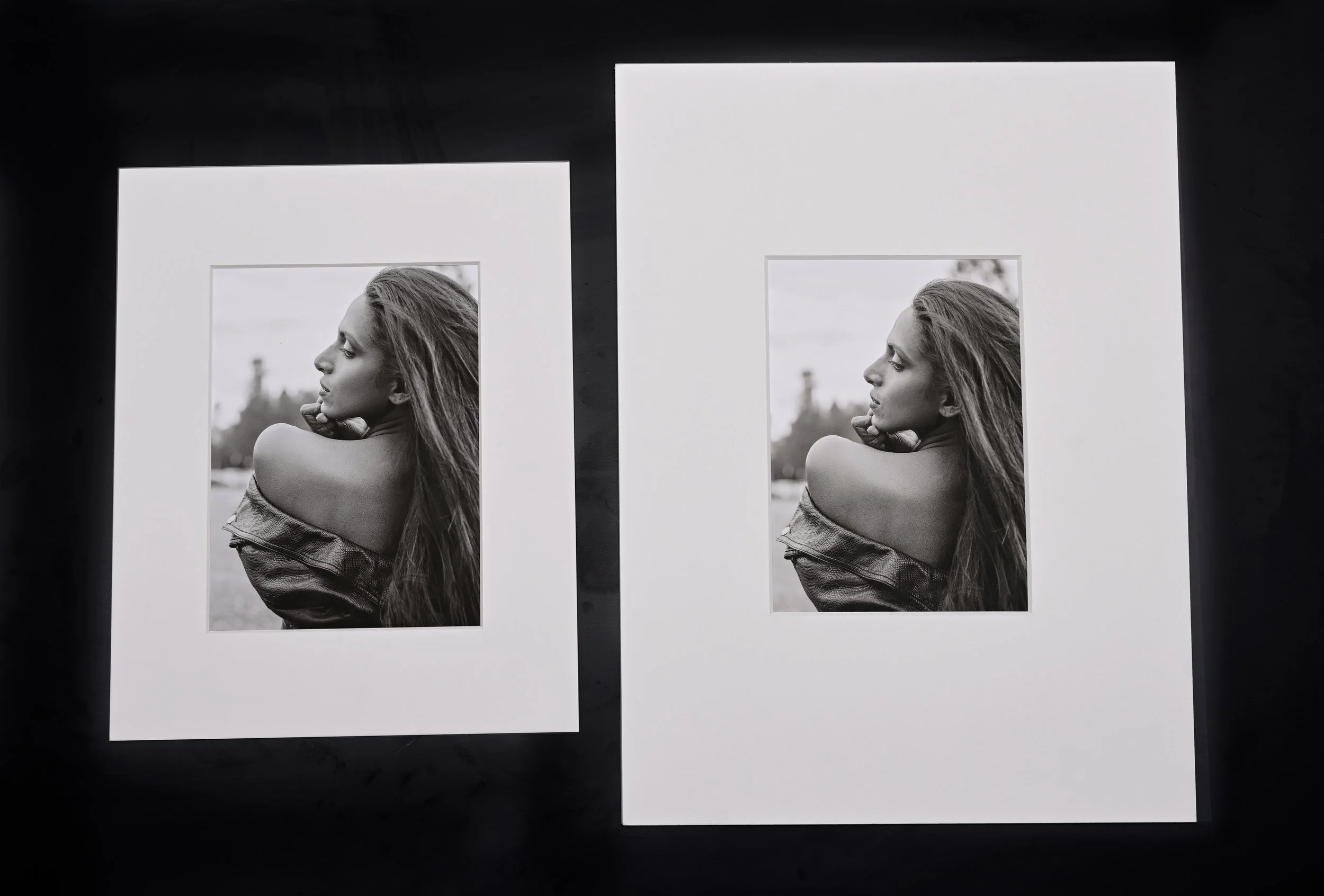
The same size image can feel very different depending on the passepartout width. A one-size-up mat with a 5cm border gives the print a clean, balanced presentation. But a two-sizes-up mat with a 10cm border creates more breathing room around the image, drawing the eye inward and giving the work a more elevated, gallery-like presence. The extra space can shift the mood from casual to refined, even when the image itself stays the same.
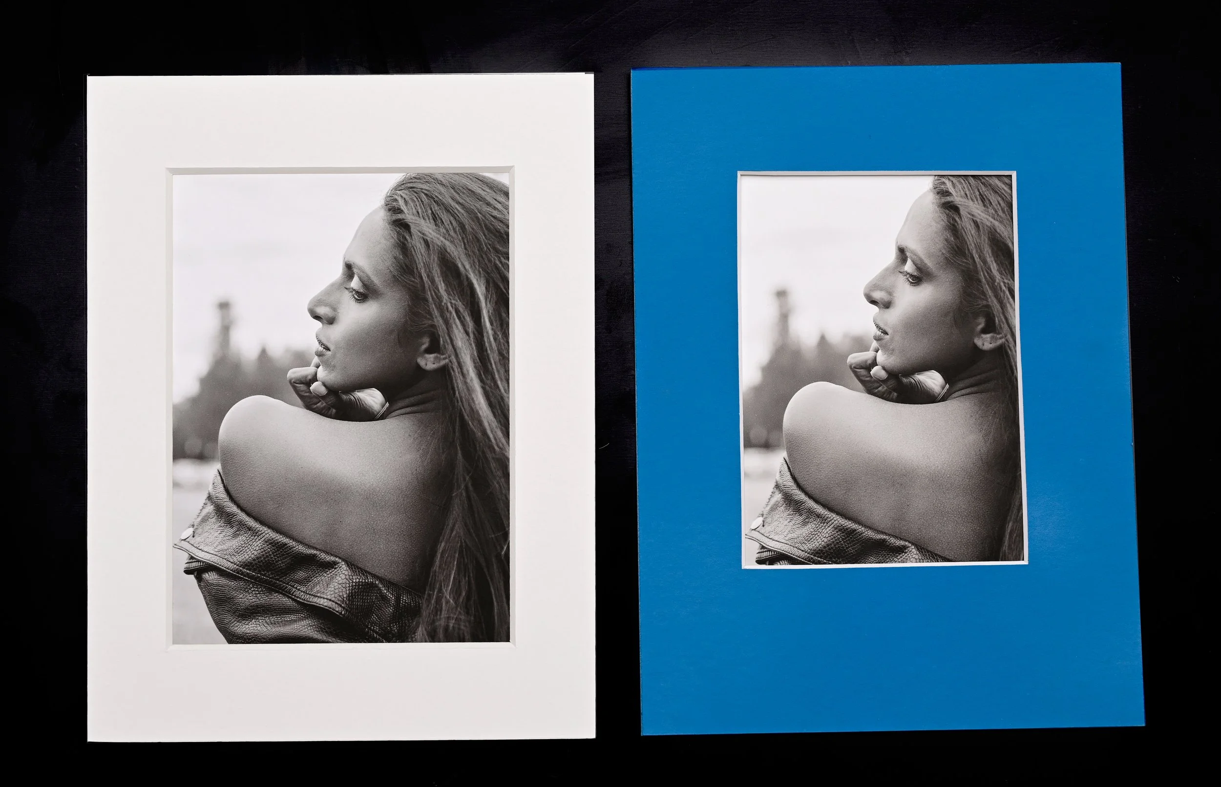
Passepartout color and framing can dramatically influence how we perceive an artwork.
Frames? We sell most of our art unframed. Many collectors already have a preferred framing style, so it doesn’t make sense for us to offer every frame for every use case. Our goal is to make high-quality nude art more affordable. By removing frames, we lower costs and pass the savings on to you. This also gives you the freedom to choose a frame that fits your space—and often at a better price than we could offer. If you are new to framing, read our guide to framing and glazing for your new art.
4.Putting it all together.
If you haven’t already, make sure to check out our full guide to buying prints once you’ve finished this article. In short, start by imagining what your ideal collection could look like. What sizes do you actually like, can afford, and have space to display? What kind of prints do you want to focus on in terms of quality, materials, and style?
Knowing these things ahead of time makes choosing much easier. Think of it like walking into a shoe store already knowing your size and what you need the shoes for—suddenly, most of what's on the shelf becomes irrelevant, and your options are clear. It might sound overly simple or a bit too practical, but it’s a helpful exercise. To get started, here are three tips that can help you in your thinking.
1.Start Small. We don’t recommend starting with the most expensive piece you can afford—it might not be what would make you happy. Just because something is premium and costly doesn’t mean you’ll fully appreciate it - you might need to grow into it. In our experience, the best way to start appreciating art prints is by acquiring smaller pieces first. Sometimes going for the highest quality small print is the smartest approach. This allows you to experience the quality of the paper and craftsmanship firsthand. If you love it, you can confidently go bigger with your next purchase selecting similar type of paper/quality level. Eventually, aim to own your largest artwork in the highest quality you can afford. Size matters, and the quality will shine and become a signature piece of your home. But do not overpay, unless you know exactly what you are getting.
To let you explore the levels and papers we offer sample print packs in XS sizes, featuring the same image printed on a variety of paper types. These sets are designed to show how the ink and image interact with different paper types, allowing you to see how each paper affects the final look and feel of the artwork. It’s a perfect introduction to the core of printing craftsmanship, helping you make more confident and informed choices as you build your art collection.
2.Have a goal for your collection. Have a plan for what you want to collect. Buying random pieces in various sizes and quality levels is rarely a good strategy. Do your research and think about the collection you want to build. Is it going to be around one specific model or photographer? Is it a special visual style that you want to focus on? Is it size, materials ore ranting technique that appeal to you? Remember—any plan is usually better than no plan at all. It’s very easy to spend a fortune on art and still end up with random pieces rather than a well thought collection. Value your time and money - take the time to plan how you want to spend them.
3.Accept that some of your initial purchases may not be your best. Most certainly, your tastes and budget sensitivity will evolve over time, and you might eventually sell or give away some of your earlier pieces. If your tastes don’t evolve, you probably didn’t buy art that truly resonates with you in the first place. The most important thing is that art should make you happy - it has no other purpose than this. But art buying is also a risk. If you find yourself constantly thinking about how much you paid for a piece, that’s usually a sign you overpaid - take it as a signal and learn from it. But if you look at it and feel like your home wouldn’t be the same without it, then you’ve probably found the right one. In that case, the feeling it gives you - the dopamine, the quiet rush every time you see it was worth every cent.In the end, art is about the journey and the personal connection it creates. It should reflect who you are, inspire you, and bring you joy.