

THE LIBRARY
Essays, guides, and collector insight.
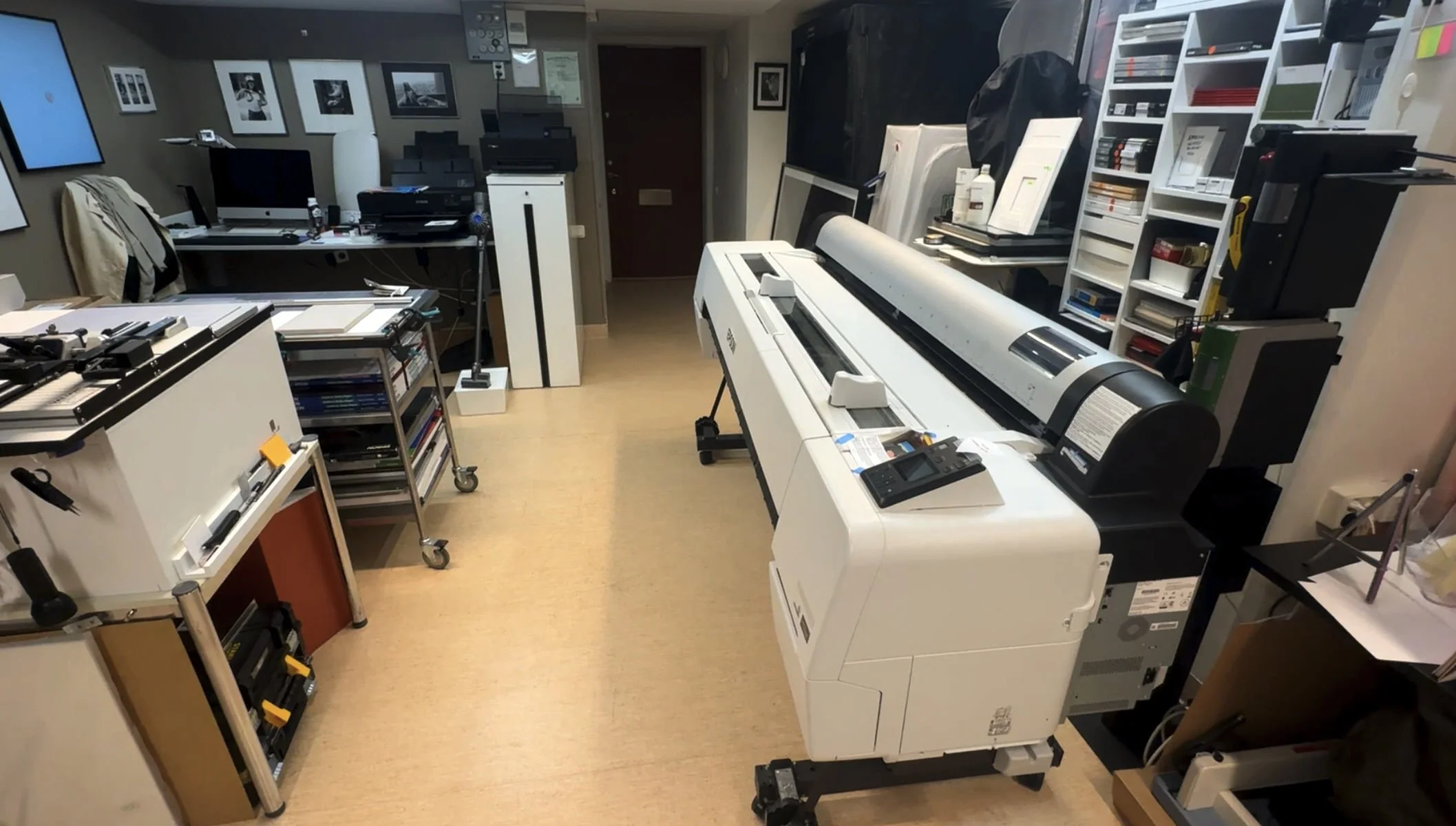
Why Nudicci? How we make our prints.
This article explains how we make printing decisions, what tools we use, what problems we try to solve, and what makes our prints special.
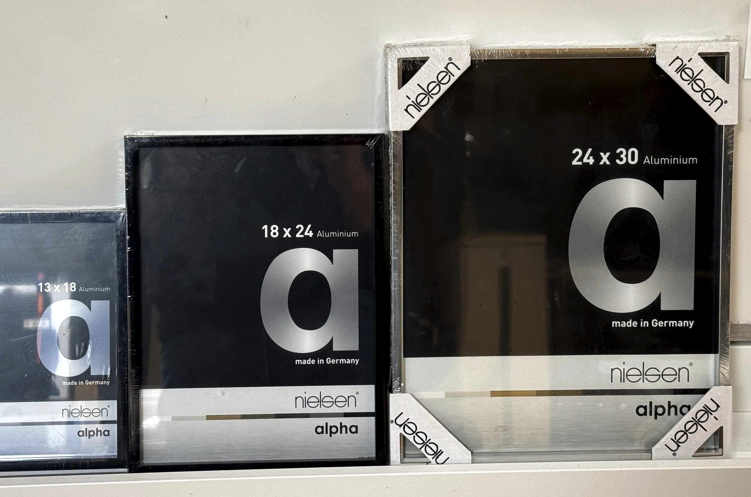
Nielsen and Halbe: Probably the Two Best Frame Brands in Europe
Out of every question we get post-sale, one keeps rising to the top: what frames do you recommend? My two favourite manufacturers are Nielsen and Halbe, both German, and both chosen for the same reason: quality. Yet they've taken very different approaches…
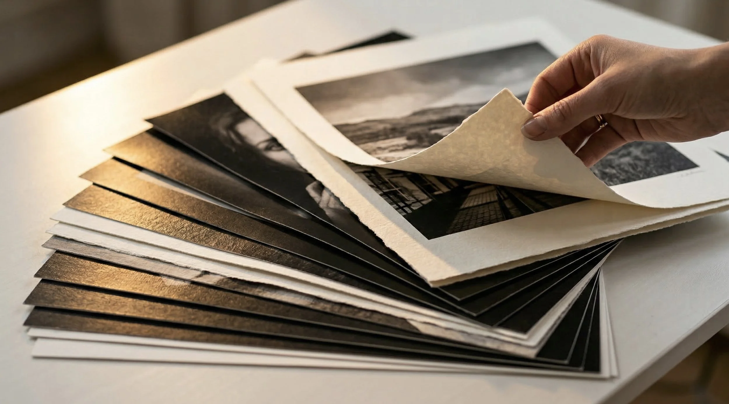
How Paper Weight and Thickness Affect a Print
There are three main metrics directly affect how a printed image will look: paper coating, weight (measured in GSM – grams per square meter), and thickness (measured in microns). These influence how the ink sits, how colors

Inside BBB: Nudicci’s Large-Format Limited Edition Series
Big, Bold, and Beautiful, or BBB, as we call them — is a limited-edition series of large-format prints. Each edition comprises roughly 15 copies, spread across a range of sizes. But the concept behind BBB isn't about luxury, exclusivity, or rarity. It's about…
The 3 Printmaking Principles Every Collector Should Know
In this article, I want to introduce a framework for understanding art production that might change how you look at art as a whole. It developed gradually in my mind as I went through various printmaking courses and noticed how certain methods shared similar principles and values, while others though producing similar visual results relied on completely different processes…

What Goes Into a Print, and Why Most Aren't That Great
A good print is never just about the image. It is about paper, ink, process, finish, presentation, and the judgment behind every step. This article breaks down what actually goes into a print, why most prints are far less impressive than they first appear, and what separates a print worth owning from one that is merely passable.

What Makes a Good Print?
What quality really means in paper, detail, finish, and overall presentation. This guide is here to help you uncover what truly goes into creating an art print, how to choose the perfect piece for your space, and what makes a print worth your investment.
The Limited Edition Mindset: Why Artists Limit Their Work
For many artists releasing work as a limited edition is both a creative and strategic decision. It’s a way to control how the work enters the world and how it’s perceived and valued in an oversaturated art market. A strong limited edition strategy ties together the number of prints, the price point, and the presentation into a single story. It highlights quality and exclusivity, establishing the artwork’s value both artistically and financially.

Edition Types Explained - One-Offs, Limited Editions, and Open Editions
Generally, there are three main types of prints: one-offs, limited editions, and open editions. You can think of them as one, some, and unlimited copies. Each category has its own subtypes and nuances. Let’s take a closer look at what each one includes.

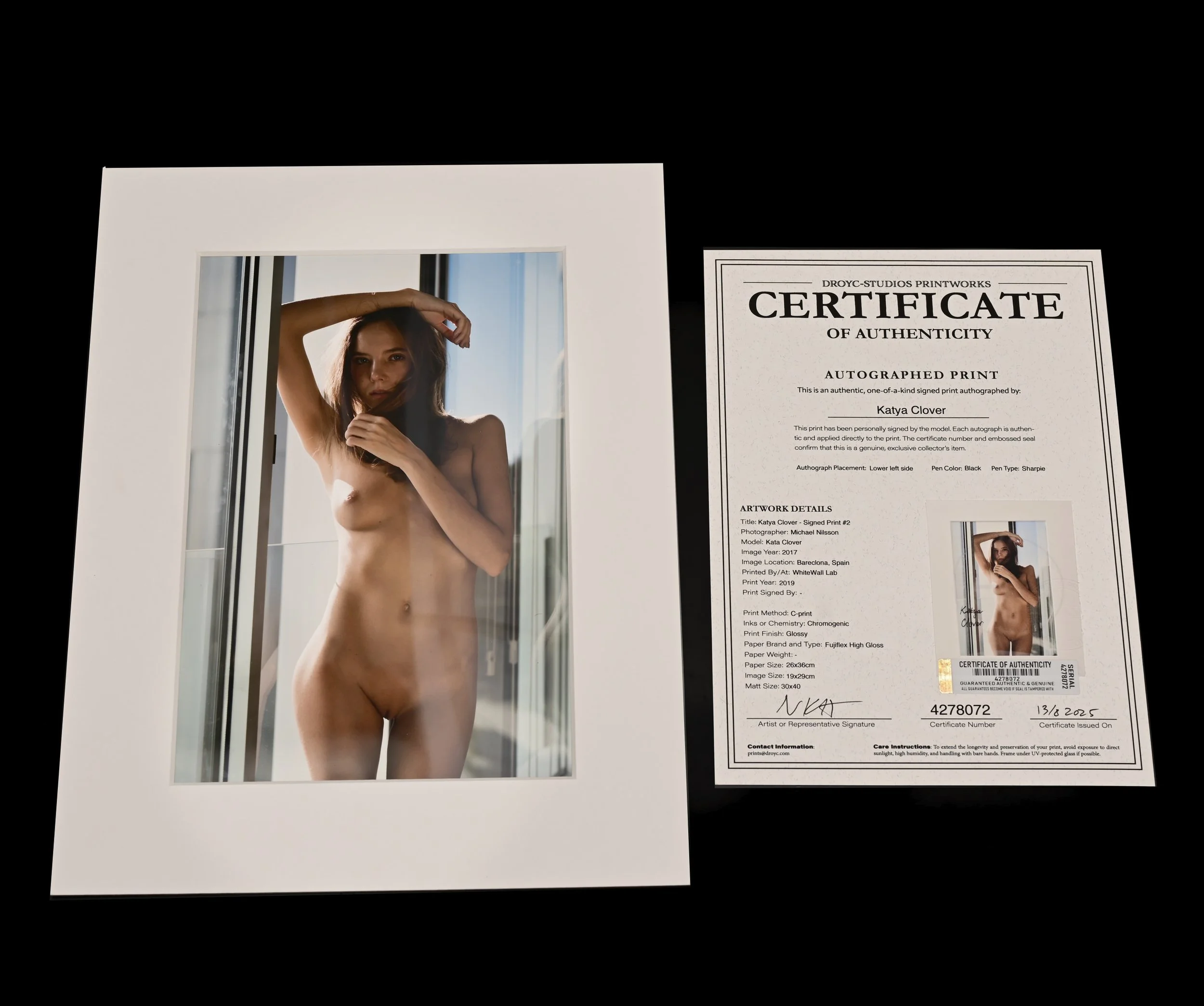
What is a Limited Edition Print?
Limited edition prints usually cost more than open editions. But why is that? What really sets them apart from just “high-quality” art? Is it all just a marketing trick, or is there something real? If there is real value, then what are the assumptions, expectations, and ideas behind the whole concept of a limited edition that make people willing to pay a premium? Great questions! Let’s dig in.
The Art of Framing or Why Bad Framing Kills Great Art.
Bad framing kills great art. Framing is a powerful tool that shapes how we see and feel about a piece. It’s the difference between simply hanging something on a wall and turning it into a bold statement. The right frame can transform a simple print into true art.

Paper, Part II: How Inkjet Coatings Shape Print Quality
In Part I, we followed the 2,000-year journey of papermaking, from its origins in ancient China to today’s advanced inkjet papers. Now, in Part II, we explore how modern technology is reviving old innovations and giving them new life: inkjet coatings.
Paper, Part I: The Medium of Art
Without paper, a digital photograph is just another content—something to swipe past. Paper turns it into art, into a physical object that shares space with us, demands attention, and holds its own weight in the world. But what is paper, really? Just a surface or a medium, a message or the messenger?

A Guide to Print Sizes and Quality Levels at NUDICCI
Whether you’re just starting out or building a serious collection, we have something to suit your needs. From affordable professional prints to high-end premium pieces. Every artwork is designed to cater to different spaces, tastes, and budgets. Read on to learn more…