

Why Nudicci? How we make our prints.
At Nudicci, we treat printing as an art form. It is something we love, enjoy doing, and are good at.
We only print our own photographs and have full creative control over every image, which means we can alter each image so it looks its best in print. This is what sets us apart from photo labs - we are not just printing, but actively making creative decisions about how to make each print into a true artwork - what to add, remove, modify. It is not about productivity, efficiency, or scalability. It is about recognising that we owe the best possible quality to the photographer, the model, and the collector. If we are going to use resources - paper, ink, shipping, and time - we have to believe that the result is worth making for the long term. Otherwise, why bother.
This article explains how we make printing decisions, what tools we use, what problems we try to solve, and what makes our prints special. If you are a collector, it will help you understand what you are paying for and what to look for when you hold one of our prints. It will hopefully demonstrate what sets us apart from photo labs and other services - why Nudicci is more than just a print store. Alternatively, if you are an artist who prints your own work this article will give you a practical look at how we think through the full process. We also recommend checking our Collectors Guide section for in-depth articles about framing, prints, and collecting.
By the end of this article, you will not look at prints, or printing, the same way again. Guaranteed.
People often hold two conflicting ideas about printing at the same time: that printing is easy, and therefore not really an art; and that printing is too difficult to do yourself. Both ideas come from the same misunderstanding of art-making: the gap between idea and execution. It is not unlike the misunderstanding people have about drawing or painting. What may look easy, even chaotic, on a finished canvas is not so easy to repeat once you have a blank canvas and a brush in front of you.
Anyone can send a file to a printer and get something that looks acceptable. Documents, family pictures - we all know this kind of printing. In this view, printing is seen as one simple step: choose an image, then print it. It works. You get a usable print. Easy.
But the moment you try to make a print that you truly care about, the printer seems to fail you every time. Colors are off. The image is too dark. The size is not correct. This is where the other view comes from: printing feels too hard when you want something very specific. When you have an idea in your mind, but cannot execute it in a way that matches your vision.
This is because printing is a sequence of decisions that lead to the final print. Those decisions require knowledge, experience, and judgment — things most people do not have when they first start and a printer will not make them for you. It is not enough to own a printer and call yourself an artist. Just as owning a set of paints and brushes does not make you a painter. These are only tools — and, in the case of printers, quite unreliable ones.
In fact, if you have a printer, it will break, misbehave and drive you mad. It often does not matter if it is a €200 home printer or a €25,000 production machine. They all break. They clog, complain with odd error codes, refuse paper, and stop working when you need them most. That is why photo labs exist: they give you a decent print without requiring you to know anything about printing. But ordering a print is not the same as making one. You can by as many oil paintings as you want, but that will not make you an artist. You only get there through practice, and by learning how to overcome the challenges.
A printer does not make a great print by itself. It gives you a set of possibilities and limitations. The real work is knowing how to use it within the whole workflow: which tool to use, when to use it, and what kind of result each tool is capable of producing. And this is where we start: with an overview of our tools.
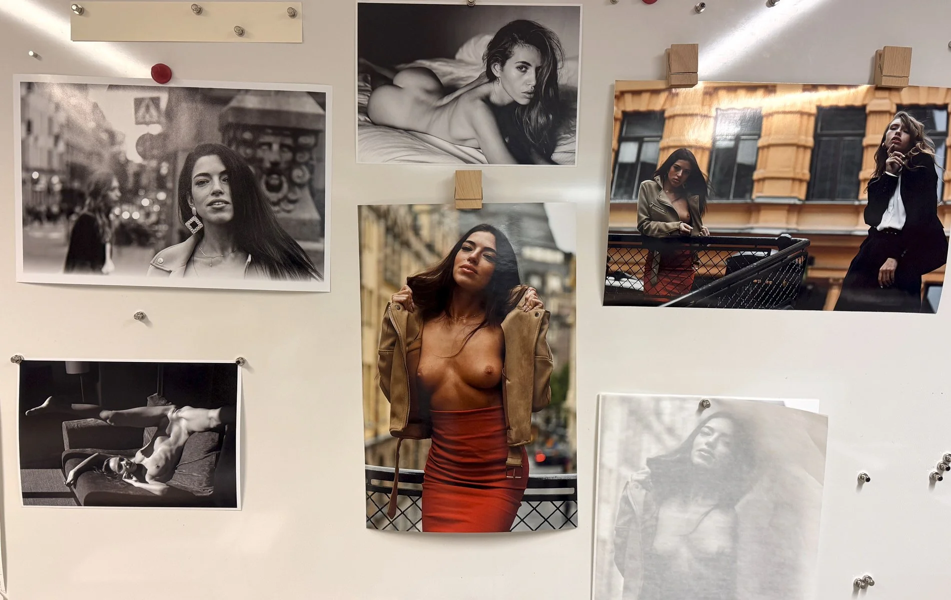
Before a print becomes a final artwork, it goes through many iterations. Here, a board for test prints - evaluating colour, contrast, and sharpness.
The inventory.
As a note, we do more than inkjet printing - analogue film development, cyanotype, photogravure, and screenprinting. But this article will focus on the inkjet only.
Printers are tools to make a print, but no single printer can do everything. Each machine is made to fill a specific role in production and excel at that. Some printers are made for large-format production: large prints, fast output, and efficient handling of bigger jobs. Others are made for small studios or home businesses: compact, cheaper to refill, and easy to use for on-demand printing. Both have their strengths and disadvantages. Some printers shine in one use case, while others excel in another. The task is to match the tool to the purpose. At Nudicci, we work with 4 Epson printers and each plays a specific role.
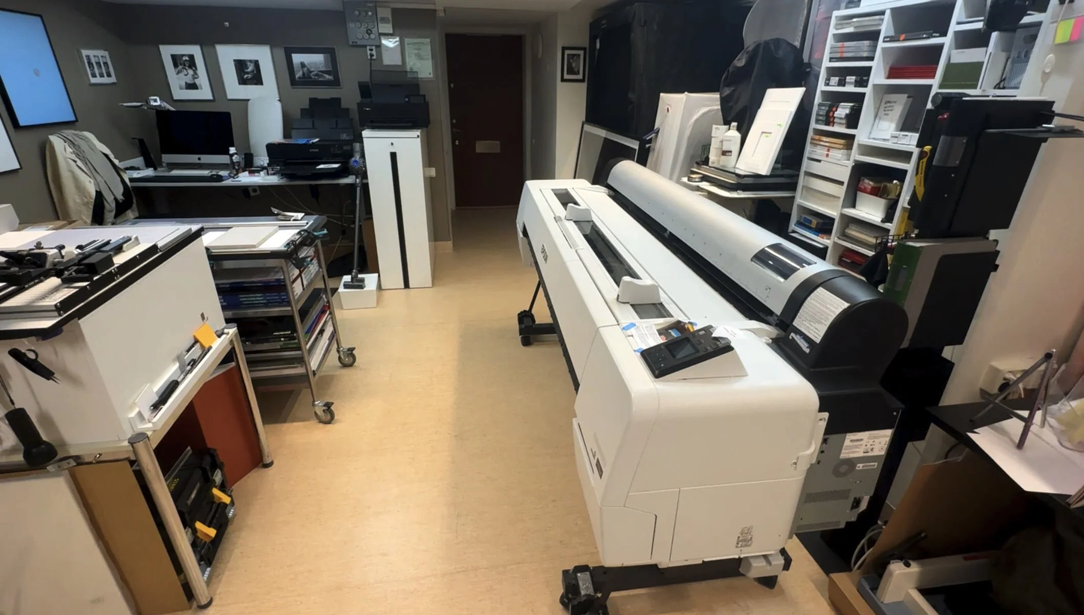
Printing space with 3 printers in view.
Our largest printer is the Epson P20000, which can print on 64-inch / 1.6 m rolls. This is the machine we use for large-format prints. It is built for roll printing, which makes it ideal for big works, long paper lengths, and large-scale production. Sheet paper can be used, but the printer is not really designed for that. It cannot take anything smaller than A4, and you can only load one sheet at a time. In practice, it is a pure roll printer. This printer is a beast, but it is not always practical. You do not want to swap rolls just to print one small image. You also do not want to waste paper and ink by doing tests on that machine. Before committing to that large scale, we often need to test the image on smaller paper first. This is where the Epson P800 becomes useful.
Epson P20000 at work
The Epson P800 can print up to A2. Its biggest advantage for us is that it uses the same inks as the Epson P20000. That makes it a very useful testing machine. We can make smaller test prints before committing the image to the larger printer, and the result will be very close to what we get on the P20000, as long as we test on the same paper. This is not only about saving money. It is about seeing. A screen can tell you many things, but it cannot tell you exactly how an image will sit on paper. A smaller test print can reveal problems before they become expensive mistakes on a large print. Test prints lets us check density, contrast, color balance, sharpness, surface response, and whether the image actually has the impact we expected.
Our third printer is the Epson P700. It is a newer printer with a newer ink set than Epson P800 and P20000, but it can only print up to A3. Its main advantage is the new inks made to optimize glossy prints, given them true blackness. In terms of ink costs, this is by far our most expensive printer as inks cartridges are small and expensive. Because of that, we use it carefully and rarely.
The fourth printer is the Epson ET-8550, also an A3 photo printer and also a newer model, but very different in purpose. It uses dye-based inks. These inks are extremely cheap compared to pigment inks, but they do not offer the same longevity or color control as our other 3 printers. For that reason, we do not use it for prints that we sell. Instead, we use it to make hundreds of 10 x 15 prints when we are selecting which images should become candidates for larger editions. At that stage, the goal is not to create a final object. The goal is to look, compare, reject, reconsider, and select.
That stage is important. Before an image becomes a large print, it often needs to live as a small print first. A small print can be moved around, placed next to others, looked at in different light, put into sequences, and judged away from the screen. It becomes part of the editing process. The ET-8550 is perfect for that because the cost of each print is low enough that we can print freely without considering the costs or printing 100 or 200 prints.

The Epson ET8550 is used to print thousands of small images — a full visual catalogue of the digital files we have to work with. Each one can then be evaluated as a candidate for a larger print at A4. At that size we often use the ET8550 as well, until we arrive at a final version worth moving to another printer for A3 prints or larger.
This is a good example of how we think about printing. The cheapest printer in the studio is not used because we believe it produces the best final print. It is used because it is the right tool for a specific stage of the work. The same image might pass through several levels of printing before the final version is made.
Moving along in the studio, printing is not the final stage. We have various paper and passepartout cutters, which we use to trim papers and prints, and to cut mats for presentation. Cutting a passepartout is both technical and creative. It requires the correct physical movement to pull the cut cleanly, but it also requires judgment. What size should the window be? How much space should the print have around it? Changing a ratio can change the feeling of the final object.
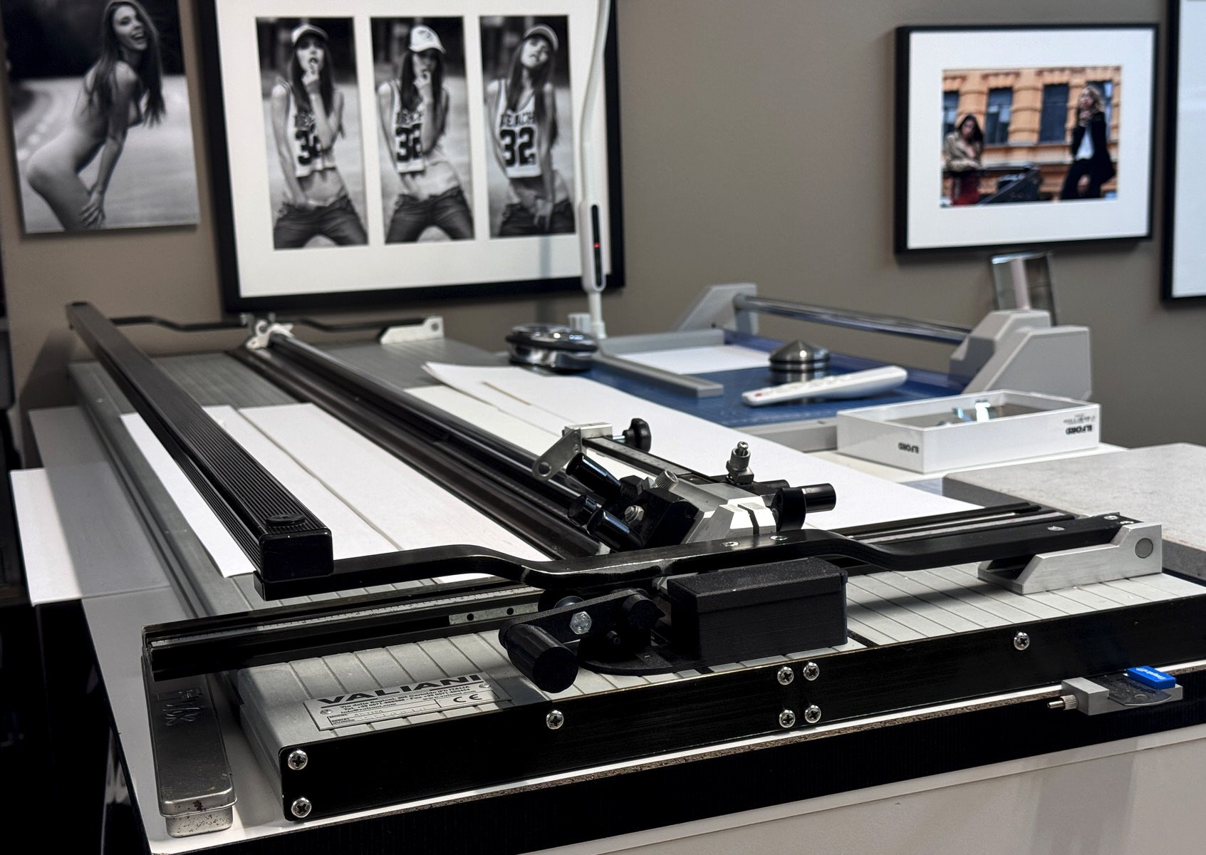
A manual passepartout machine that can cut mat windows up to 120cm. As explained in our other article, passepartout is often an essential part of transforming a print into an art presentation.
We think of printing as a broader process than simply putting ink on paper. The print is not finished when it leaves the printer. It still has to be handled, trimmed, evaluated, protected, and presented. A good print can be damaged by careless finishing. A strong image can feel weaker if the presentation is wrong.
One thing we do not do is framing. There are practical reasons for this. Framing requires a large investment in materials, tools, mouldings, glass, storage, and packing systems. We have a limited space. It is also much more difficult to ship a framed print abroad than a print in a passepartout. A framed work is heavier, more fragile, more expensive to transport, and more likely to be damaged.
But the most important reason is ideological. We truly believe that in order to fall in love with a print, a collector needs to spend time choosing the frame. This is related to the IKEA effect - when someone takes part in the final step - like assembly, they develop a stronger personal attachment to the object. Choosing a frame is that step. It is the moment where the collector imagines the print in their own space, visits framing store to check the framing options, and finally settles for one. That engagement matters.
So this is where the article begins: not with one perfect printer, one perfect paper, or one perfect method, but with a way of thinking. Good printing is a chain of decisions. Some are technical. Some are visual. Some are physical. Some are emotional. The printer matters, but so does the paper. The ink matters, but so does the surface. The file matters, but so does the hand that trims the sheet. The final print is the result of all of these choices working together. Now that we have covered what we have, let’s get into how we use it.
Navigating the choices
Most printing decisions come from the same three problem areas: what we see on screen is not what we see on paper; what we see in a small print is not what we see in a large print; and what we see in a print today is not always what we see after a month of looking at it.
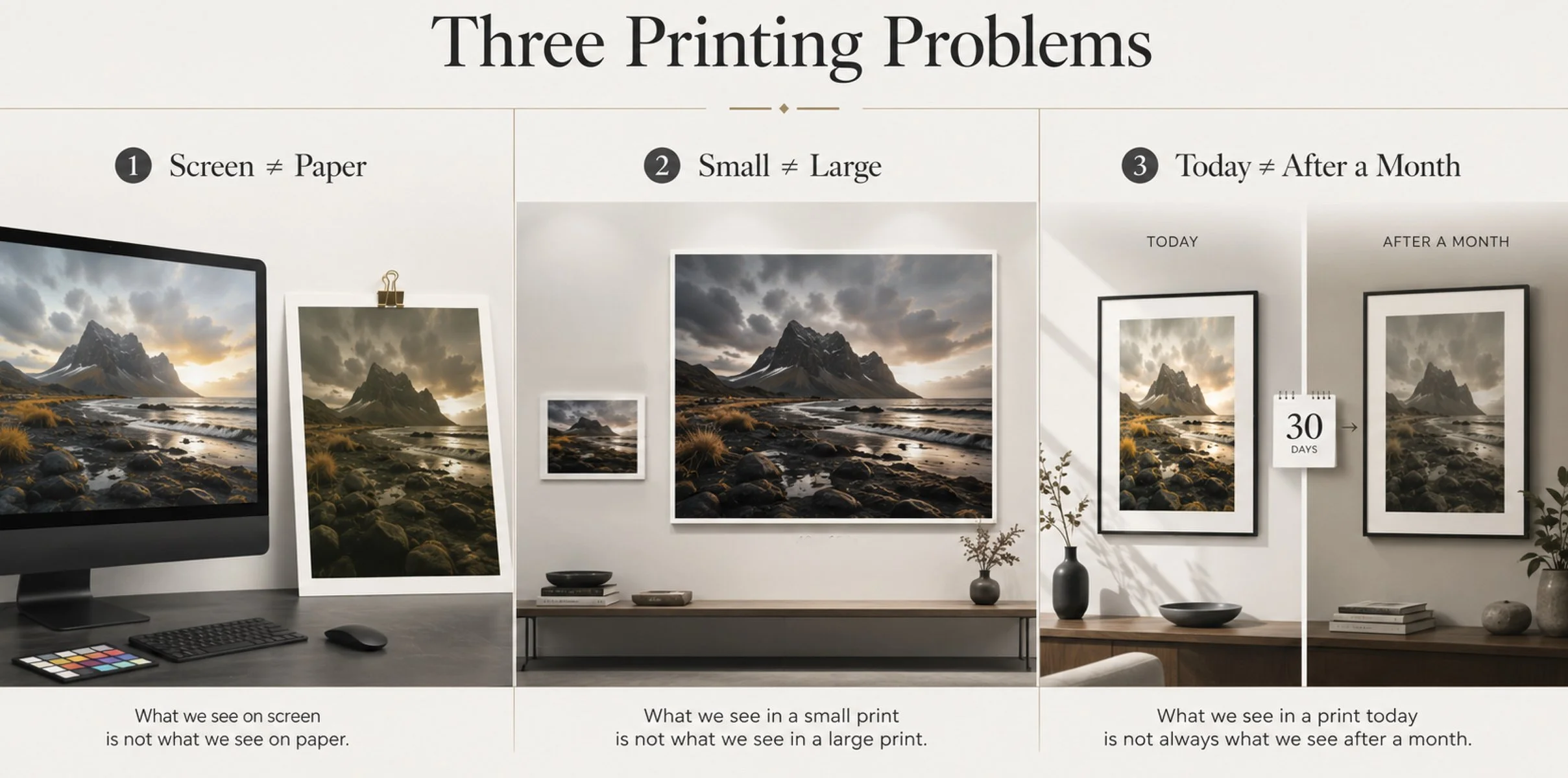
Most problems and decisions in printing come down to these three groups.
The first and most obvious decision is color. Many people have experienced color issues with prints. What you see on screen is not always what you get on paper. A print may come out lighter or darker than expected. It may have a color cast. It may look too warm, too cold, too green, or simply different from what you saw on the monitor. Some of this is technical. It can be caused by an uncalibrated monitor, paper choice, printer drivers, bad profiles, or incorrect settings. There is a whole field of color management dedicated to avoiding these problems. That field matters, and anyone serious about printing has to understand it. But that is not the only kind of color decision I mean here.
In nude printing, color management is important, but it does not make the artistic decision for us. Of course, we do not want green-looking skin or a purple cast in a black-and-white print. Basic technical control has to be there. But after that, the question is not only whether the color is “correct.” The question is whether the color works.
This is different from industrial printing. In packaging, magazines, banners, and brand material, color accuracy can be the main requirement. A brand color has to be the exact shade of green, not just “greenish.” The job is to match a defined color as closely as possible.
In our case, a well-managed color system is only the starting point. The final print still has to be judged by eye. Skin tone, atmosphere, contrast, warmth, coolness, softness, and emotional weight cannot be decided by numbers alone. You look at the print, decide what it is doing, and then decide what it needs.
This is why printing is not only technical, but creative.
If you send an image to a lab, they may have a perfect color management system. The file may be handled correctly, the profile may be right, and the printer may be excellent. But the print can still arrive looking less than ideal. Not because the lab failed technically, but because a technical match is not the same as an artistic decision.
A photographer knows what the image is supposed to become. A lab can reproduce a file. A printer who works closely with the image has to interpret it. Sometimes that means making the print slightly warmer than the file. Sometimes it means holding back contrast. Sometimes it means opening the shadows, deepening the blacks, softening the skin, or letting the paper carry more of the mood.
Problem 1: What we see on screen is not what we see on paper
A screen is made of light. A print is made of ink sitting on paper. A screen emits light; paper reflects it. This means that an image that feels deep, bright, and dramatic on screen can become flatter once it is translated into ink on paper. Paper absorbs, reflects, softens, and changes the image depending on its surface and structure. This is where paper choice becomes critical. Glossy and matte paper can produce two very different prints from the same file. Glossy paper can hold sharpness, contrast, and deep blacks in a way that feels immediate and vivid. Matte paper can soften the image, reduce glare, and create a more physical, quiet, and intimate feeling. Neither is better - each paper creates its own version of the image.
Each new paper requires learning its capabilities and understanding how to use it to get the best possible translation from screen to paper. Knowing what to expect from each paper type is where the real mastery lies. The choice of paper matters, and the expertise needed to get the maximum out of that paper is the real name of the game.
Knowing a paper well is far more important than offering a wide range of papers. The more papers you use, the more profiles you have to master, and the more complexity you introduce into the process. This is why some printers stay with just a few papers they know really well, at least until they are ready to explore more. When a photolab offers 30 different paper types, the real question is whether they have mastered each one or simply added them to make the menu look impressive.
Problem 2: What we see in a small print is not what we see in a large print

As the print goes from 10 × 15 cm to 60 × 80 cm, you start noticing details that were simply not visible in the smaller version. For example, at what point do you start noticing the crosswalk sign? Does it add to the image, or is the image better without it? Questions like that are what printing large prints is all about.
As print size increases, details stop being secondary. They gain visual authority. When we go from a 10 x 15 cm print to A3, we often start seeing things that were not visible before. When we go from A3 to a large 70 x 100 cm print, it happens again. The image changes. It is not just a bigger version of the same thing. It becomes a new object and has to be evaluated on its own terms. Small prints are forgiving. They compress information and hide problems. We might not notice that an image is slightly out of focus. We might not see a distracting detail in the background. But when the same image becomes large, those details become part of the experience. This is especially important with nudes.
A nude at 10 x 15 cm can still feel private, intimate, almost documentary. It can be slightly out of focus, oddly composed, and still carry the charm of a spontaneous shot. At 70 x 100 cm, it becomes a statement piece. The body is no longer small enough to simply glance at. It occupies space. It asks to be looked at. Every detail carries more weight. What felt spontaneous, cute, and intimate in a small print can suddenly feel poorly executed in a large one. What once felt natural can start to look unprofessional and sloppy.
The scale changes the responsibility of the image. By enlarging the print, we give more voice to other elements in the frame. Details that were quiet in a small print can become visually loud in a large one. This creates a decision: which elements are still important at this size, and which ones need to be toned down? Smaller prints often work because the mind completes the missing details. They are more about feeling than information. The viewer does not see everything clearly, so the imagination fills in the gaps. In larger prints, the visual information dominates. There is less mystery for the mind to complete, and fewer unknowns to fantasize about.
At a large size, the viewer can see many elements at once, and each one competes for attention. If too many details are visually strong, the mind becomes scattered. The image loses focus. This is why editing for large prints is essential. It is not about manipulating reality or beautifying everything with filters. It is about controlling the visual aesthetics of the final object. Raw, unedited images can work beautifully on screen, where they often carry a feeling of authenticity and immediacy. But that rawness does not automatically translate into a successful large print. If it is raw, the rawness has to feel deliberate. If there are distractions, they need to earn their place. What goes into a statement piece has to be considered carefully.
Problem 3: What we see in a print today is not always what we see after a month of looking at it.
A large print has has to be appealing to hang and live with for years. It has to carry presence without exhausting the viewer. It has to hold attention without depending only on novelty. It has to feel intentional. A large print does not only have to impress you when you first see it. It has to keep working after you have looked at it for days, weeks, months, and years. This is one of the most overlooked parts of printing. A print lives with people. It hangs in a room. It is seen in different light, at different times of day, and in different moods. The first reaction is only one part of its life.
This is especially critical for nudes. After a month of looking at the same nude, you no longer see it the way you did in the beginning. The novelty fades. The shock value fades. The immediate attraction settles. Your eyes begin to wander, searching for new details.
A mark that felt irrelevant at first may start to pull attention. A background line may become annoying. A strange shadow may begin to look heavier than it should. A detail that felt authentic on screen may become a distraction on paper. A good printer has to anticipate these issues before the print becomes final.
A classic example is facial expression. In a weak nude, the woman’s seductive expression can often be interpreted in only one way: she is horny and wants sex. There is no second reading. In a good nude, the facial expression is less fixed. It invites interpretation. And that interpretation can change depending on your mood that day. One day you may see submission. Another day, power. A third day, indifference, uncertainty, or struggle.
This makes the print far more interesting in the long run. But it also shows that the original image is everything. A bad photograph cannot be saved by a good printer. Printing can refine, strengthen, and clarify an image, but it cannot create depth or add vision that was never there.
Now that we have introduced these three groups of problems, we can look more closely at the nuanced decisions involved in navigating them.
I. Creative choices
Once the basic technical control is in place, the next question is whether the image actually works as a print. A technically correct print can still feel dead: flat, distracting, or simply not strong enough to hold a wall. This is where creative judgment begins — how it should be printed. A good print is a creative interpretation of the original image. Think of it as a film adaptation of a book: the core idea has to survive, but the new medium demands a different set of choices to make it come alive.
IA. Removing confusing elements in a print
One common challenge is that something completely ordinary on screen can look like a printing error once printed. Dark spots, strange patterns, uneven tones, small marks, or rough transitions can suddenly look like problems with the printer. A dark mark may look like an ink issue. A sharp line may look like a scratch. A harsh gradation may look like the printer was running out of ink.
The question is not whether the element was really there. The question is what it does to the final print. These elements may be part of the image, but in print the viewer can stop reading them as part of the photograph and start reading them as defects. That changes the decision.
This matters especially for prints meant to be seen every day. A small issue can be easy to ignore at first, but once noticed, it becomes almost impossible not to see. The eye keeps returning to it. A print that should give pleasure and presence starts to feel imperfect, even sloppy.
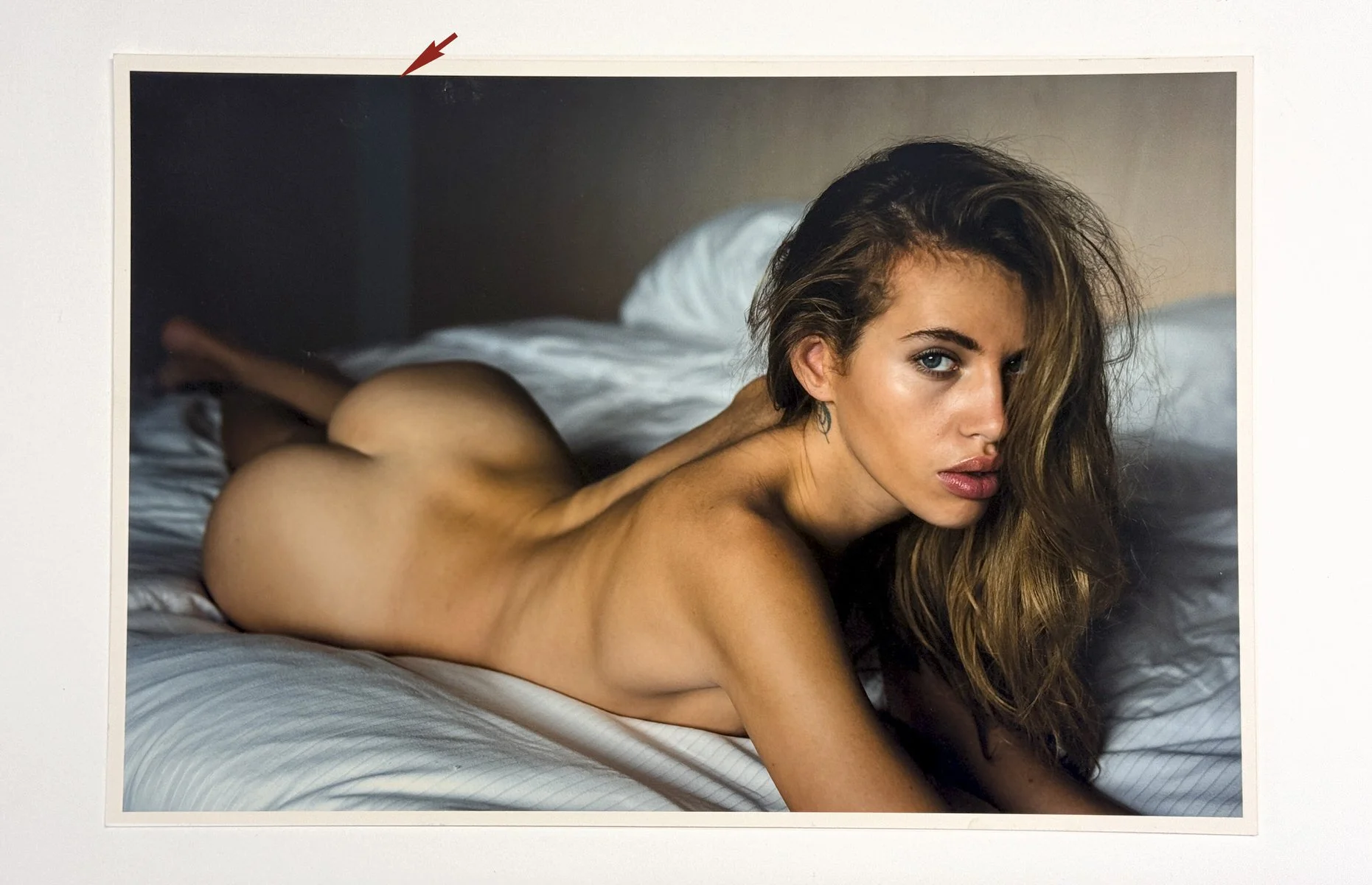
In digital file, the stripe behind is almost invisible. It is just out of focus element that blurs smothly into the background. In print, the same element looks like a printing issue - as if a printer skipped a color.
These issues are difficult to predict before printing. They depend on the paper, surface, printer, size, and settings. Most images look acceptable small. Many problems only reveal themselves when the image is printed large enough for the eye to enter it. An example is this next image:
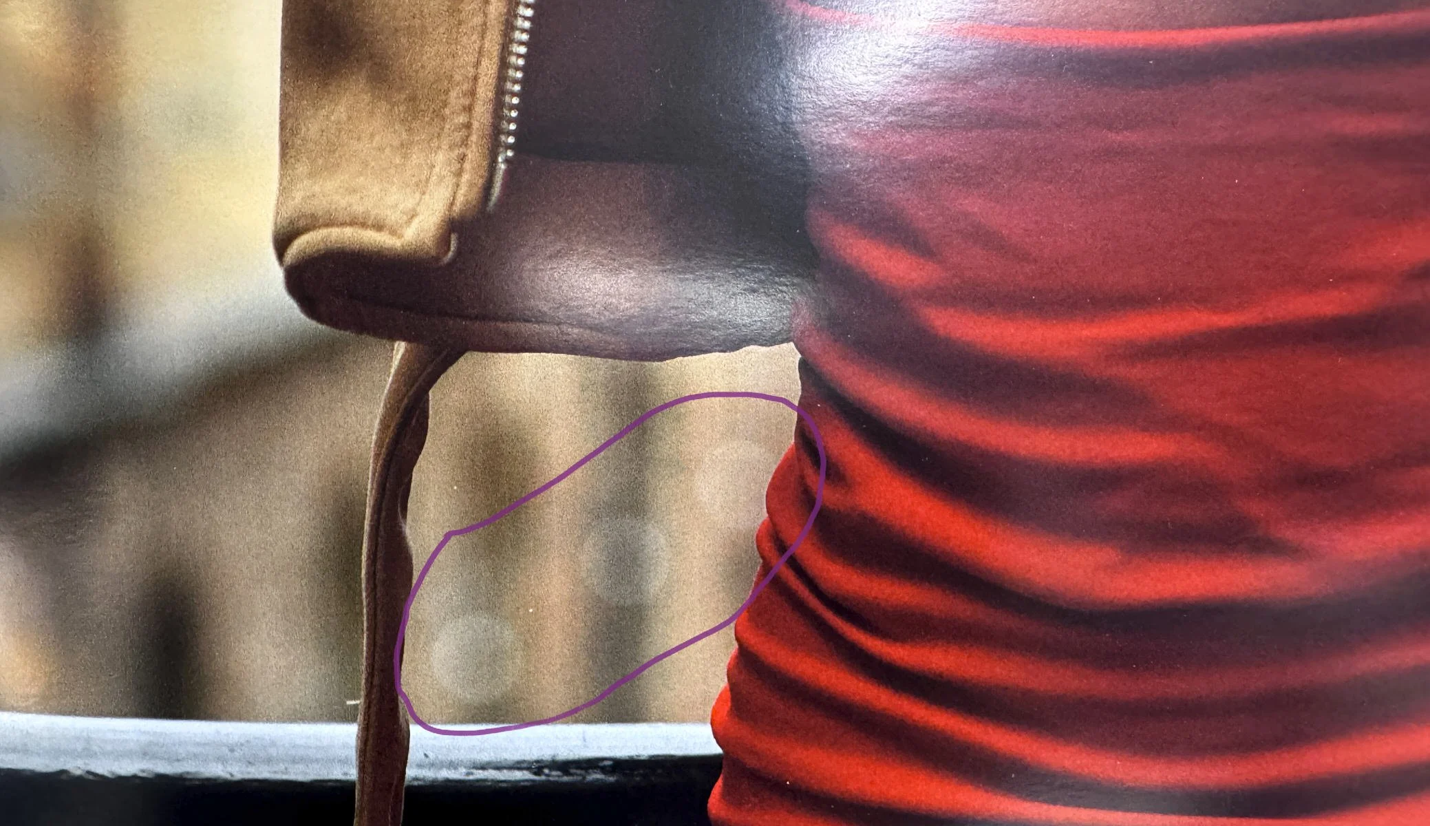
A legitimate out-of-focus bokeh effect that you barely notice on a small print or on screen can suddenly look like an artifact when printed — like water damage on the paper or a printing issue. Once you have seen it, it is hard to stop wondering whether it is a problem or a feature.
The decision to remove the confusing elements or leave them alone is a creative choice. Leaving them means staying true to the original image. Nothing wrong with it. Most photolabs would print it just as it is. Removing them means taking creative control of the narrative: adapting the image to paper as a medium, narrowing the focus to what is essential, and recognising the print as a long-term artwork rather than a quick digital image.
1B. Adjusting contrast and clarity
Another major decision is contrast. When we print, we have to decide what kind of contrast the image needs for the paper. On screen, an image can feel deep, bright, dramatic, and full of separation. On paper, the same image may become dull. This is both a technical decision — how to adapt the image to a specific paper — and a creative one: what to change in the original image so it works better as a print.
One example is converting a color image to black-and-white. A printer can do this automatically, but we usually do it manually because the translation matters. In color, nude skin dominates. It pulls the eye first and pushes everything else into the background. Color gives nudes a natural hierarchy. In black and white, that hierarchy disappears. Skin becomes just a tone, not flesh. It has to compete with every other element and shape in the frame. This is one reason black and white is often more demanding than color, especially for nudes. It removes the easy hierarchy of skin tone and color attraction. The image has to carry its own weight, and any weakness in the composition becomes visible immediately.
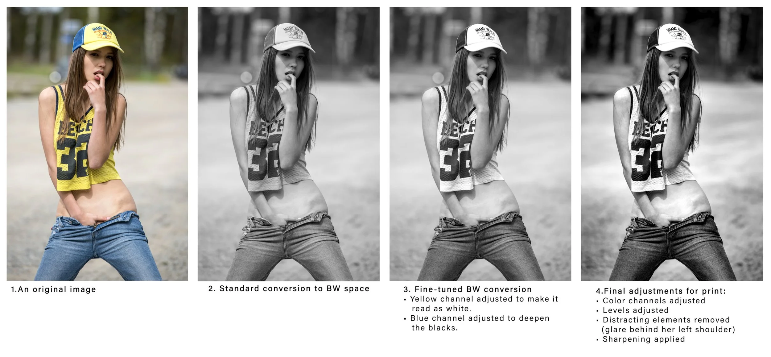
The example above shows why sending your pictures to a lab rarely results in a great print. They may have excellent printing equipment, but they will not make the creative decisions for you. Unless you control those choices yourself, the print will not do any magic for you.
1C. Removing distracting items
There is a difference between elements that look like printing errors and elements that distract from the image’s message. In nude photography, a lot of retouching is around skin retouching. This can be a valid part of removing distractions. You do not want the viewer to pay more attention to a pimple on the model’s forehead than to the image itself. The pimple will disappear in a few days anyway, so removing it is simply speeding up time. But removing tattoos, scars, or other personal marks is different. A nude should not turn a person into a stereotype, deprived of any personality. We do minimal skin retouching because we work with carefully chosen models. If a nude needs heavy beautifying retouching to work, the photographer chose the wrong model for the image.
But there is another kind of distraction: details that should not be there. The larger the print, the more visible these small details become. Things that are easy to miss on screen or in a small print can suddenly start competing with the main image. Flying hair, glare, odd shadows, or small objects near the edge of the frame can pull attention away from the subject. The question is simple: does the element add to the image, or does it weaken it?
This is not about documentary truth. It is about making the image’s message clearer. If a detail supports the image — makes it feel more alive, intimate, or believable — it belongs. If it competes with the main elements, it becomes a distraction. A good rule is to ask whether the detail is clear enough to belong. If the viewer looks at a portrait and thinks, “What is that on the wall?”, it is usually a distraction from the portrait itself.
Another method is to ask whether the detail is doing a job that another element has already done. Do we need to see electrical sockets or wall lamps to understand that the model is in a room or in a hotel? Or has the room already been established by better, stronger elements? If the detail adds nothing new, it can usually go. For example, one of the clearest signs of a hotel room is a wired telephone beside the bed. Once you see it in the picture, you know it is a hotel room, no matter how elegant the space looks. Ideally, the decision to keep or remove the telephone is made on set, but sometimes it has to be handled in post. Things like floor plans, exit signs on doors, and other hotel markers cannot always be removed on set.
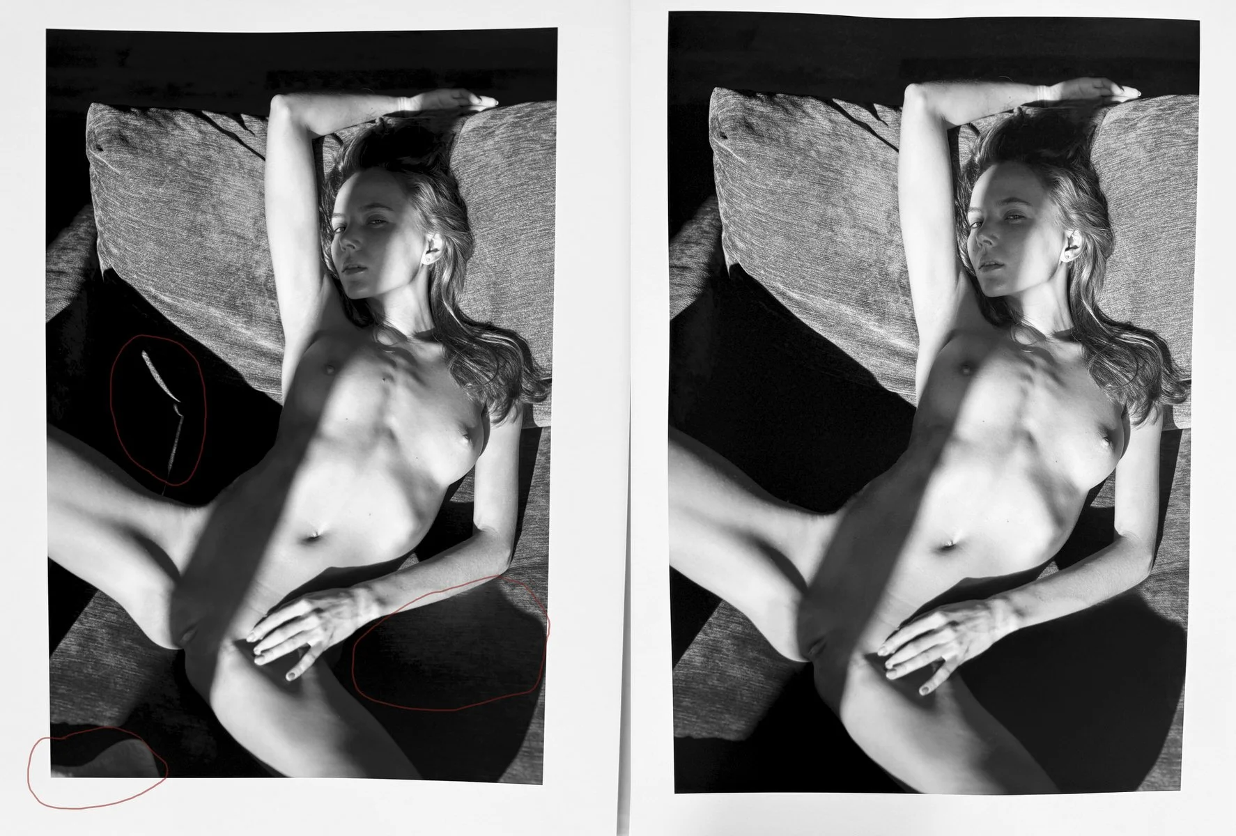
The draft print and the final print, with distracting elements removed and highlights adjusted.
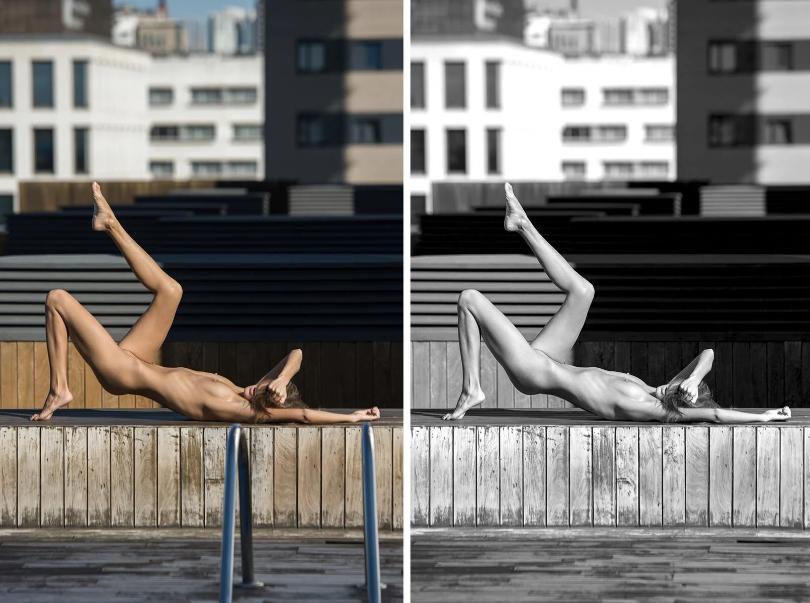
The swimming pool did not make it into this shot, so the stairs became a distracting element. The image works better without them. The remaining question is whether the image needs that much space at the bottom at all, or whether it should be cropped into a tighter composition.
1D. Dealing with blur and soft focus
Focus is another issue that often appears only when the image becomes large. In small versions, almost everything can look reasonably sharp. It is like looking through a small camera viewfinder: everything seems sharp until you open the file on a large screen. When the image is printed large, the real focus becomes obvious. Sometimes the problem is technical: the focus is simply in the wrong place, on the nose instead of the eye. Sometimes the image does not have enough critical sharpness for the intended size; it is not truly sharp anywhere. Sometimes motion blur, shallow depth of field, or camera shake becomes more visible than expected. At that point, the question is not just whether the image is sharp. The question is whether the softness works.
Softness can be beautiful. It can create intimacy, distance, movement, memory, or vulnerability. Not every nude needs to be clinically sharp. In fact, too much sharpness can make a nude feel artificial. But softness has to feel intentional. It has to belong to the image and to the story.
So the decision is both practical and artistic. At what size does the focus issue become visible? Can the image still be printed that large, or should the edition be limited to smaller sizes? And what is the real viewing distance? A large print is not judged only from close up. It has to work from the distance where it is actually seen. Can AI sharpening help without making the image look fake? Can other elements be softened so the main focus feels sharper by comparison?
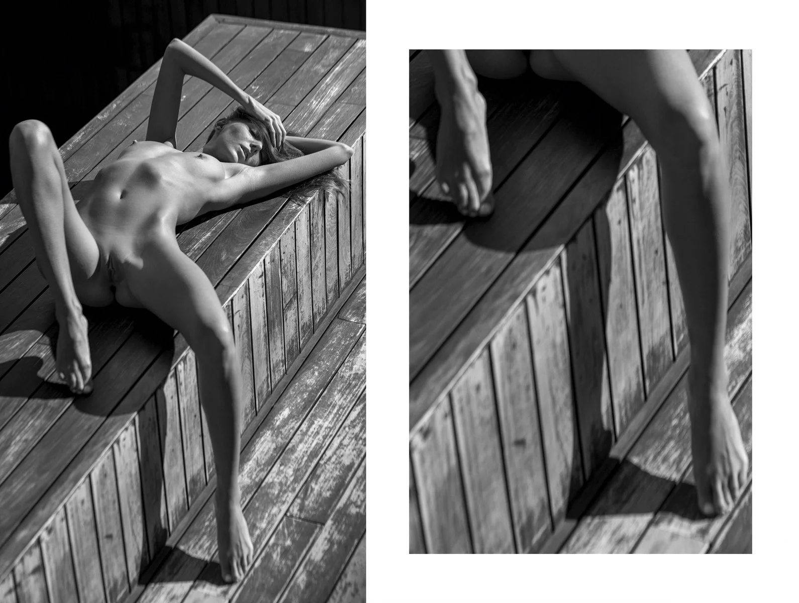
Motion blur appears because she is moving. The focus is on her face, while her legs are in motion and are out of focus. At a large size, this type of blur may become distracting, with the mind trying to stabilize it. But it also gives the image energy and movement.
1E. Preserving shapes and volume
Another subtle issue is the loss of volume. The shapes remain the same - a round breast will still be a round breast when printed. But the sense of form can change dramatically between screen and paper. The glow of the monitor separates tones and makes skin feel dimensional. On paper, those same tonal relationships can collapse. Curves lose roundness due to lack of backlight. Skin loses softness, weight, and depth. This matters especially in nude printing, because the body is form: shape, texture, and volume. When the print loses that, the nude loses much of its core message.
Preserving volume often comes down to small tonal decisions. Shadows may need more separation. Highlights may need protection. Local contrast may need adjustment. The goal is not to make the image more dramatic, but to make the body feel more solid, believable, and true. This is where printing comes close to sculpture. The printer has to think in terms of form. The body has to keep its shape on a flat sheet of paper. Depth, softness, tension, and weight all have to be carried by tone. When this works, the print feels physical. The body does not just appear as a shape. It has presence. It occupies visual space. It holds your attention without collapsing into flatness.
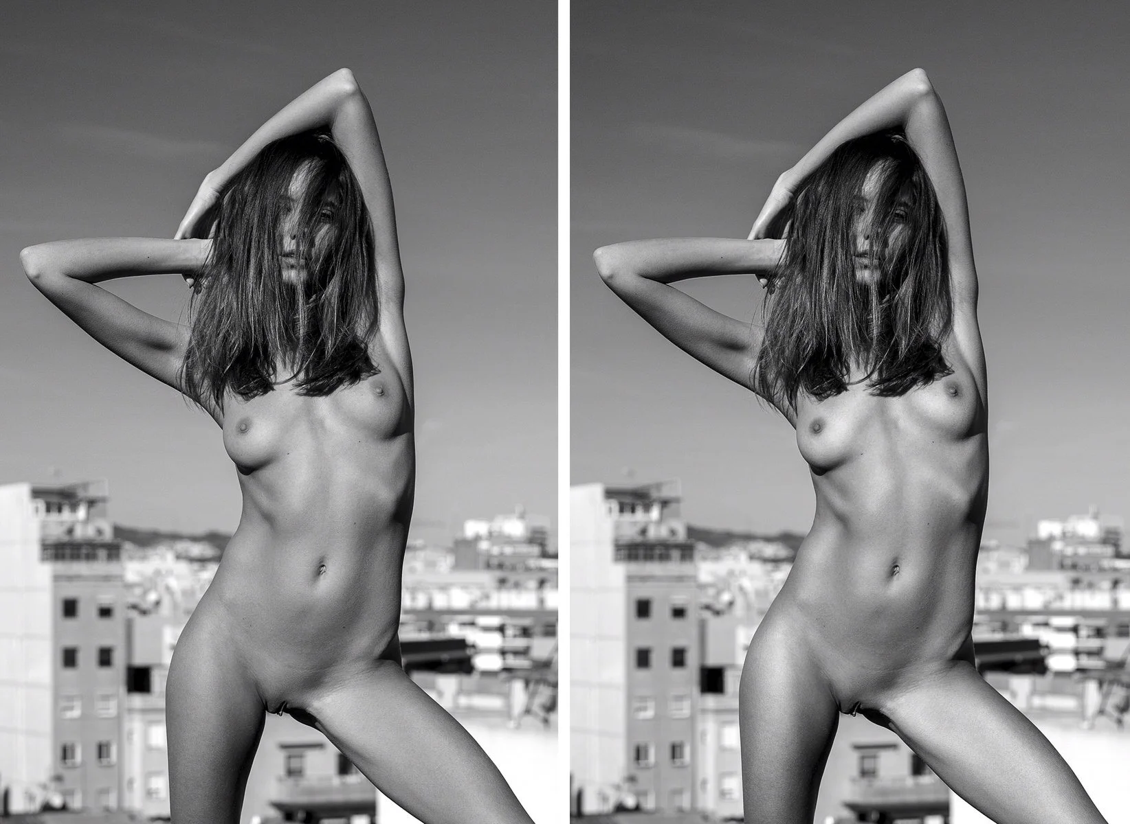
Standard black-and-white version on the left, compared with a version where highlights and shadows have been adjusted to improve the perception of shape and skin quality. You might not see it first, unless you actually compare one version to another.
II. Overcoming technical issues
This is one of the most frustrating parts of printing: a good print is not finished when it leaves the printer. Printing is a physical process, and the machine can leave roller marks, ink smudges, scratches, or pressure marks. Even when the image, paper, and colour are right, the print can still be damaged before it is clear of the machine. Three common problems can make an otherwise good print unusable: pizza wheel marks, ink smudging, and paper curl or warping.
IIA. Pizza wheel marks
Pizza wheel marks are tracks left by the printer’s small paper rollers. These rollers guide the paper through the machine, but on glossy, delicate, or thick papers they can press into the surface and leave visible marks. The name sounds harmless. The damage is not. A strong print can be ruined by a row of tiny marks running across the image. They may only show from certain angles, or only in dark areas and smooth tones, but once you see them, the print is compromised. What makes this problem frustrating is that the image is not at fault. The paper is. Some surfaces simply do not tolerate the way the machine feeds them. Glossy papers, fragile coatings, and heavy sheets are the usual suspects.
IIB. Ink smudging
Ink smudging is another common way a print fails. It can come from the printhead, dust, debris inside the printer, paper curl, or any part of the machine touching the surface before the ink has settled. Sometimes the smudge is obvious. Sometimes it is tiny. On a final print, tiny is enough. This matters most in skin, clean backgrounds, soft gradients, and bright negative space. A small dark mark in the wrong place pulls the eye immediately. The image stops being a photograph and becomes a damaged object. The worst part is that smudging often appears at the end. The file is prepared, the paper is chosen, the sheet is loaded, the print is almost done — and then a smear appears near the edge, across the background, or right through an area that needed to stay clean. That print is not “almost good.” It is unusable. That is the reality of physical printing. Sometimes the difference between a finished print and waste is a mark only a few millimeters wide.
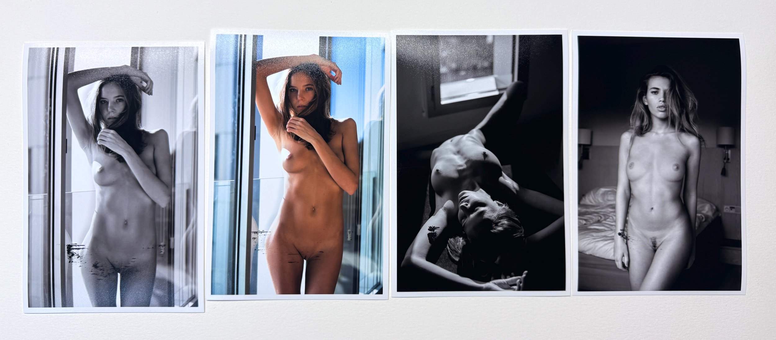
Ink smudging on a finished print. Minor instances may be acceptable for private use, but in a commercial context these are throwaways.
IIC. Paper curl and warping
Paper curl and warping can happen before printing, during printing, after printing, or while the print is drying. The damage can be immediate. If the paper lifts, it can hit the printhead and cause a strike, smudge, scratch, or ink deposit. If it feeds unevenly, the image can shift or the edge can get damaged. If the curl appears after printing, the print becomes harder to inspect, flatten, store, pack, and ship. Large prints make everything worse. The bigger the sheet, the harder it is to control. A small print is easy to move. A large print has weight, flex, and surface area. It bends, catches air, and can be damaged just by being moved badly from one table to another. This is why printing is physical work. You are not only managing color, contrast, and sharpness. You are managing the behavior of the material.
IID. Clogged printhead
A clogged printhead happens when dried ink or small debris blocks the tiny nozzles that release ink onto the paper. When this happens, the ink cannot flow properly, which can cause faded prints, white lines, or missing colors. The extent of the problem depends heavily on the image. For example, in black-and-white prints, not all ink channels may be used equally, so it is possible to have a clogged printhead without noticing it immediately. In color images, the problem is usually much more obvious, but even then it depends on the image itself and the type of paper being used. Luckily, most clogs can be cleared with a couple of cleaning cycles, though this does waste both ink and paper.
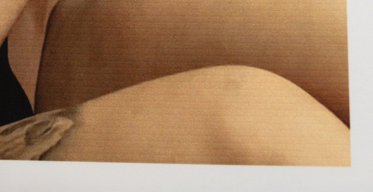
A typical example of clogged printheads is white lines or streaks in the print. These happen when some nozzles stop firing, so parts of the paper receive no ink. What should be a smooth gradation, such as skin tone, breaks down into visible lines of missing color.
IIE. Other reasons for failed prints
Modern printers are very capable. They have sensors and smart features that help them feed paper, control ink, and protect the machine. But they are also sensitive. If something feels wrong — a lost connection or a skewed sheet — they may stop printing and eject the paper. The problem is that many printers do not clearly explain what happened. They stop, waste the sheet, and leave you guessing what has happened. The only way forward is often to try again, losing more ink and paper until you find the real cause. So your most reliable tool can suddenly fail you with no warning and no guide what to do to fix it.
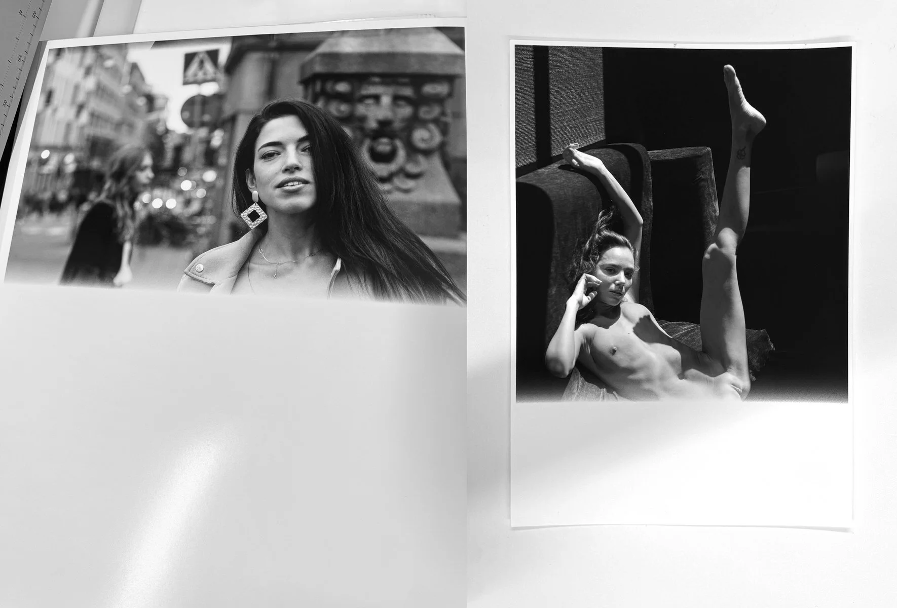
A typical pattern of prints being ejected mid-print. Depending on the cost and rarity of the paper and ink, this can be a very frustrating experience.
Then there is the general cost of owning a printer. A large printer can cost as much as a car, and like a car, the purchase price is only the beginning. Any serious technical issue can set you back at least a €500, and often far more. The worst problem is usually a damaged printhead. Replacing a printhead in a large production printer can cost several thousand euros. On smaller home or studio printers, a damaged printhead may not be replaceable at all. In that case, a printer that cost €1000 may have to be recycled or sold for parts. This is the nature of the printing industry — everything works, until it simply doesn't.
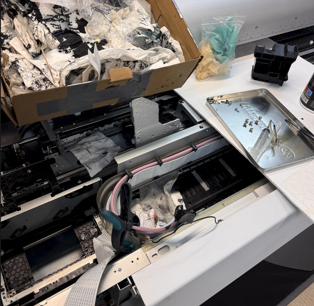
Sometimes a printhead needs replacing. It is a messy, expensive and time consuming job, but that is part of the cost of running a print studio.
Luckily, big printers have replaceable printheads, which tells you that manufacturers expect them to fail. And when they do, the problem is not just the cost or finding a technician. It is also waiting for the part to arrive. This is why many large printing facilities run several printers. If one machine is down waiting for repair, production does not stop. They can keep printing while the broken one waits its turn.
But printheads are only one part of the problem. There are pumping units, valves, rollers, cutters, sensors, paper-feeding mechanisms, waste-ink systems, and many other parts that can fail. Some failures stop production completely. Others create subtle defects that waste paper, ink, and time before you even understand what is happening. This is why printer ownership is very different from simply sending a file to be printed. When you own the machines, you own the problems too and that has to be budgeted for.
The car analogy works here as well. If someone gives you a car as a present, you’ll have an immediate costs, whether you drive it or not. You need somewhere to park it. You need insurance. You need maintenance. Big printers are similar. They need space, which means rent. They may need insurance, service contracts, maintenance budgets, spare parts, and regular use just to keep them healthy. They also need a workflow built around them. A machine that is not used properly can become a problem even when it is standing still. This is part of what serious printing costs. It is not only ink and paper. It is the infrastructure that makes reliable printing possible.
III. Post-printing risks
After the print is made, the risks do not disappear. They change. Many failed prints are not caused by the image or the printer, but by what happens after. A fingerprint, a bend, poor storage, or careless packaging can destroy an otherwise perfect print. At this stage the print has to survive in perfect condition until it is shipped to the client. A lot can happen during that time, and one careless moment can ruin work that took hours or days to prepare.
A perfect glossy print can be ruined by a fingerprint.
A large print can be bent by one careless movement.
A surface can be scratched by another sheet, a dirty table, dust, packaging material, or the edge of a tool.
Prints can stick to each other if they are stacked or stored incorrectly.
The larger the print, the more important this becomes. A small print can be picked up and moved easily. A large print needs space, coordination, and attention. It is very easy to damage a large print while trying to protect it.
That is why handling is part of printing. Clean hands or gloves, clean tables, drying time, protective sheets, sleeves, interleaving paper, flat storage, careful rolling, and controlled packing are all part of the printing process.
Working with many prints introduces additional challenges. Prints that are not shipped immediately need to be stored safely, but they also need to be easy to find later. What you do not want is a situation where it becomes easier to print a new copy than to find the one already sitting somewhere in storage. And another clear no-no is sending the wrong print to a client.
Most post-printing risks are invisible to the customer, as long as the studio handles them properly. The customer does not need to know how the print was stored, protected, checked, or packed. But they will notice the result if that process fails. A damaged print, a scratched surface, a bent corner, or the wrong print in the package breaks the trust immediately. Handling, storage, and organization are therefore not admin details. They are part of the quality of the final print.
Shipping is the last part of the risk chain, but it is also the one that can make all the earlier, carefully managed risks irrelevant. The goal is simple: the print that leaves the studio should be the same print that arrives with the client. That sounds obvious, but it requires planning. A finished print is still vulnerable until it is safely in the hands of the person who ordered it. Improper packaging is a weak spot in many printing services because good packaging is a significant cost. It requires the right materials, enough protection, and a clear understanding of how prints can be damaged in transit. A package that is too weak, too tight, too loose, or poorly sealed can undo all the work that came before it. Good printing does not end at the printer. It ends when the physical object survives the whole journey.
Each failed print adds cost — the reprint itself, and the investigation into how to prevent the same mistake again. That might mean new storage units, better packaging materials, better processes, better routines. All of which adds up, and that is what we turn to in the next section.
IV. Money, Costs, and Price
By this point, you have hopefully understood that printing is costly, and that high-quality prints are not produced by a printer alone, but by a set of decisions made before the printing even starts. But there is still the question of money: what it costs to make a print versus what it sells for. Why can a poster cost $40, while a fine-art print costs $400? This question is often misunderstood because the visible cost of a print is only a small part of the real cost. From the outside, it is easy to think in simple costs: paper, ink, printer, done. But high-end printing does not work that way. The final print carries not only the cost of materials and equipment, but also the cost of mistakes, testing, maintenance, handling, packaging, image production, and time.
A lot of people intuitively understand that when companies like Nike or Apple sell products for 5-10 times their production cost, the price is not only about raw materials. To produce at that cost they first had to invest in factories, logistics, and expertise. Without that infrastructure, the product would cost far more to make. In order to make a $30 shoe that sells for $150 Nike had to invest billions to build that capability. What we do not see in the final product is the investment that made efficient production possible.
Printing works the same way. Paper and ink are only part of the cost. The other part is the equipment that makes high-quality art printing possible at the required cost, speed, and quality. And beyond the equipment, there is the expertise needed to make the whole system work and producing prints that are worth selling. Let’s look at it closer.
The invisible work.
In high-end printing, paper is often a larger cost than ink. Ink matters, of course, but some fine-art papers are expensive enough that the paper becomes the main material cost. Some papers can cost €100 per sheet before ink or working hours are even added. At that level, a ruined print is a costly mistake. That is why testing matters. A smart approach is to make test prints on the same printer, or on a printer with a similar ink system, but on a smaller paper size. Wasting four 10 x 15 cm sheets is often cheaper than wasting one A4 sheet. Wasting a few A4 sheets is often better than wasting one large-format sheet. Most issues can be caught in smaller test prints before the image goes up in size. But not all of them, as some problems only appear at the final size. A small print can hide a distracting detail, a slight focus issue, a strange mark. This is why a large print often needs its own proofing stage. But size adds complexity.
A large print does not only cost more to produce. It carries more risk. During printing, the printhead has to travel farther, the paper has to remain stable for longer, and the surface has more opportunity to collect dust, marks, or imperfections. A printhead that has to cover 1.5 meters of paper has more chances to encounter an issue than one that only has to cover 40 cm. The cost of mistakes becomes much higher at larger sizes. If you have to reprint an A4, it might cost only a few euros. If you need to reprint a 70 x 100 cm print, it can cost €50 or €100, depending on the paper. And that is only the material cost. That means wasting paper is built into the business - a lot of ink and paper is used before the customer sees the final print. When printing is done well, most of that work becomes invisible.
After printing, the risks continue. A large print is harder to handle, harder to inspect, harder to move, harder to store, and harder to ship. It can bend. It can pick up fingerprints. It can collect dust. It can touch something it should not touch. It can be damaged by one careless movement. Hence, large prints are more likely to be ruined in the post-printing stage. This is why price for large format printing has to cover one or two ruined prints.
Let’s summarize. A print might cost €50 in direct materials and be sold for €500. If you only count paper and ink, that can look like a very large profit margin. But that calculation misses almost everything that makes the print possible. It does not include the €20,000 printer that allows prints to cost €50 in the first place. It does not include rent for the studio space needed to house the printer. It does not include repairs, service, insurance, wasted materials, failed tests, packaging supplies, or the time spent learning how to get reliable results from the machine. It also does not include the time and effort required to arrive at the final print. And this is where a lot of hidden costs are.
A large print might take 12 minutes to physically print. But it might take two hours of testing to reach the version that is worth printing. Sometimes it takes much longer. There may be small proofs, paper comparisons, color adjustments, contrast changes, sharpening decisions, retouching, drying time, inspection, and reprints. The visible printing time is only the last step. Then there is the cost of the image itself which is what we turn to in the next section.
Reinvesting the profits
At Nudicci, the images are ours. They are not anonymous files sent to a lab. They come from productions, planning, models, locations, equipment, travel, lighting, editing, selection, and years of building a visual language. That means we have a lot of upfront costs before we make a single print. Sometimes the production cost of creating the original image has been up to €5,000 before a single print is ever made. The photo equipment used to produce the images is another €10,000 investment. We also had shootings that went terribly wrong and we came back with nothing. Those costs have to be recouped if the studio is going to remain sustainable.
If an image is licensed, the costs do not disappear — they change. Instead of a large upfront investment in our own production, the financial risk is lower, but so is the return on each sale. A large part of the sale price may go to royalties. In some cases, up to 50% of the price can go to the rights holder. That has to be accounted for too. So the price of a print is not only the price of making a sheet of paper look good. It is the price of the whole system that makes the finished work possible and the ability to keep doing the work properly. Hence the need for a healthy profit.
Profit is not just margin. Profit is stability. The question is not how cheaply we can price the prints, but how much we need to make to build and sustain the current production. If a printer breaks, we need to be able to cover the repair. If we return from a shoot having lost several thousand euros with nothing to show for, we need to survive that. If another Covid hits, we need money in the bank to get through it.
Profit supports future productions, professional development, better equipment, better materials, better packaging, better testing, and a better service for collectors and artists. When you buy our work, you make all of that possible. You become part Nudicci’s vision to make nudes great again. You can also support us directly by funding a production.
5 articles to read:
1. What Goes Into a Print, and Why Most Aren't That Great Learn what to look for and what to avoid when buying a print.
2. Paper, Part I: The Medium of Art Understand why the paper under the image matters as much as the image itself.
3. The Art of Framing or Why Bad Framing Kills Great Art The print is only half the work - find out how framing can make or break it.
4. Nielsen and Halbe: Probably the Two Best Frame Brands in Europe The two frame brands worth knowing before you walk into a framing store.
5. A Guide to Print Sizes and Quality Levels at Nudicci Not sure what size or tier to start with? This guide will help you decide.